Holmedal
Brand & Identity
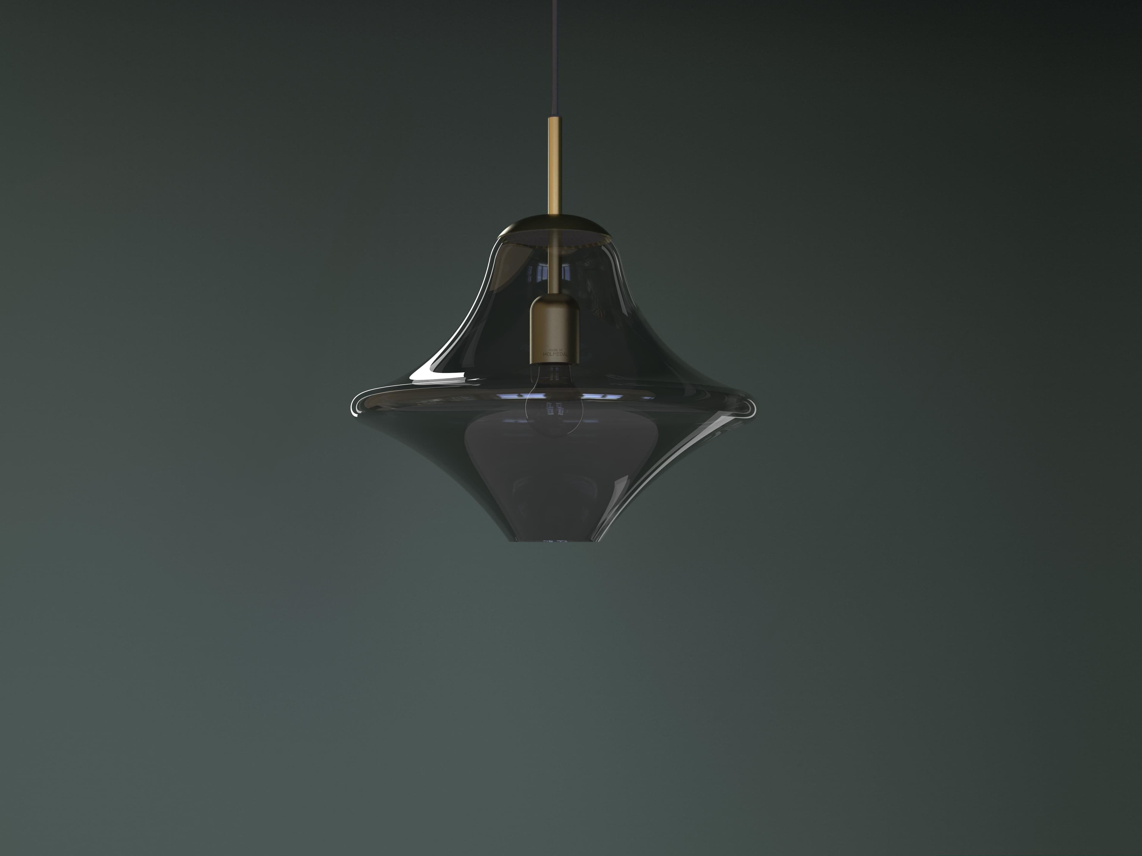
Scandinavian furniture and product design brands are often presented in a stereotypical way. Beautiful, sure, but quite stereotypical. Neutral colours, minimal aesthetic and generally everything looking oh so perfect. These were the design tropes we wanted to turn on their head when a new Scandinavian lightning company came to us to help them develop their brand.
What came up in our workshop with founder Anders Holmedal, was that he had strong urge to stir the pot a bit, to develop products that have a clear point of difference compared to what is expected of a Scandinavian lightning company. This allowed us to take the direction that we did.
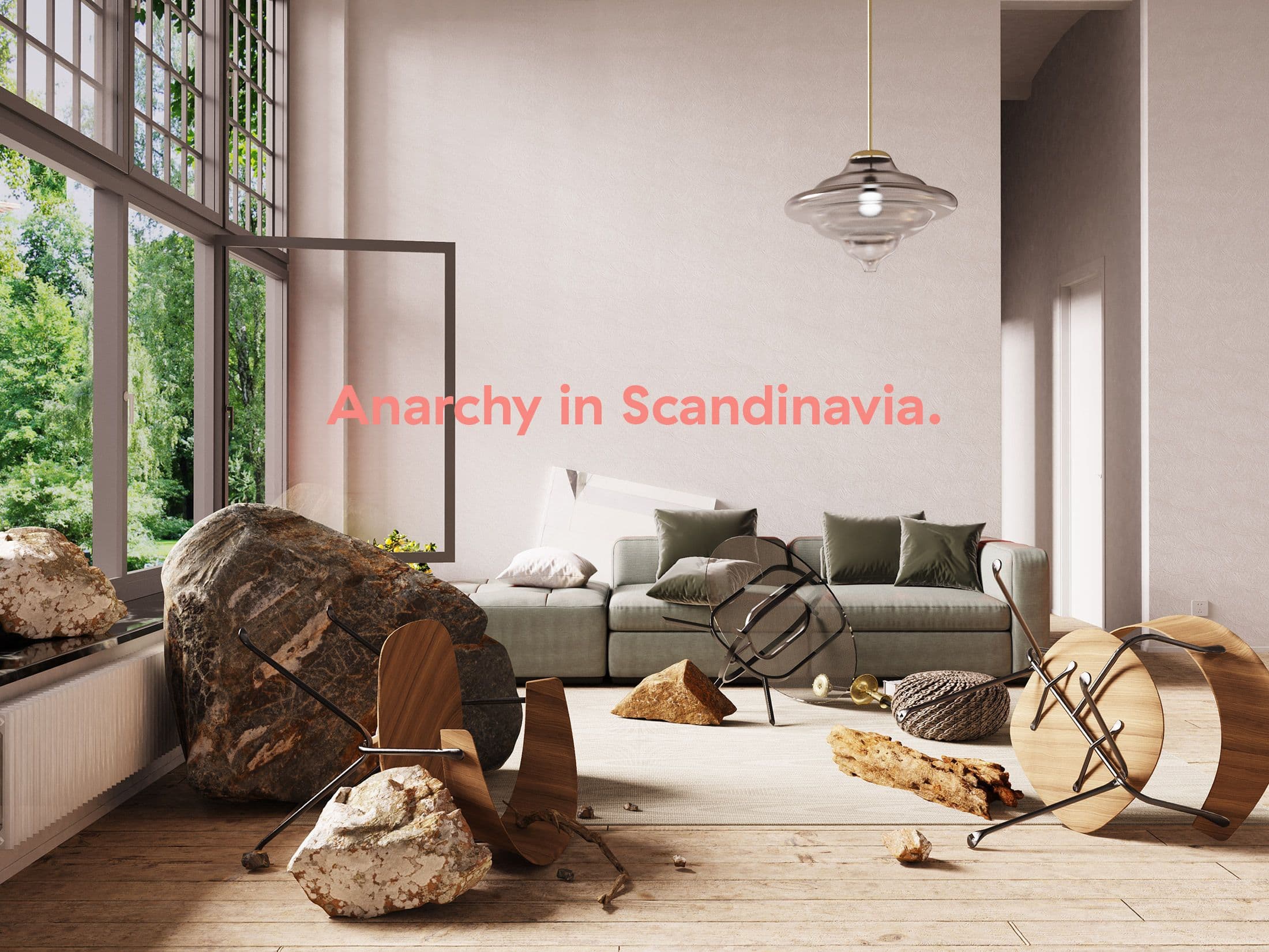
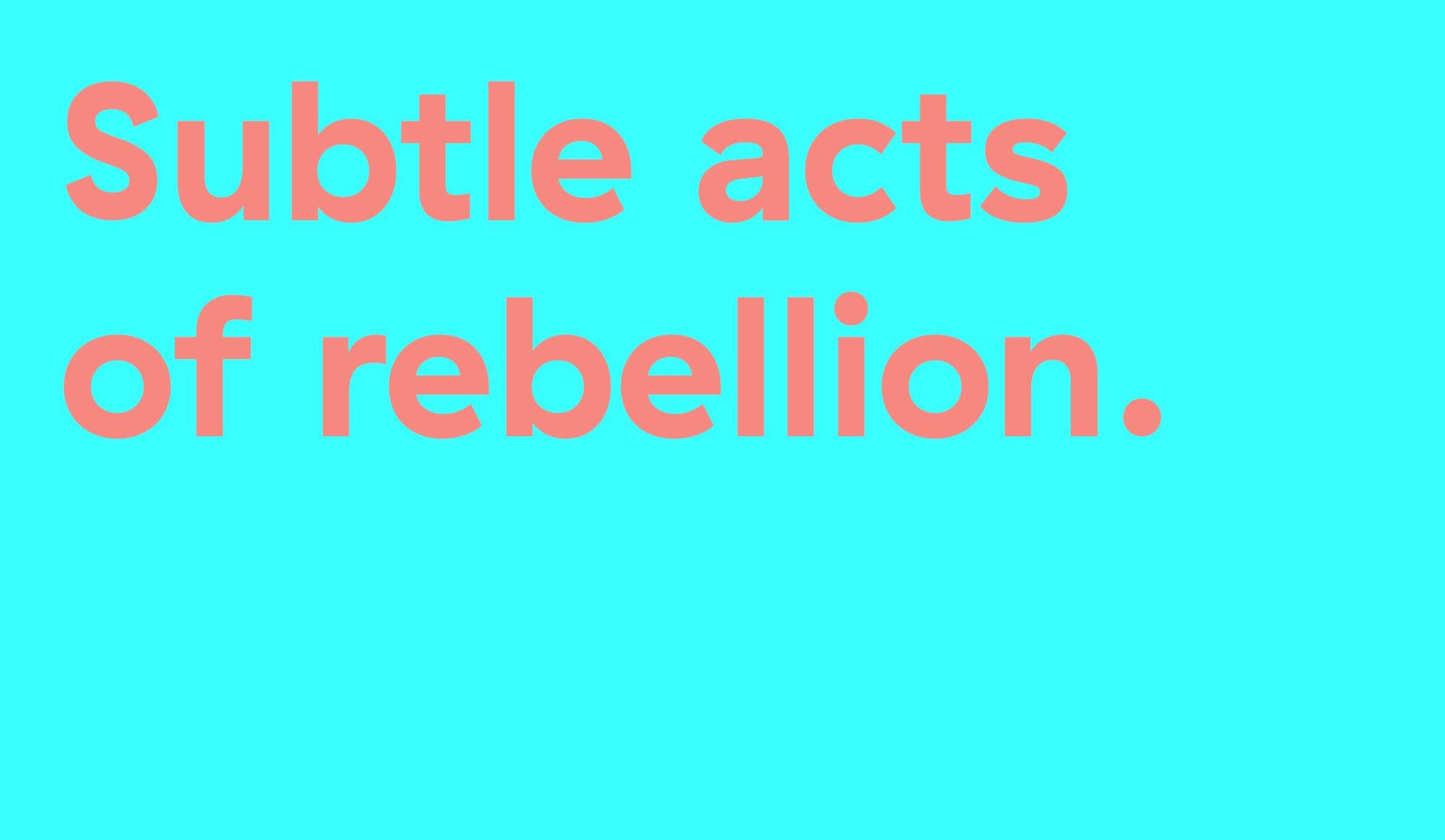
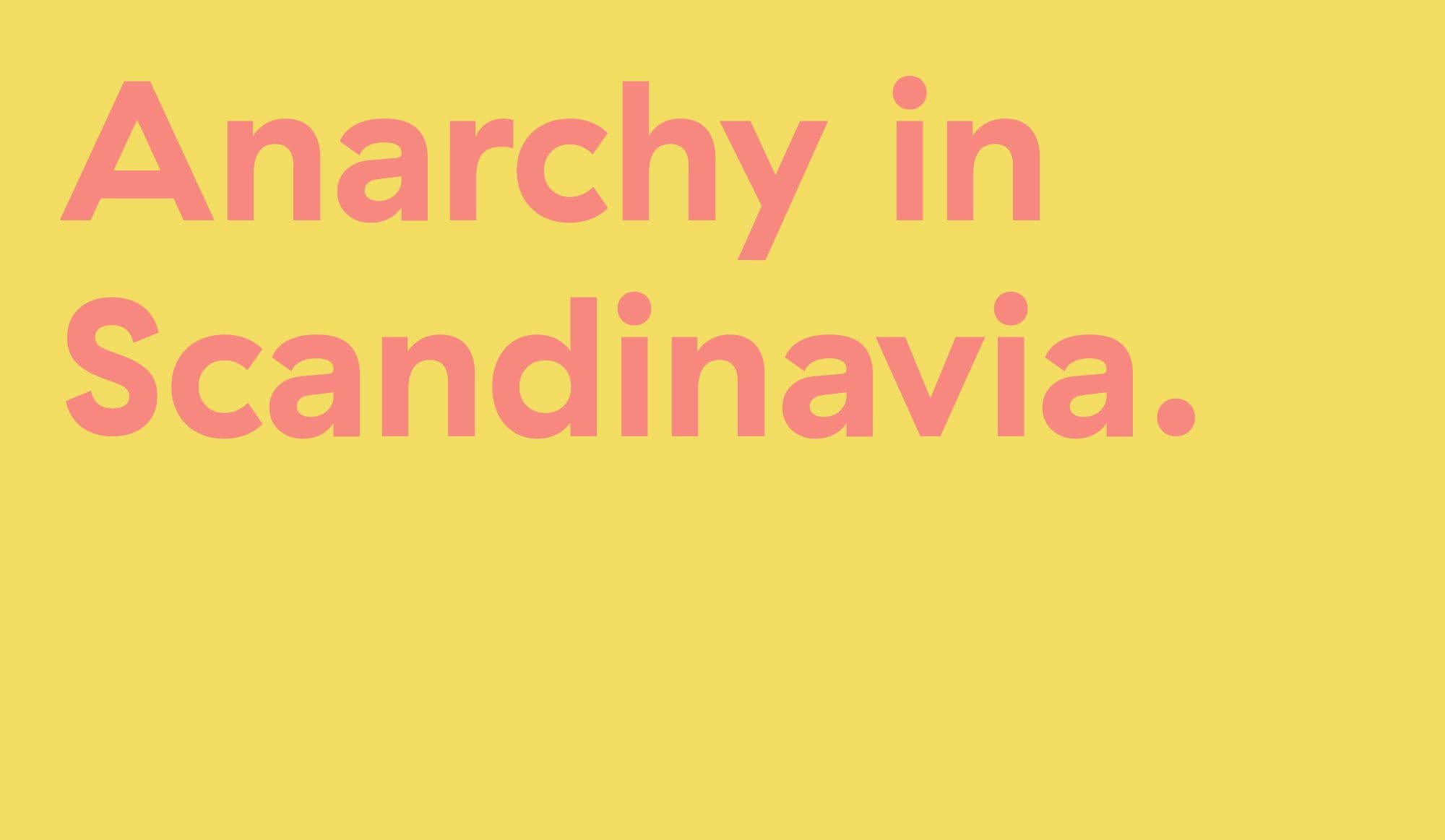
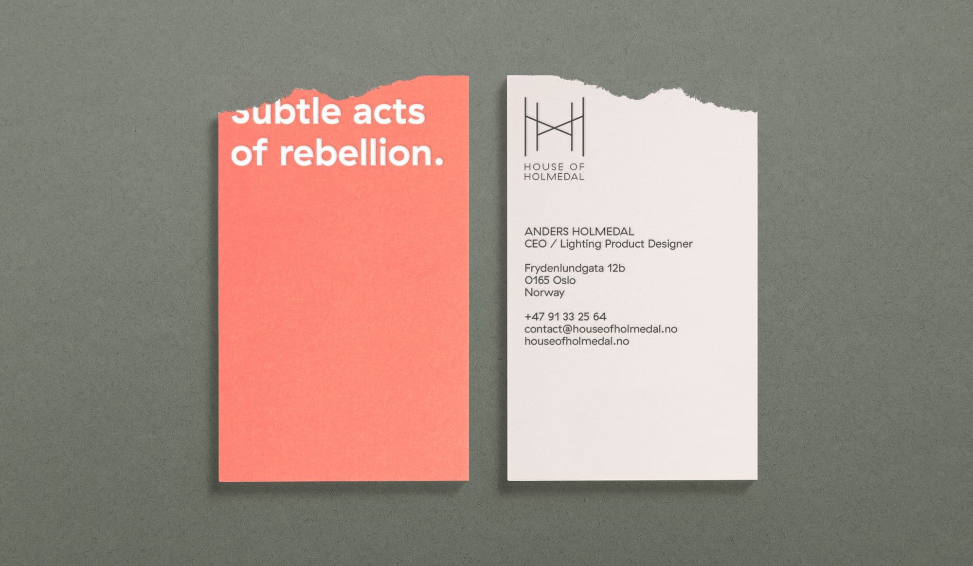
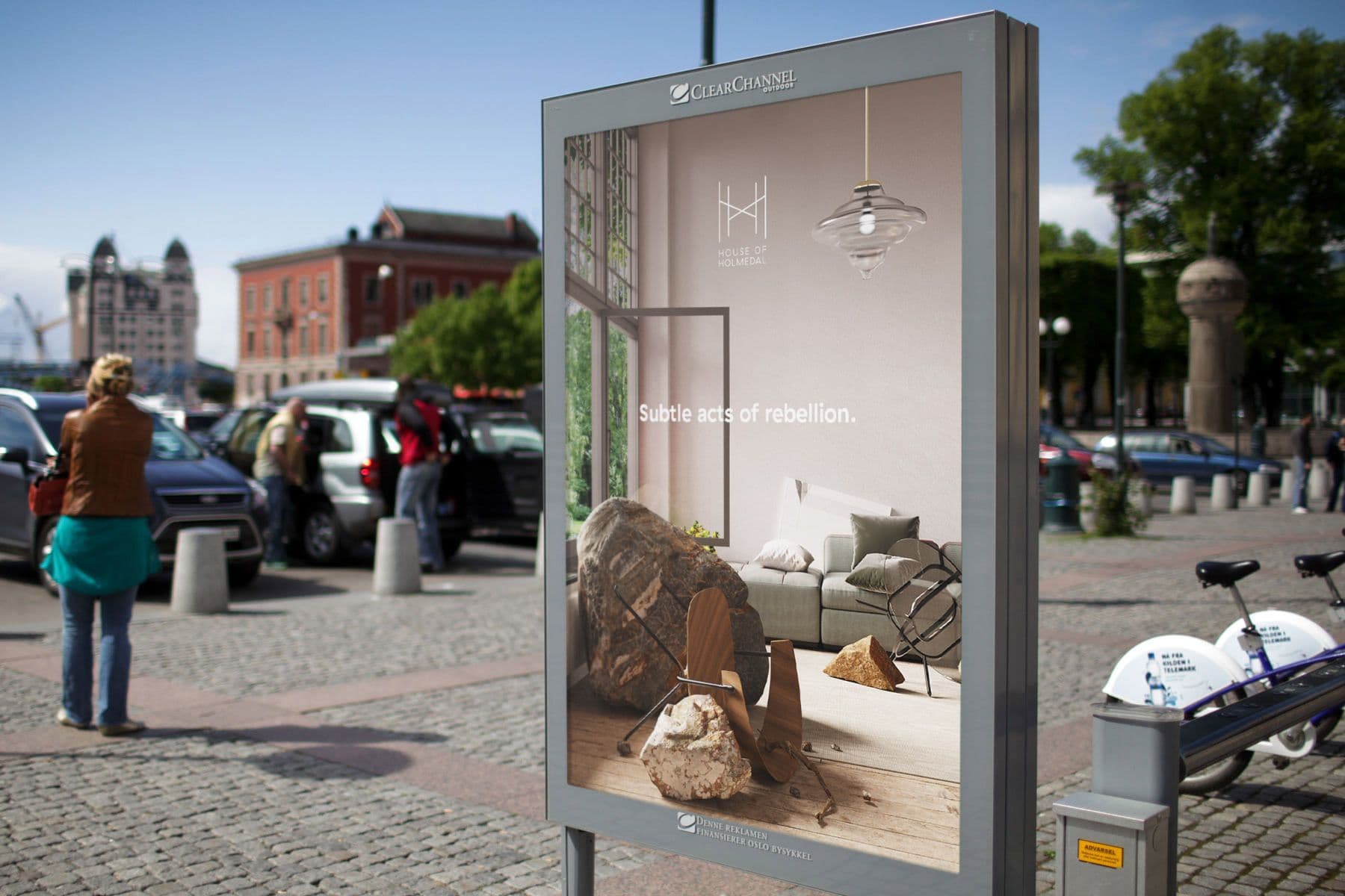
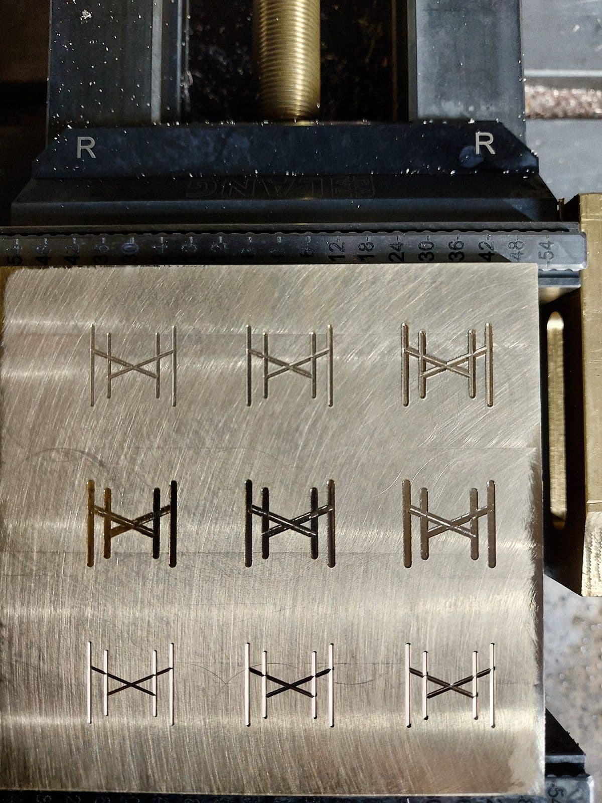
We developed the name House of Holmedal, created the visual identity, brand statements as well as the first campaign image for the brand (the messed up room above). The strategy that we developed, the idea of anarchy in the most socially democratic and 'nice' country in the world, works as an antidote to Holmedal's competitors as well as being an internal benchmark for him as he develops his products. We can't wait to see what he comes up with in the future.