Sturgeon Issues 1-6
Design & Art Direction
"It’s one thing being a big fish, it’s another if you produce caviar."
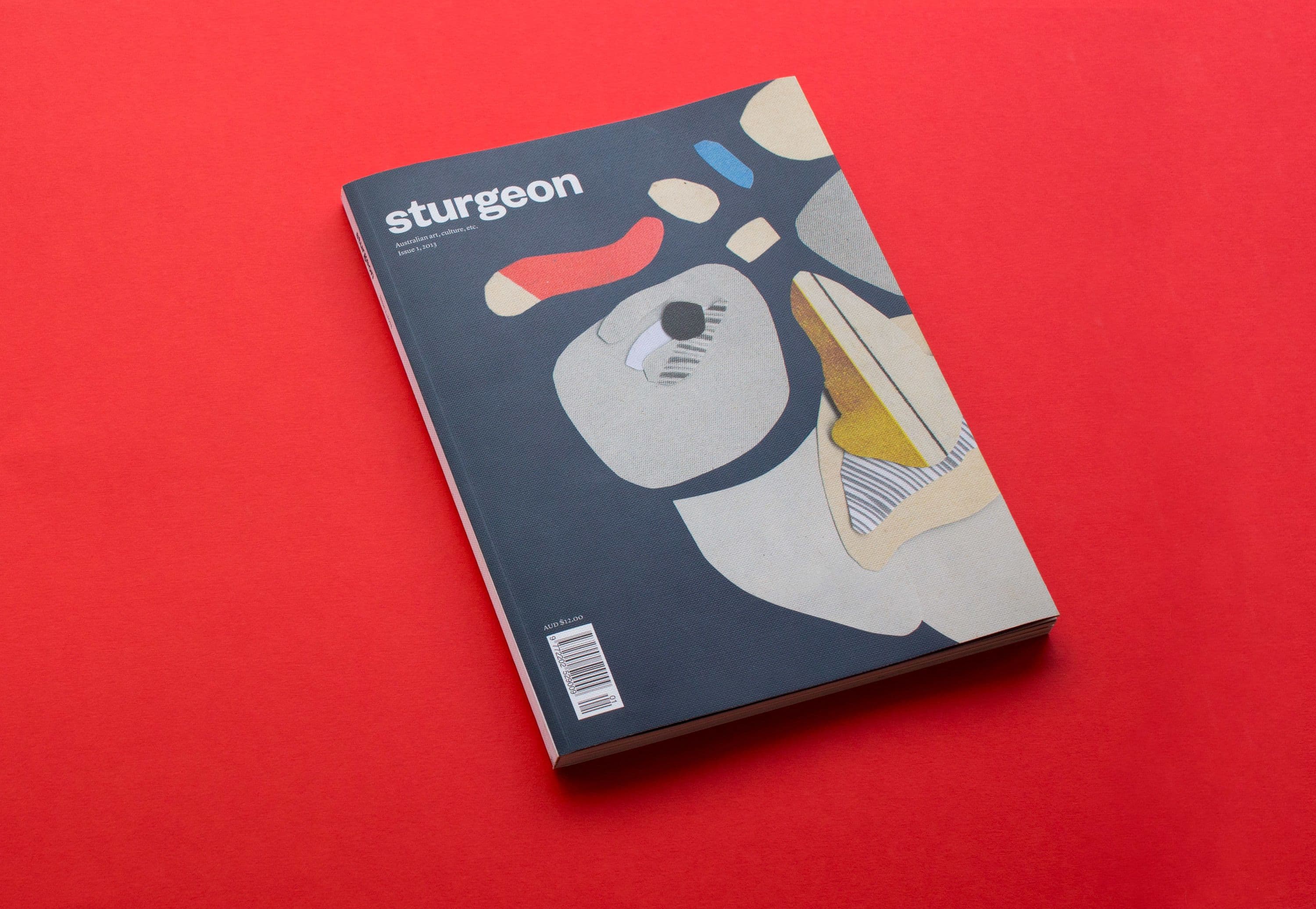
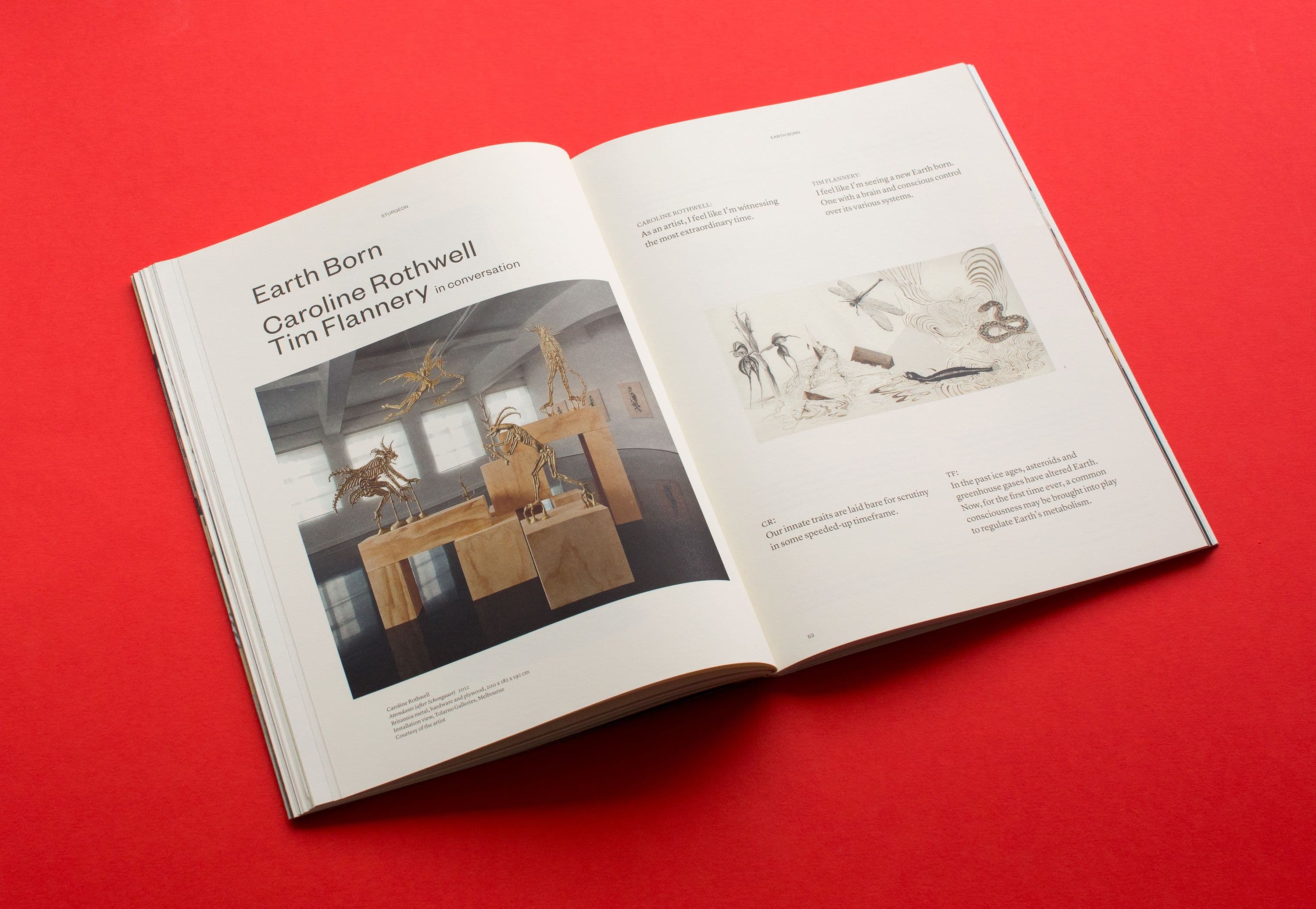
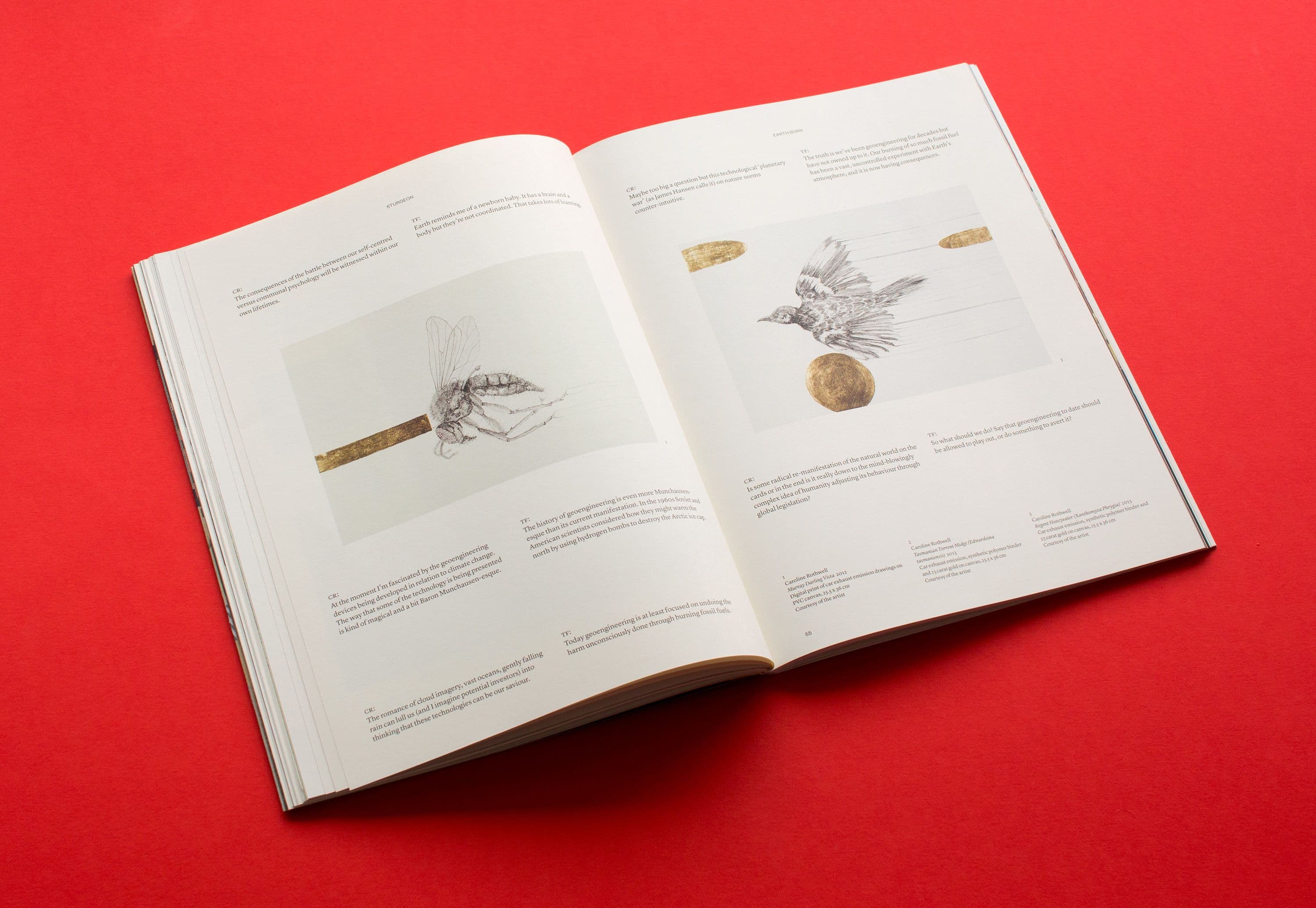
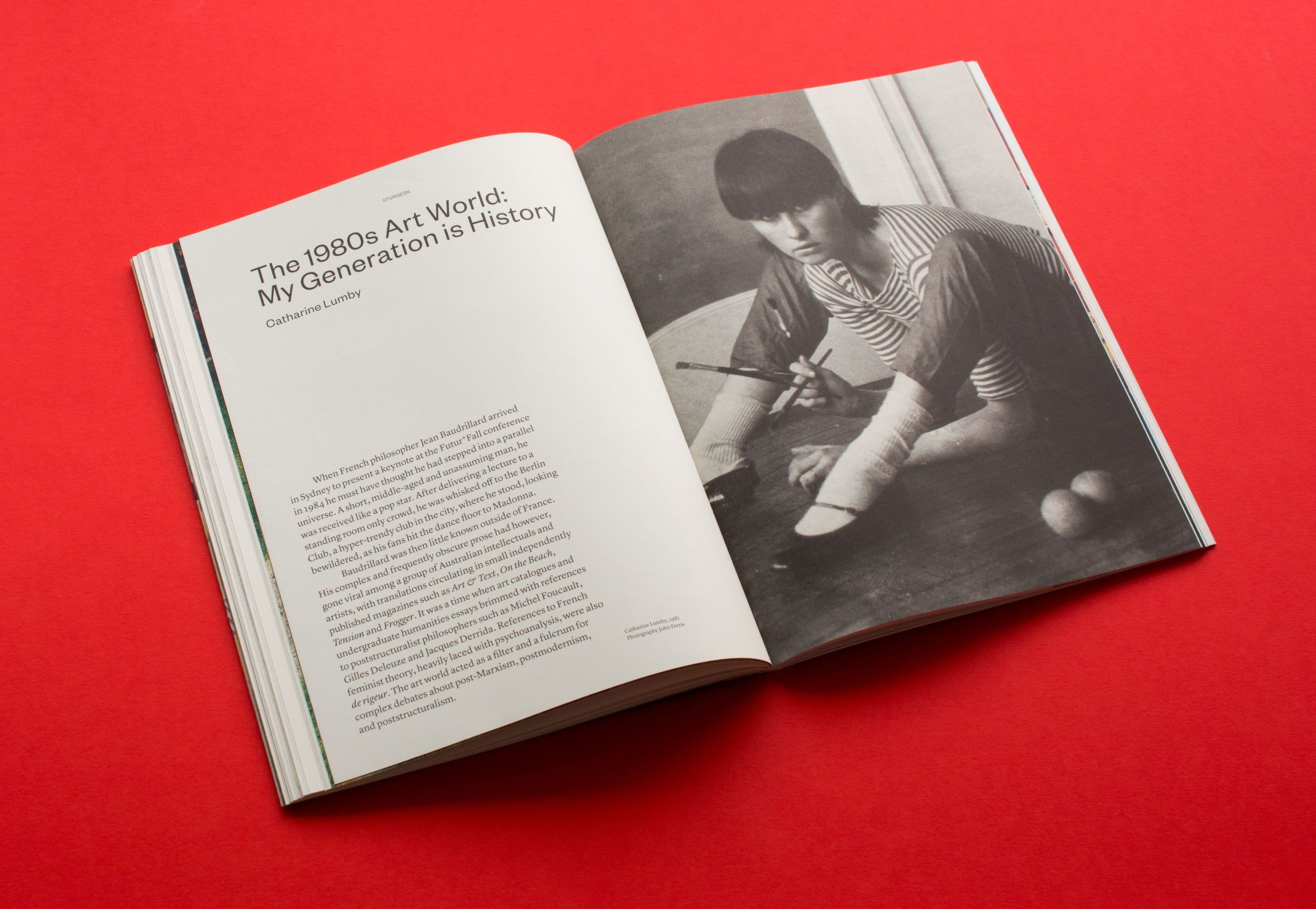
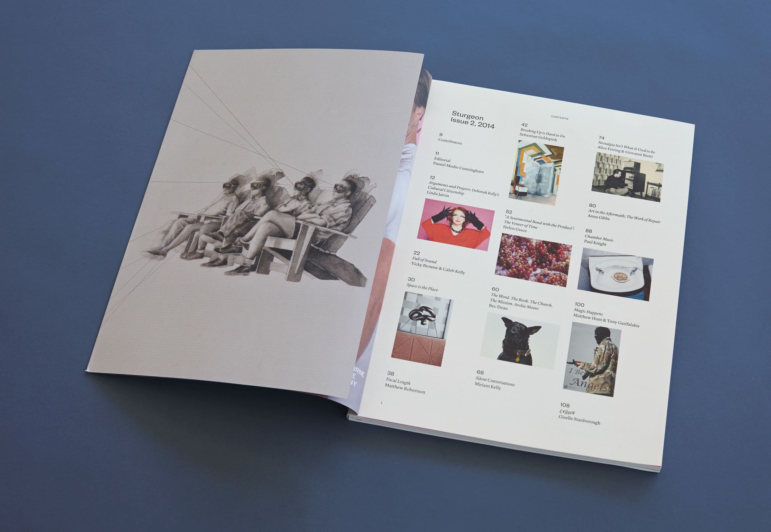
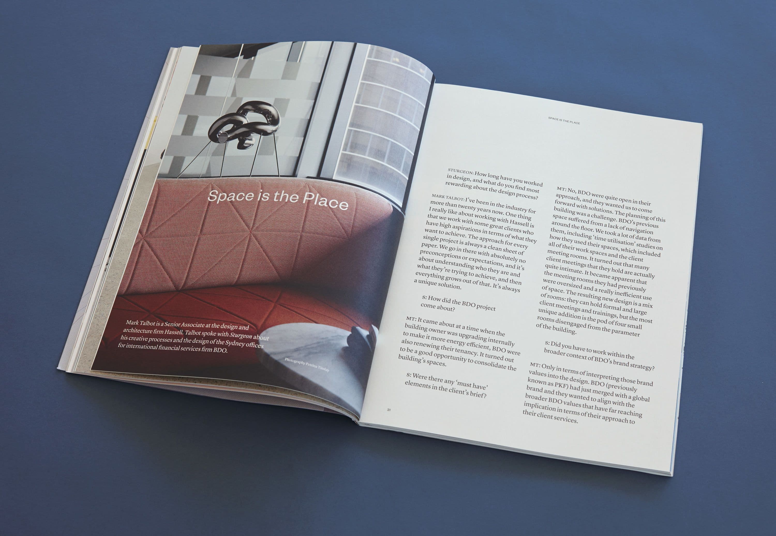
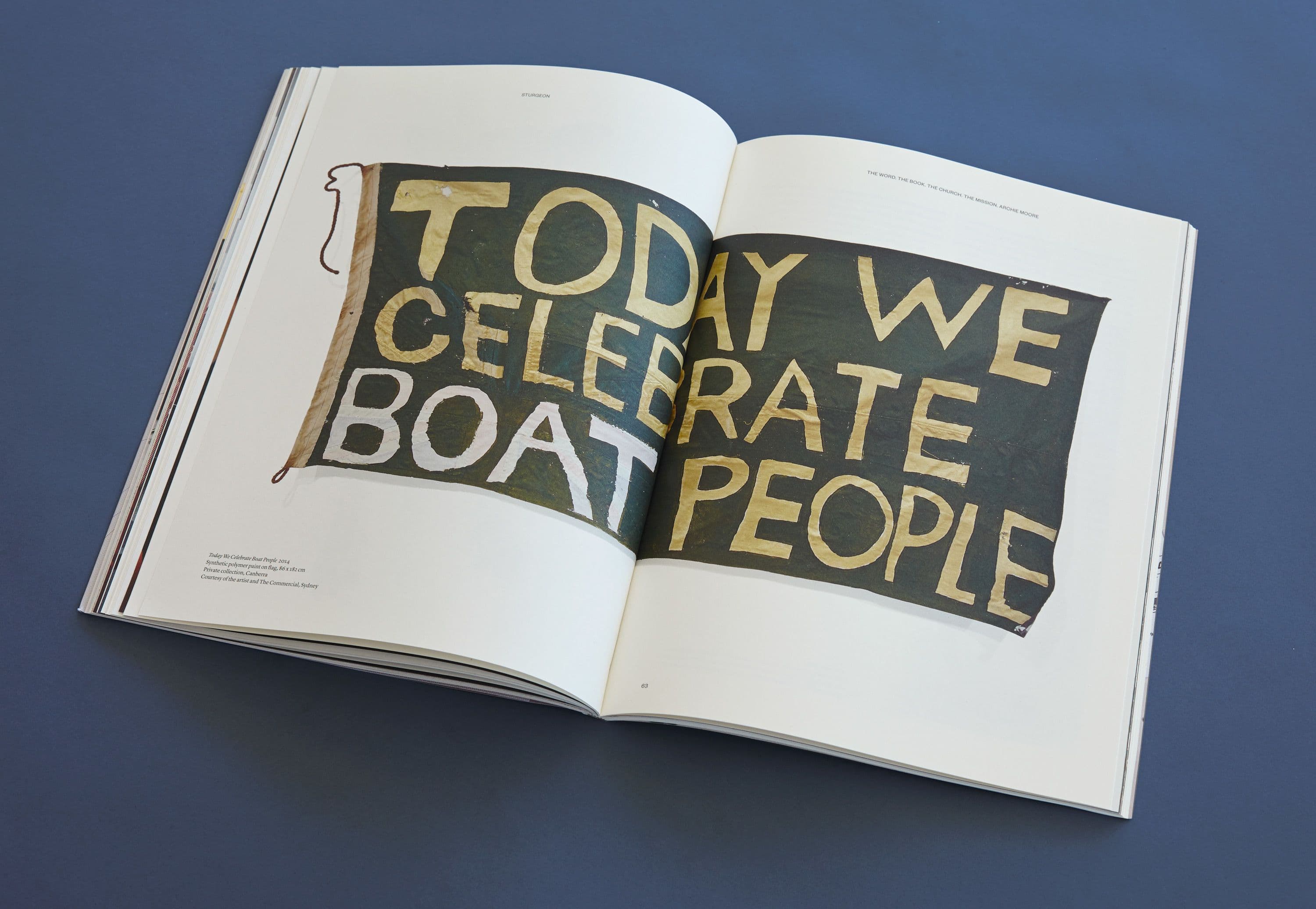
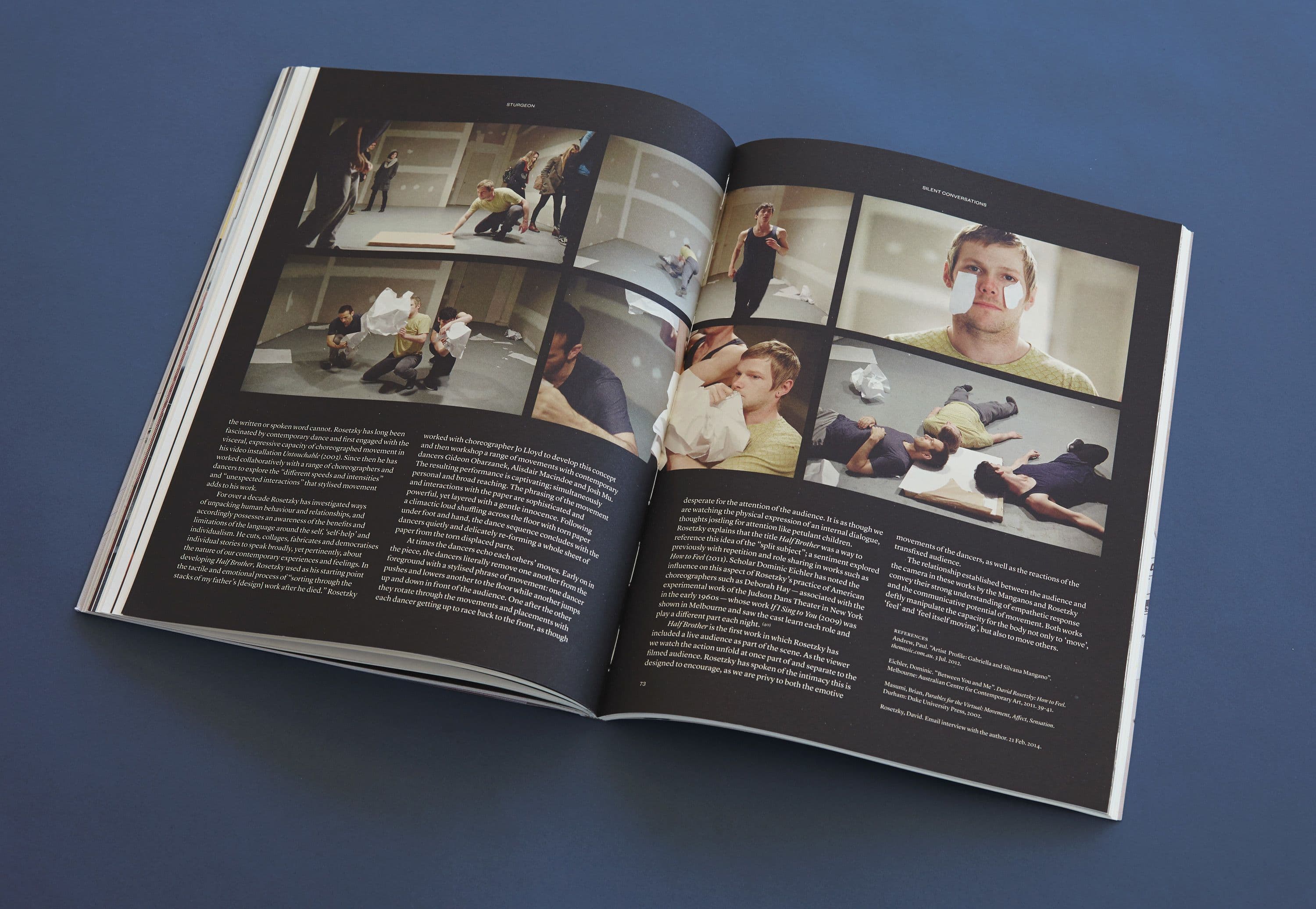
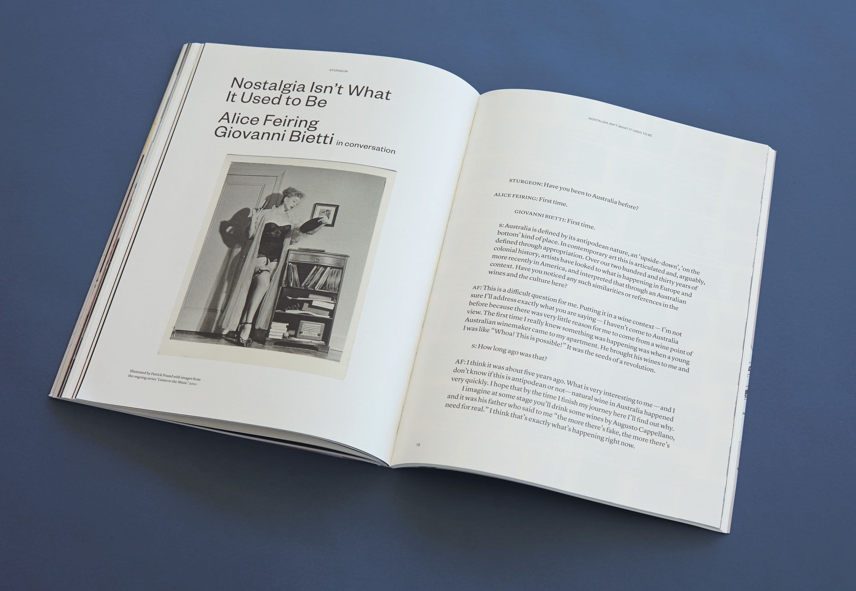
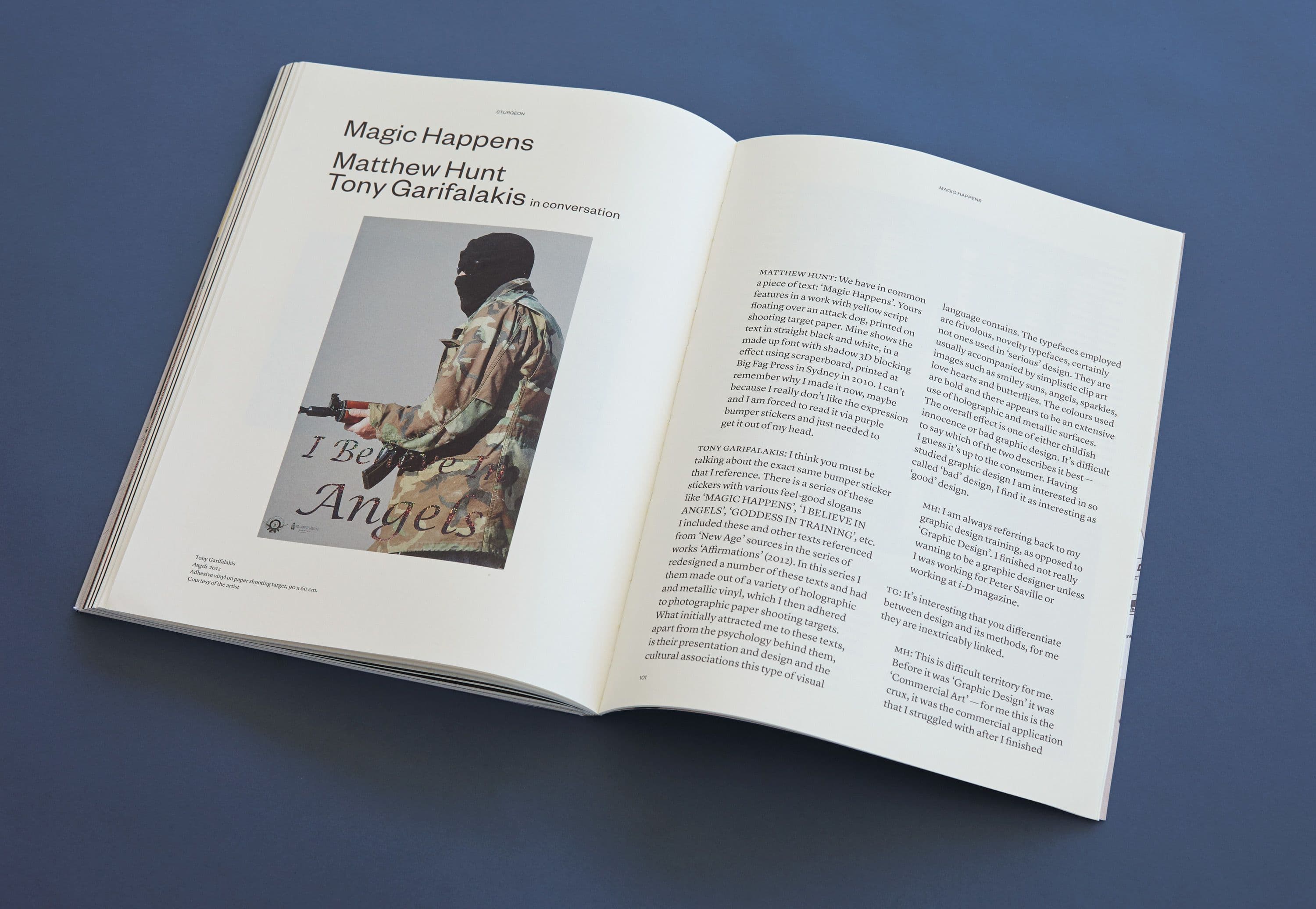
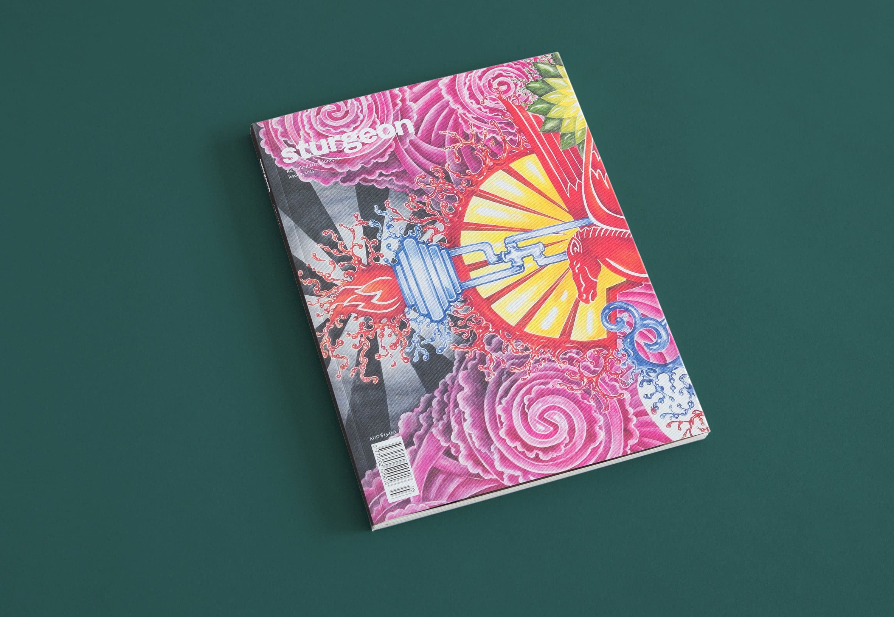
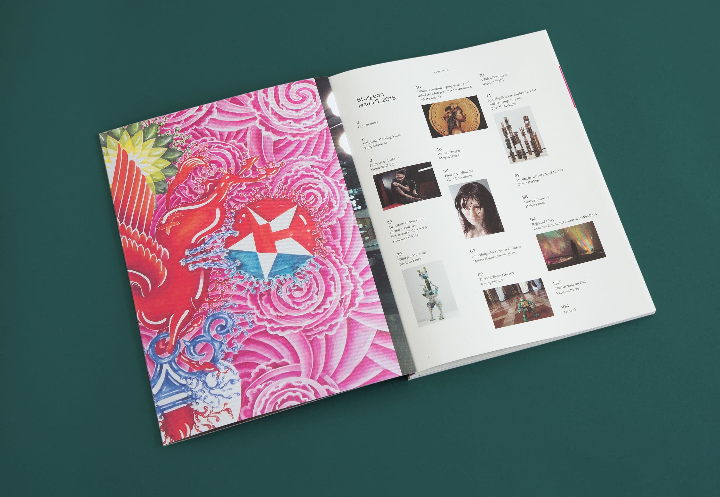
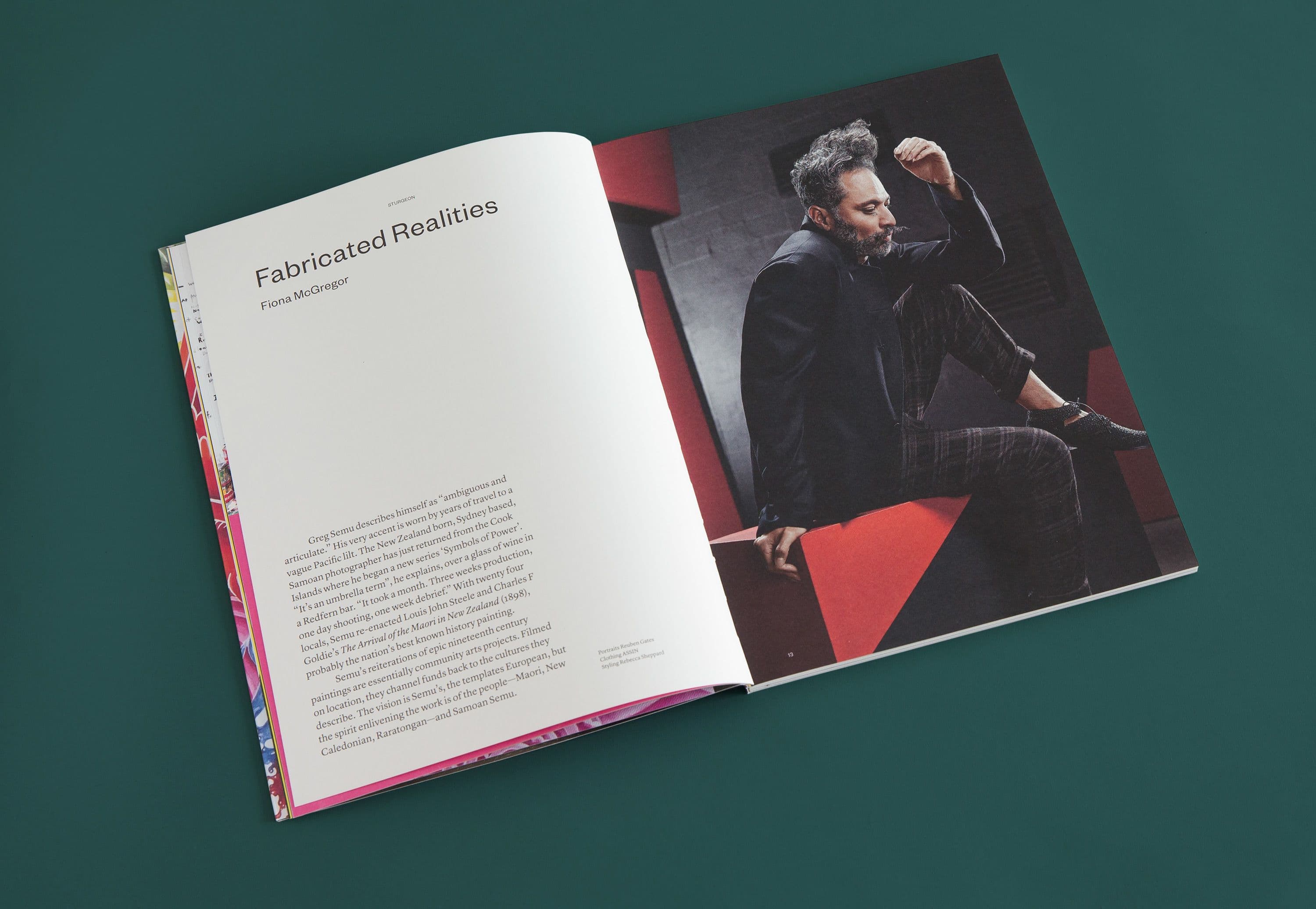
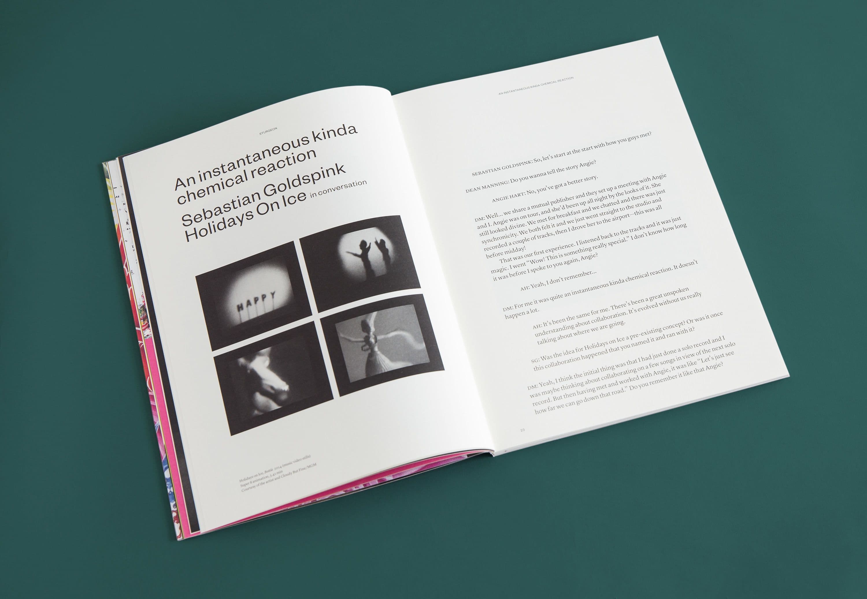
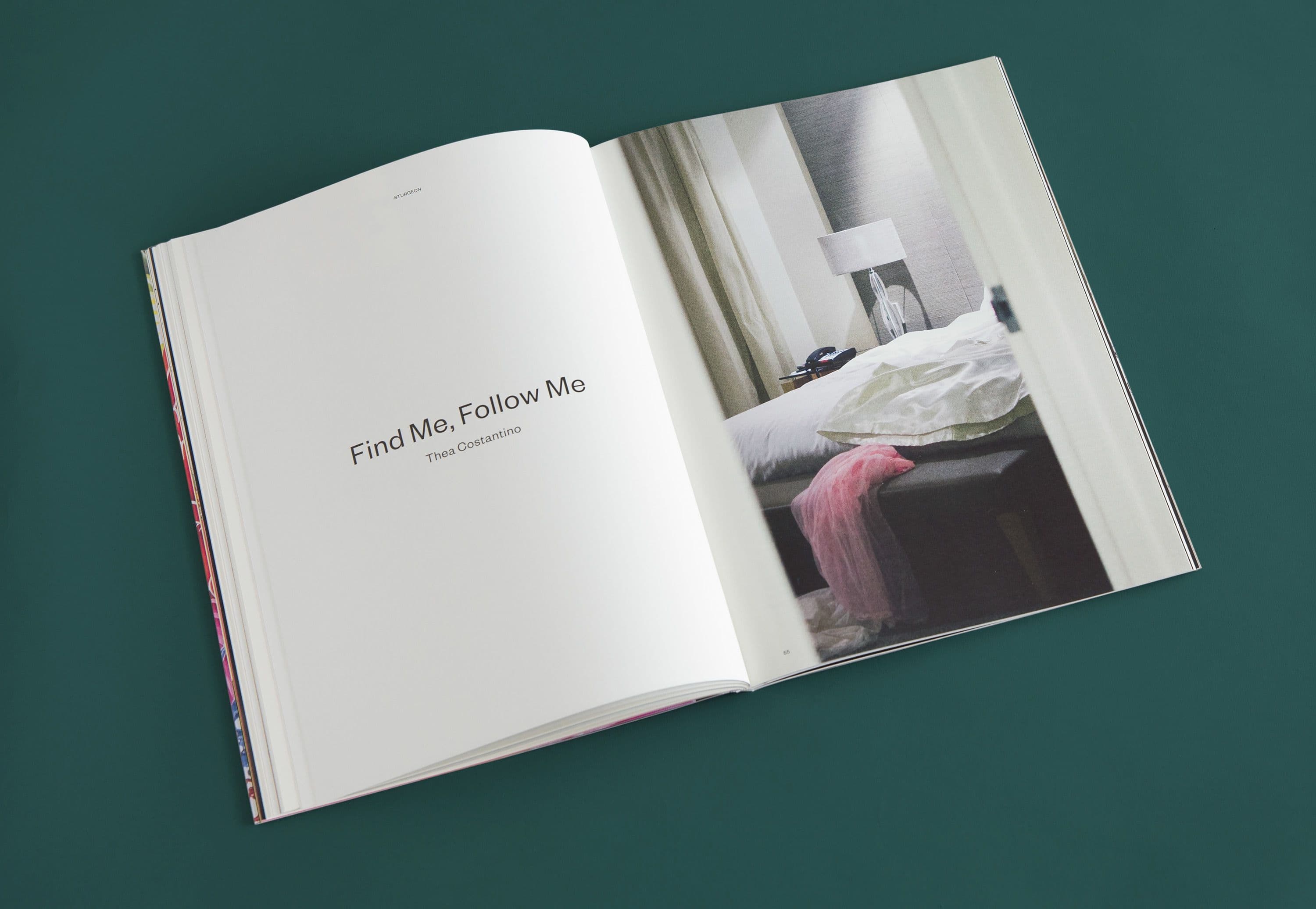
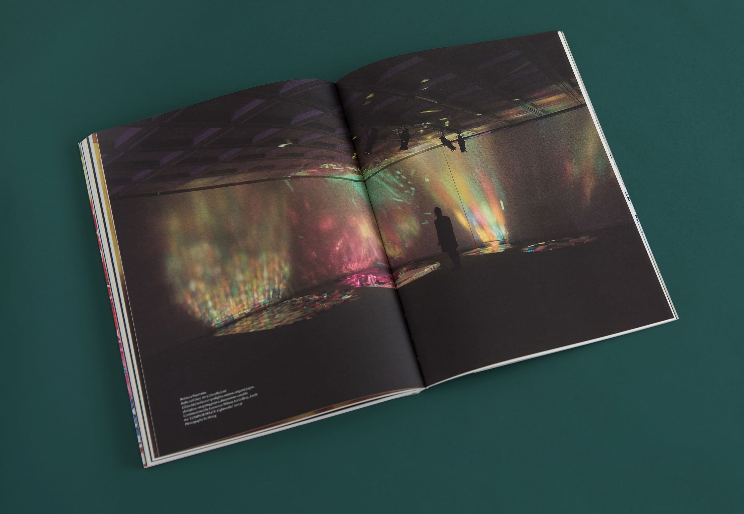
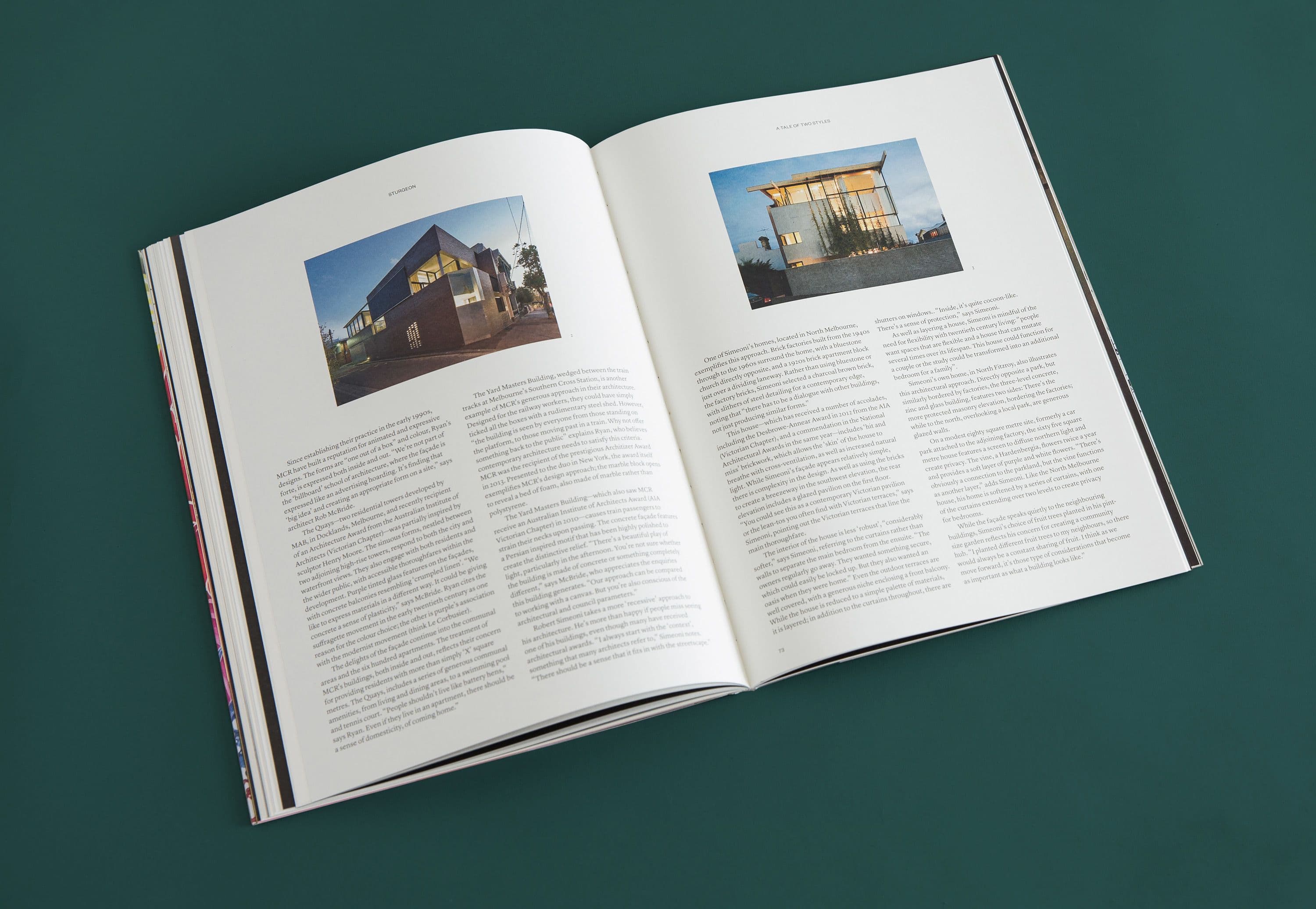
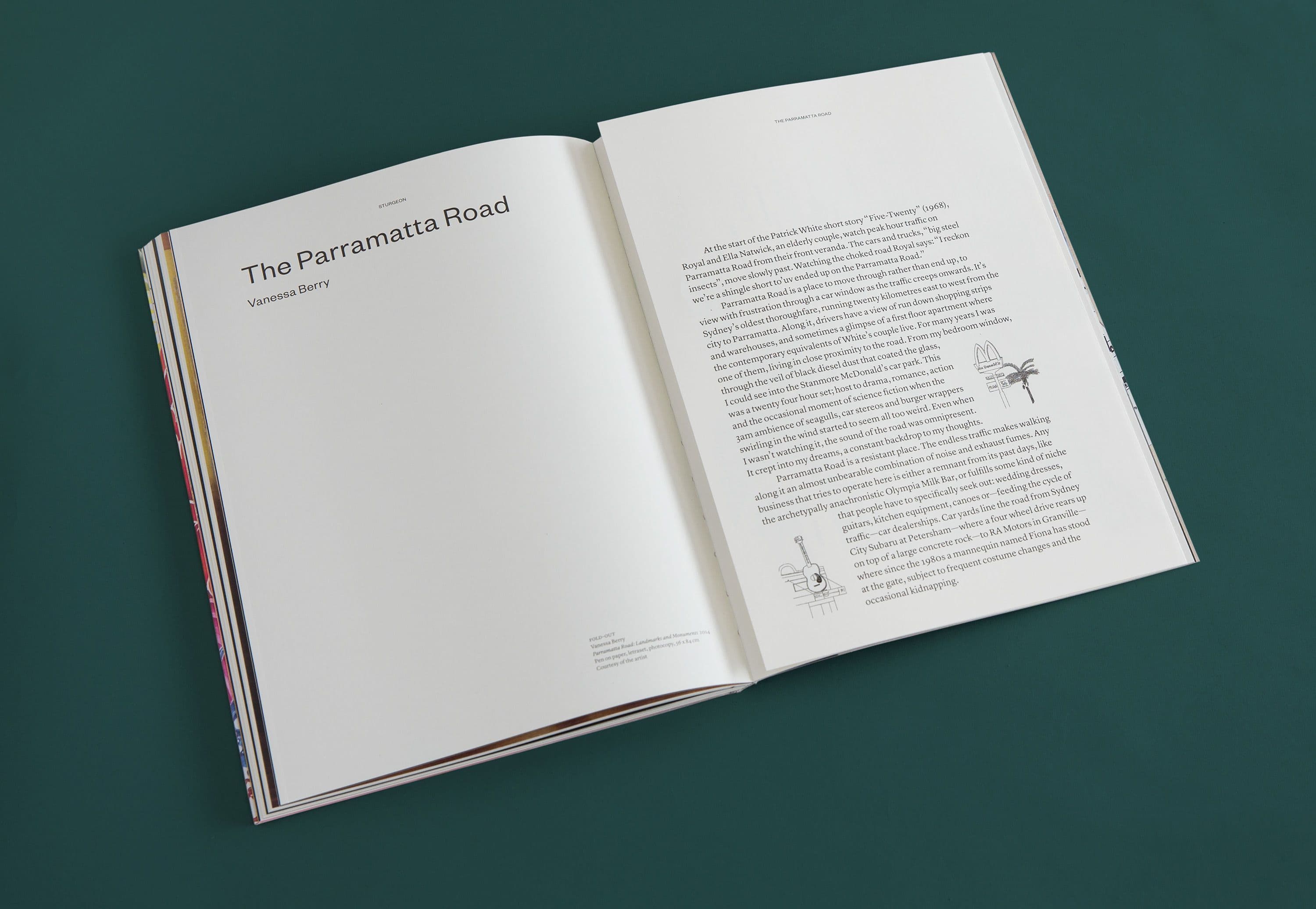
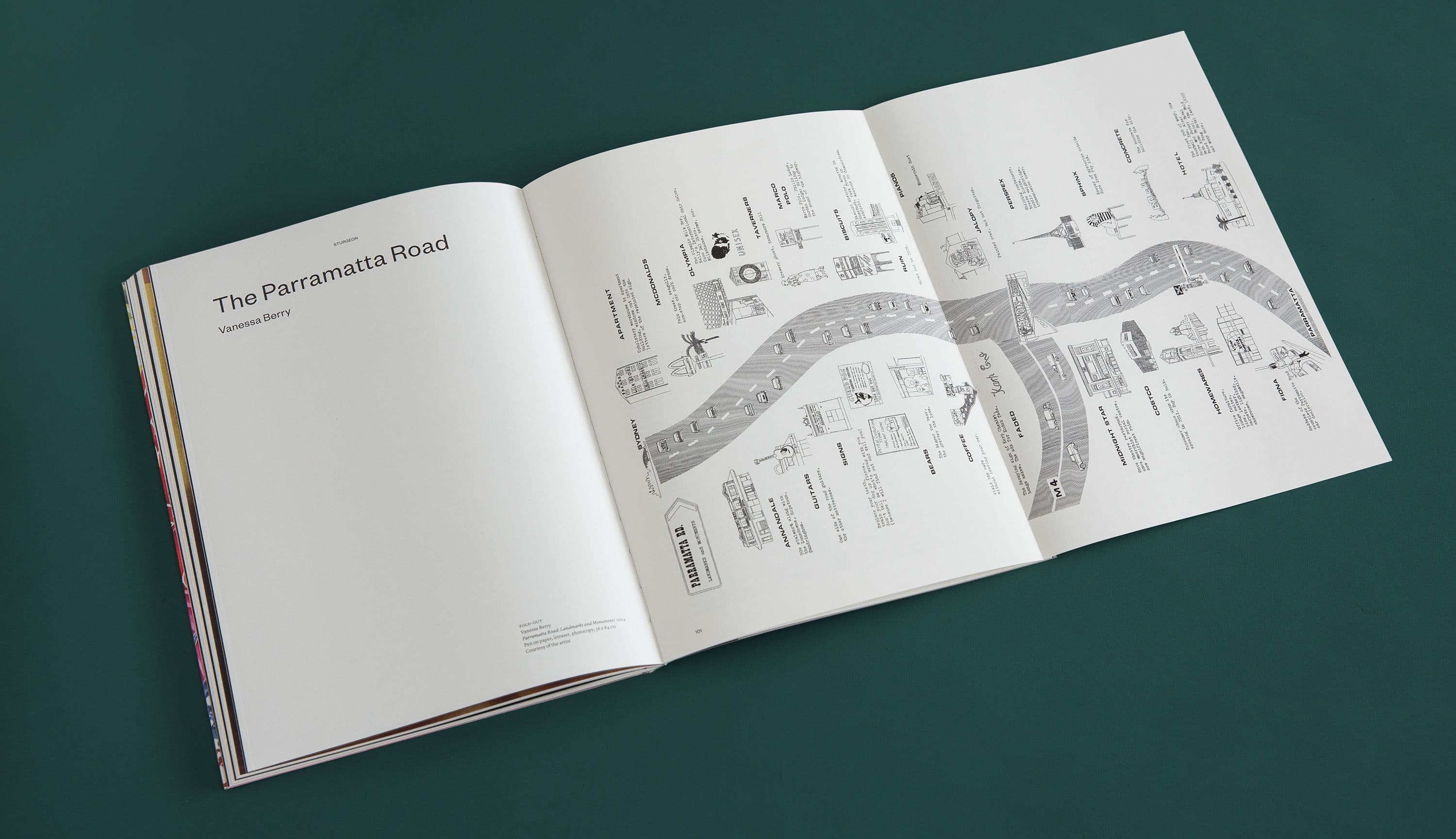
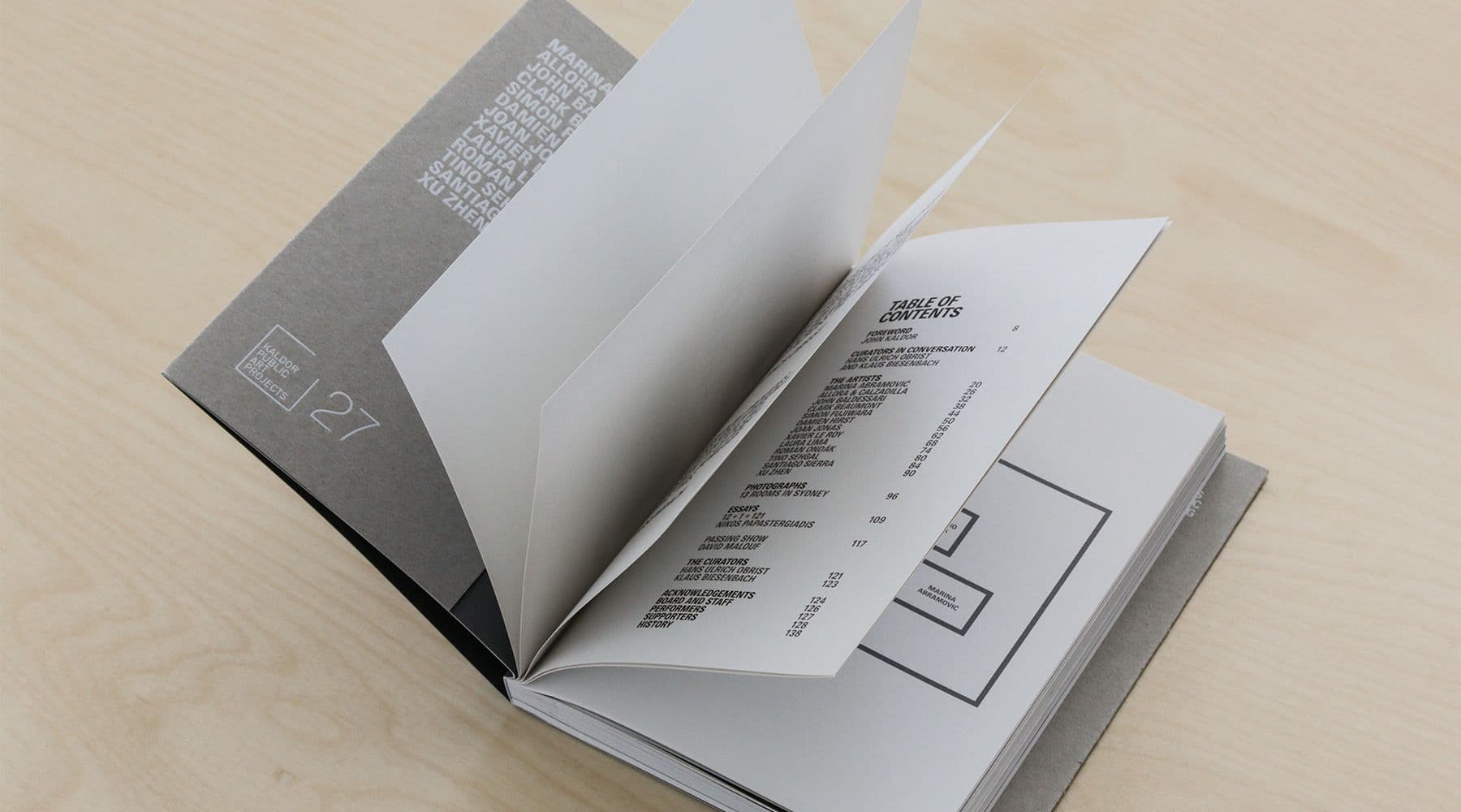
Sturgeon, a magazine edited and published by Artbank between 2013 and 2016, observed and celebrated the culture surrounding contemporary art in Australia. After our successful rebranding of Artbank early in 2013, Collider was commissioned to establish Sturgeon‘s logotype through to art direction and design of the publication.
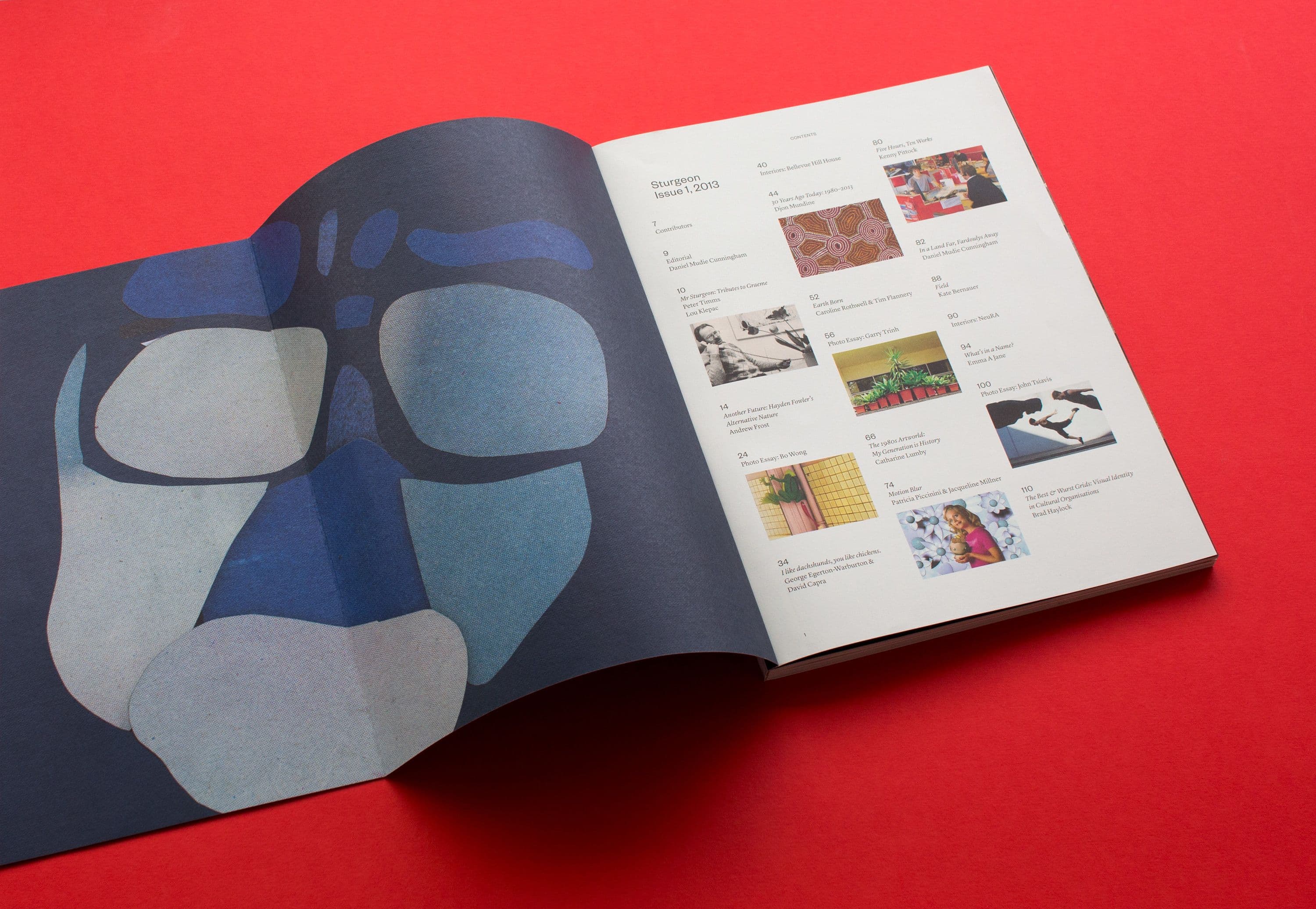
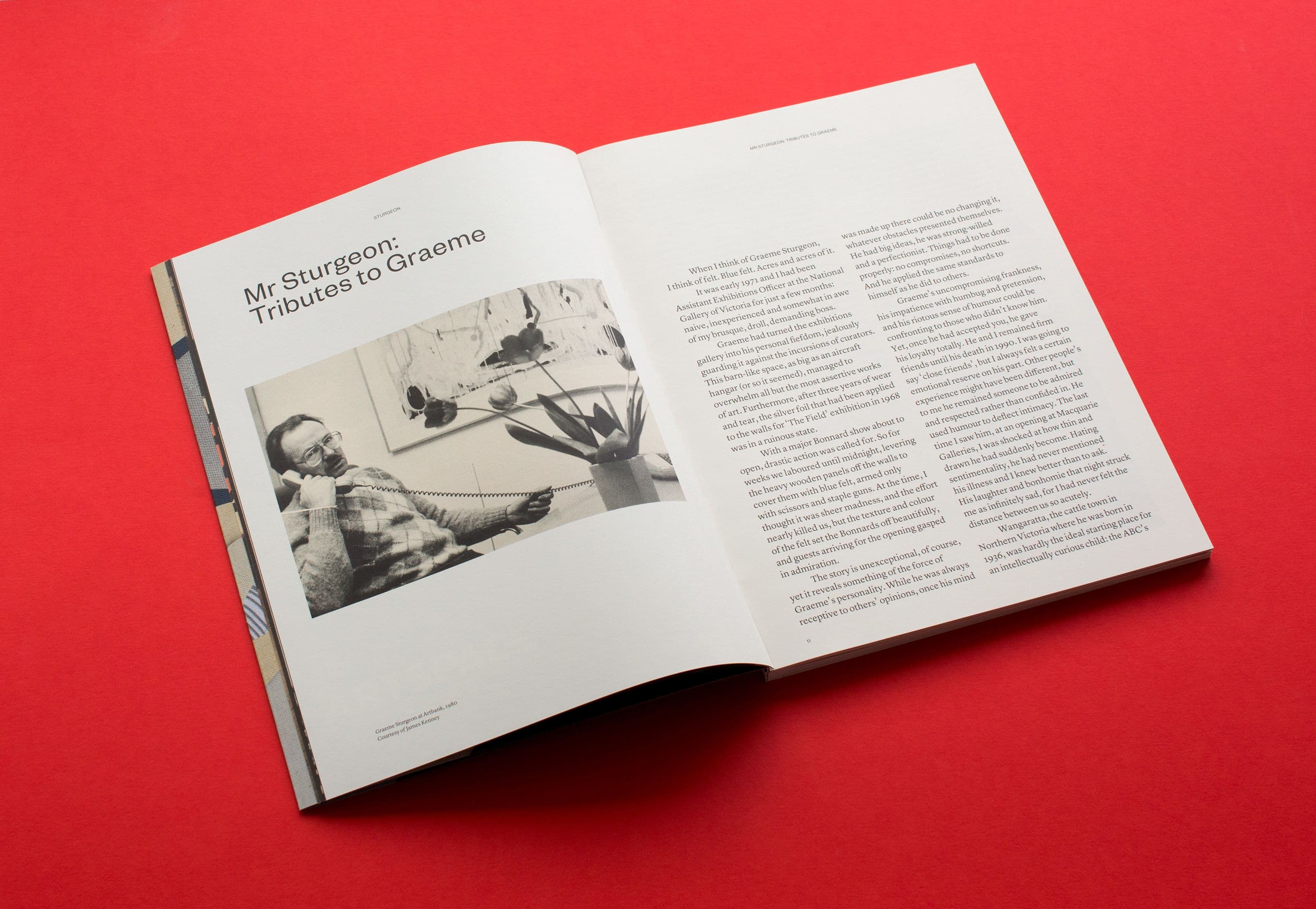
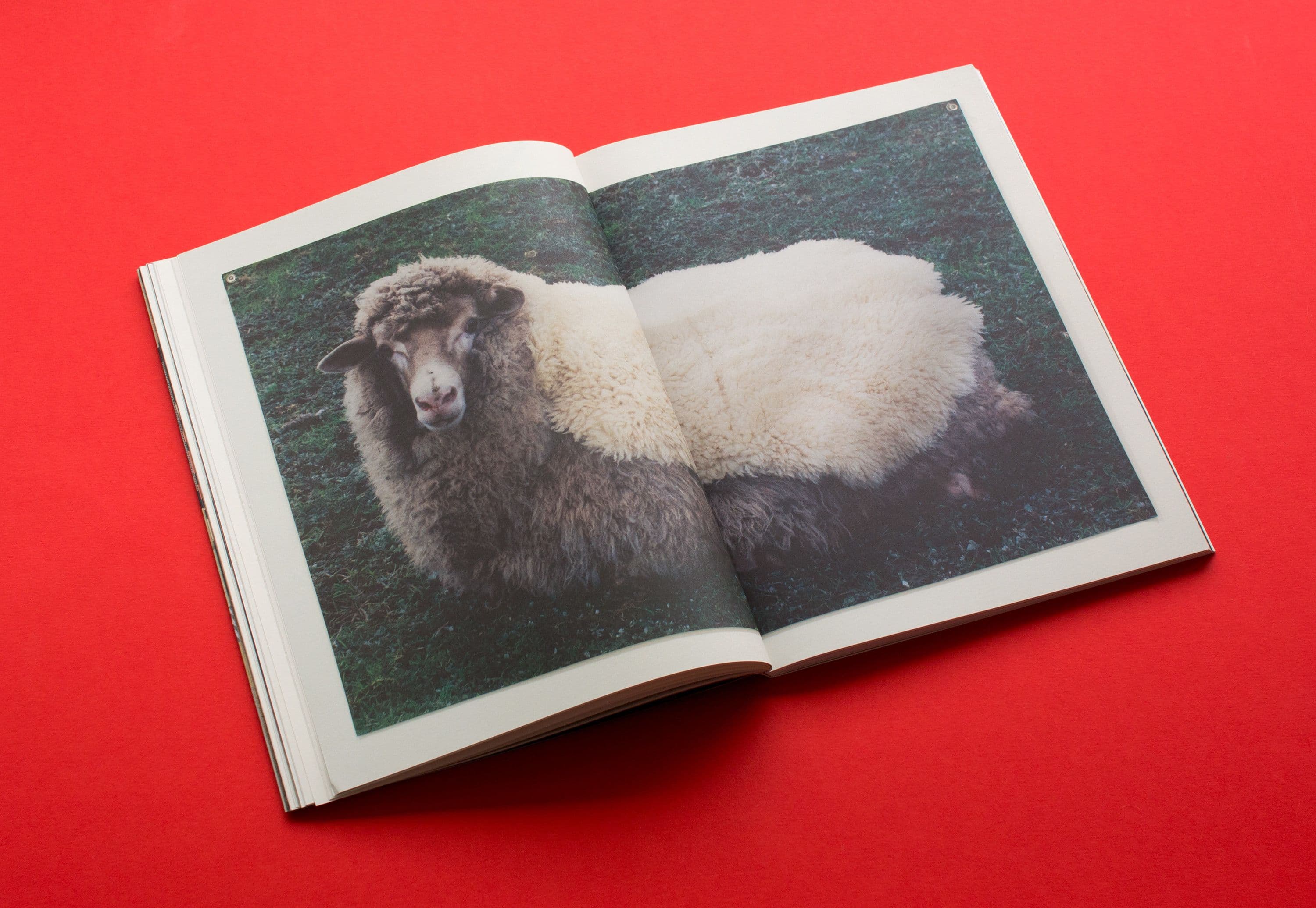
Type is set with acute clumsiness, providing a contemporary slant (and intrinsically Australian tone) to an otherwise traditional layout. Most importantly, the subtle typographic direction allows for a clean and reverent presentation of artwork within each spread.
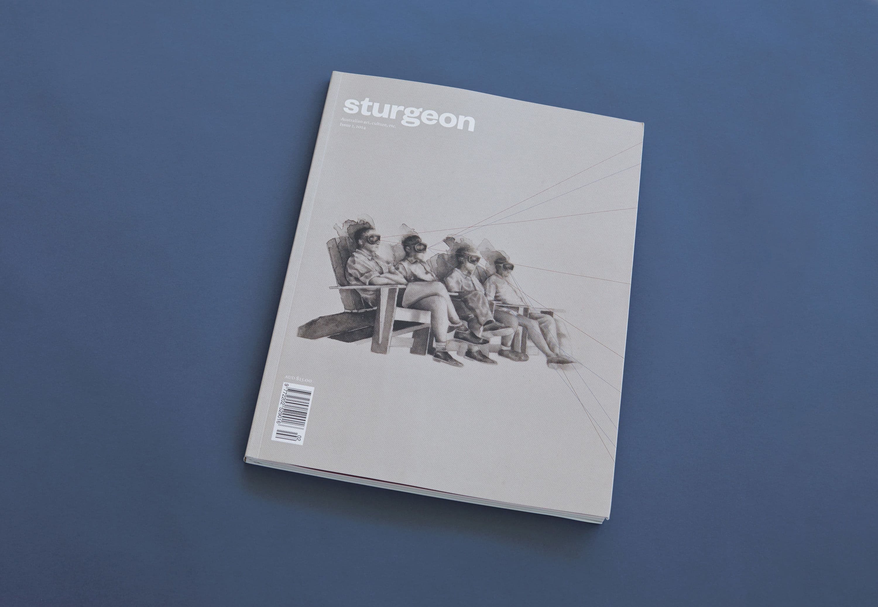
The magazine’s masthead was set simply in a heavier weight of the Founders Grotesk family, continuing our ‘minimal intervention’ approach to Sturgeon typography and its impact on artist imagery.
Cover designs were commissioned by Artbank, Issue 1 featuring recto/verso portraits of Graeme Sturgeon by Collider collaborator Clemens Habicht.