Australian Brandenburg Orchestra
Rebranding the world's leading Baroque orchestra
At the start of this exciting project, we saw the mix of the baroque and the modern as an incredibly fertile ground for exploration. Luckily for us, our excitement was shared by the Brandenburg, not least by the founder and conductor Paul Dyer himself.
Over the period of a year, we worked very closely with the orchestra to stake out a new direction, with a new purpose and attitude for the brand. The new brand is now alive and we have been able to explore the intersection of classical baroque sensibilities with new modern technology and visual expressions.
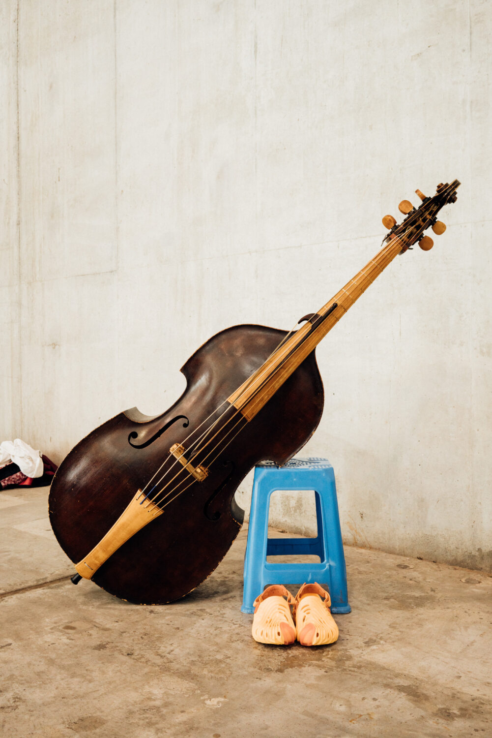
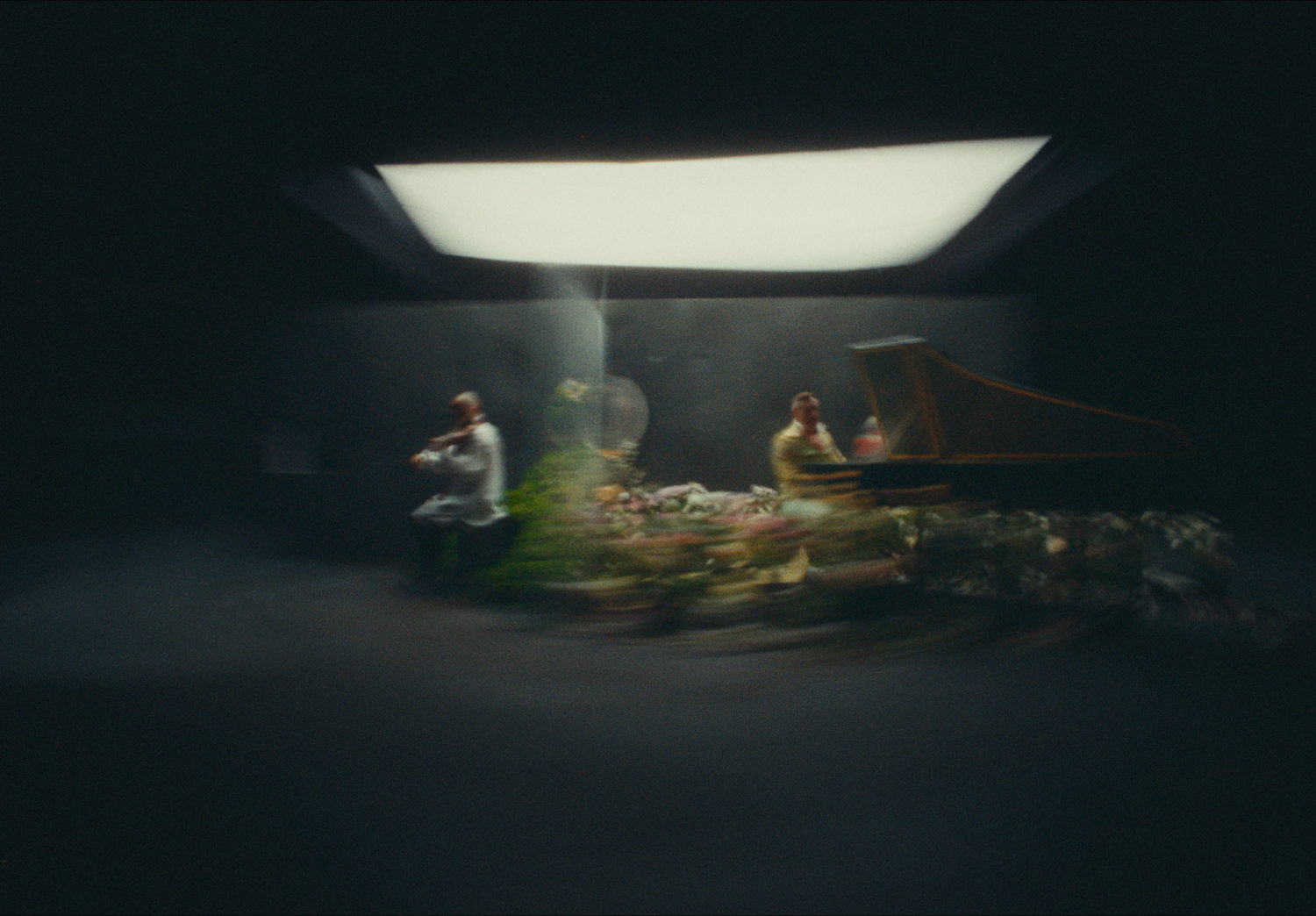
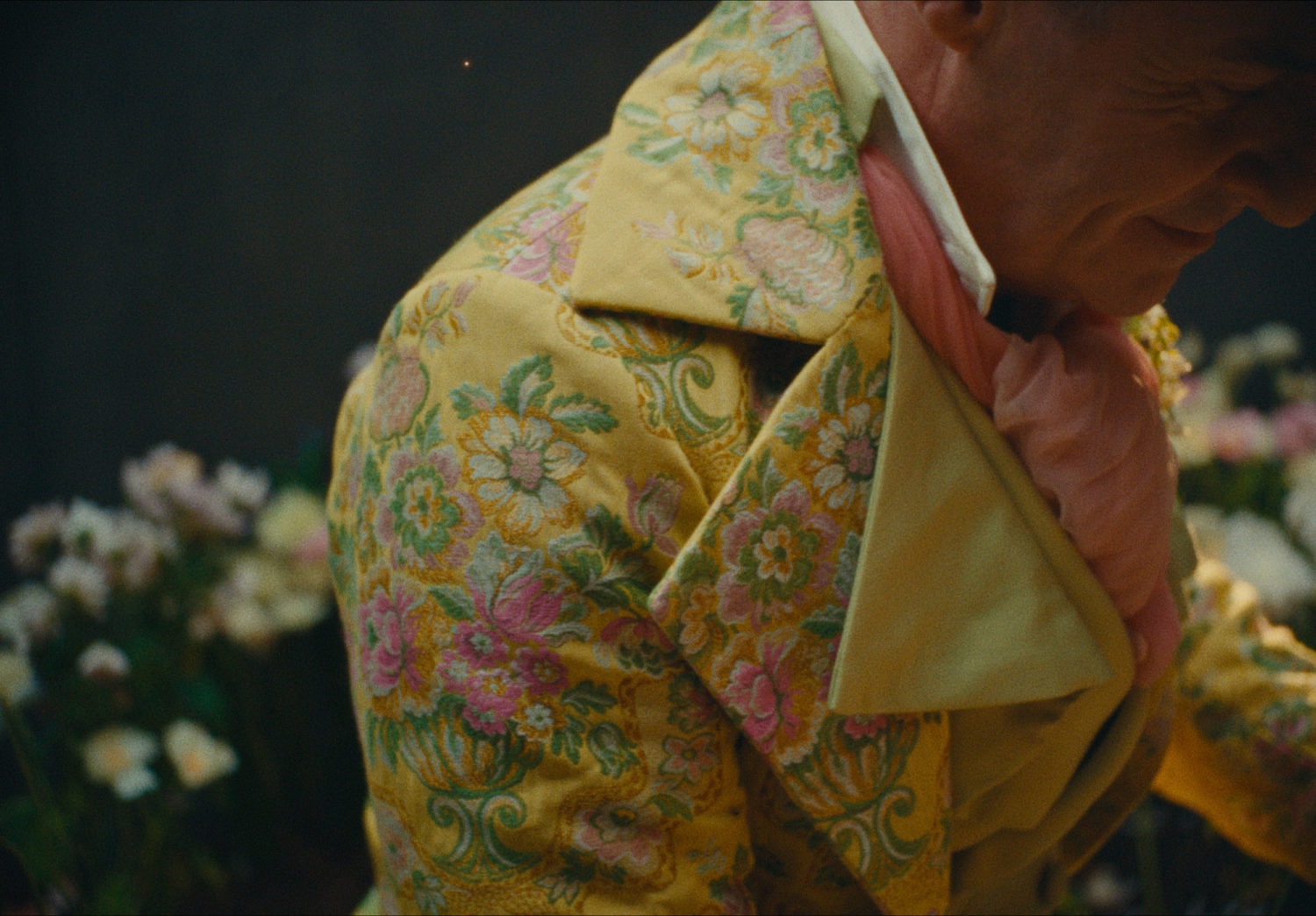
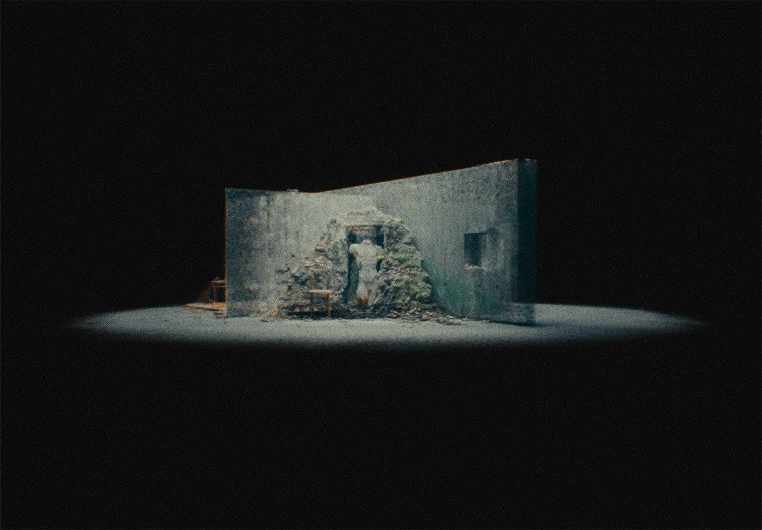
Our relationship with the Brandenburg is ongoing and we hope to harvest new ways baroque music can be expressed, both two-dimensionally, in motion, and on stage. Baroque music in its time was always fresh, challenging, and ’not right' for the establishment, and this attitude is something we want to keep reminding ourselves of as we move forward together.
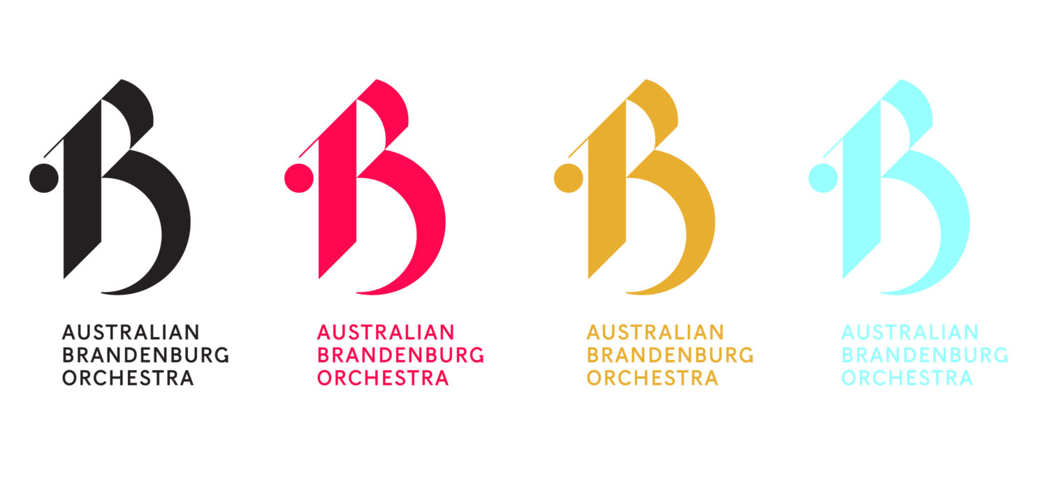
The new brand is centred around the letter B, as an expression of the Baroque, Bach and Brandenburg. The design of the B has a musical flavour to it, without being a literal reference to musical notes, as well as having a rather controlled modern aesthetic. It is expressive but also follows tight rules, much like baroque music itself. Rules around positioning of the B on the page are purposefully inflexible, as the intent is for the brand to claim its position as a strong and proud cultural institution with an increasingly high recognition factor.
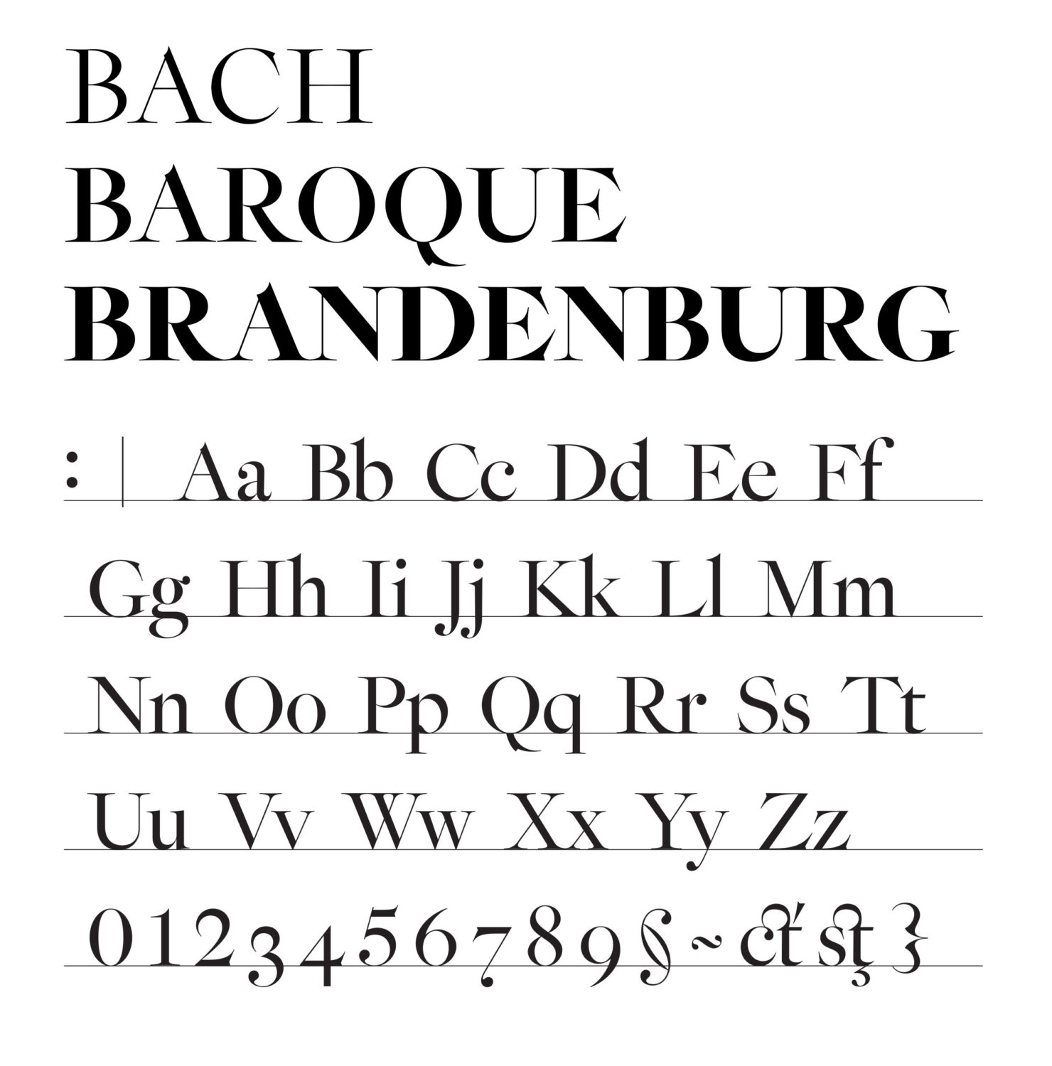
To complement the form of the logo we were lucky enough to coincide this work with the release of the Epicene typeface, designed by Kris Sowersby at Klim Type Foundry. This typeface is inspired by Baroque typefaces, especially by the work of two 18th century maestros, J-F. Rosart and J.M. Fleischmann.
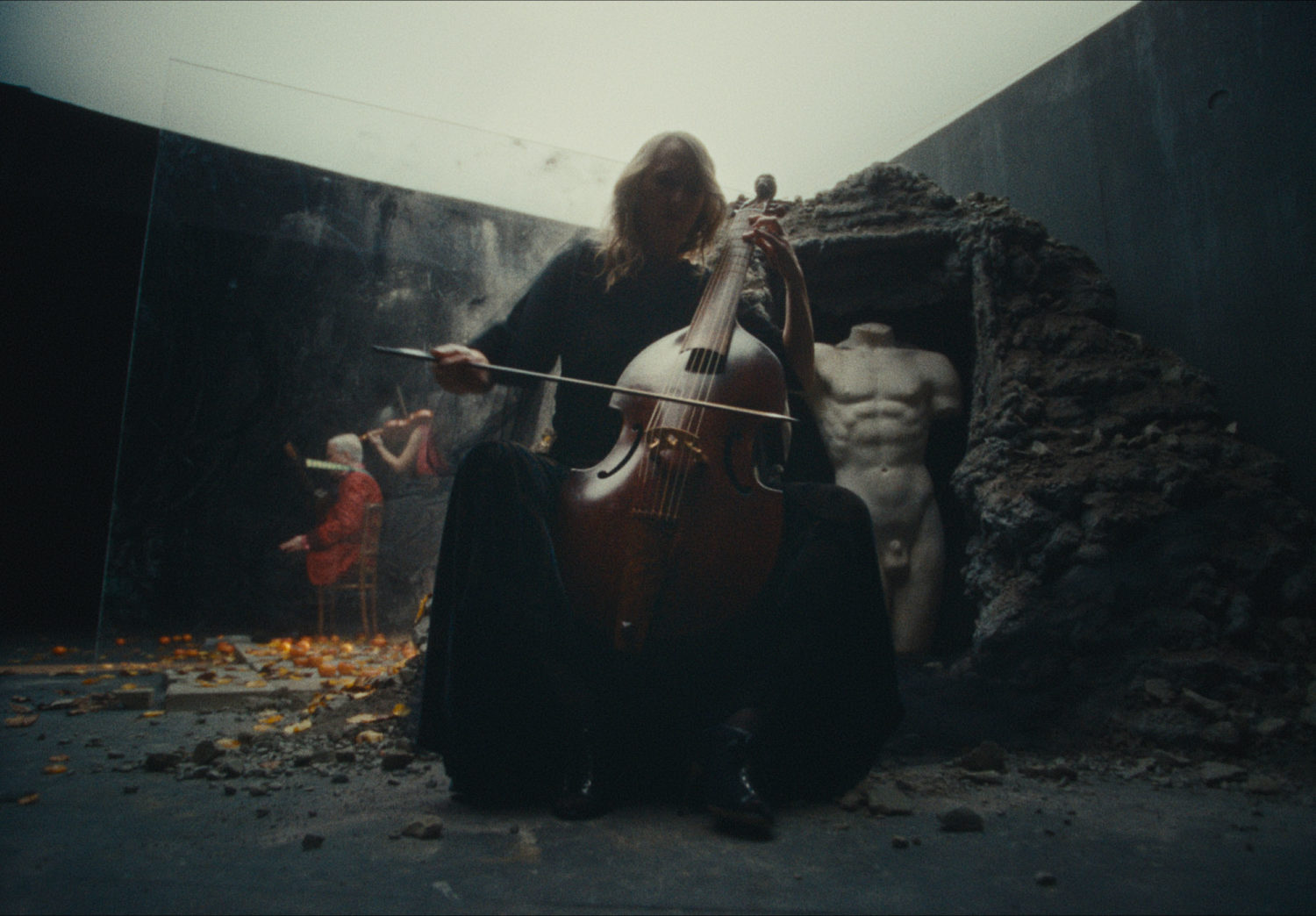
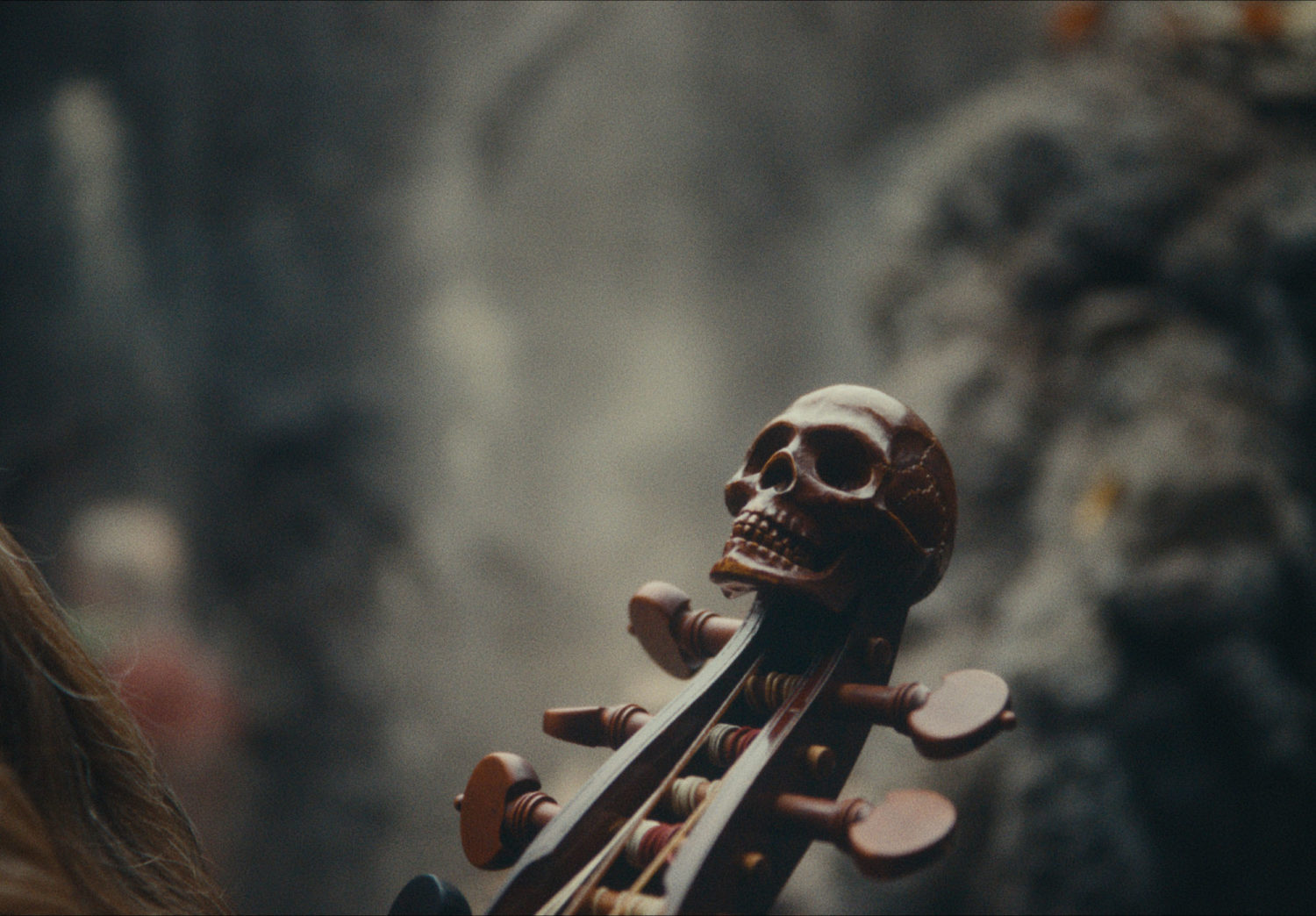
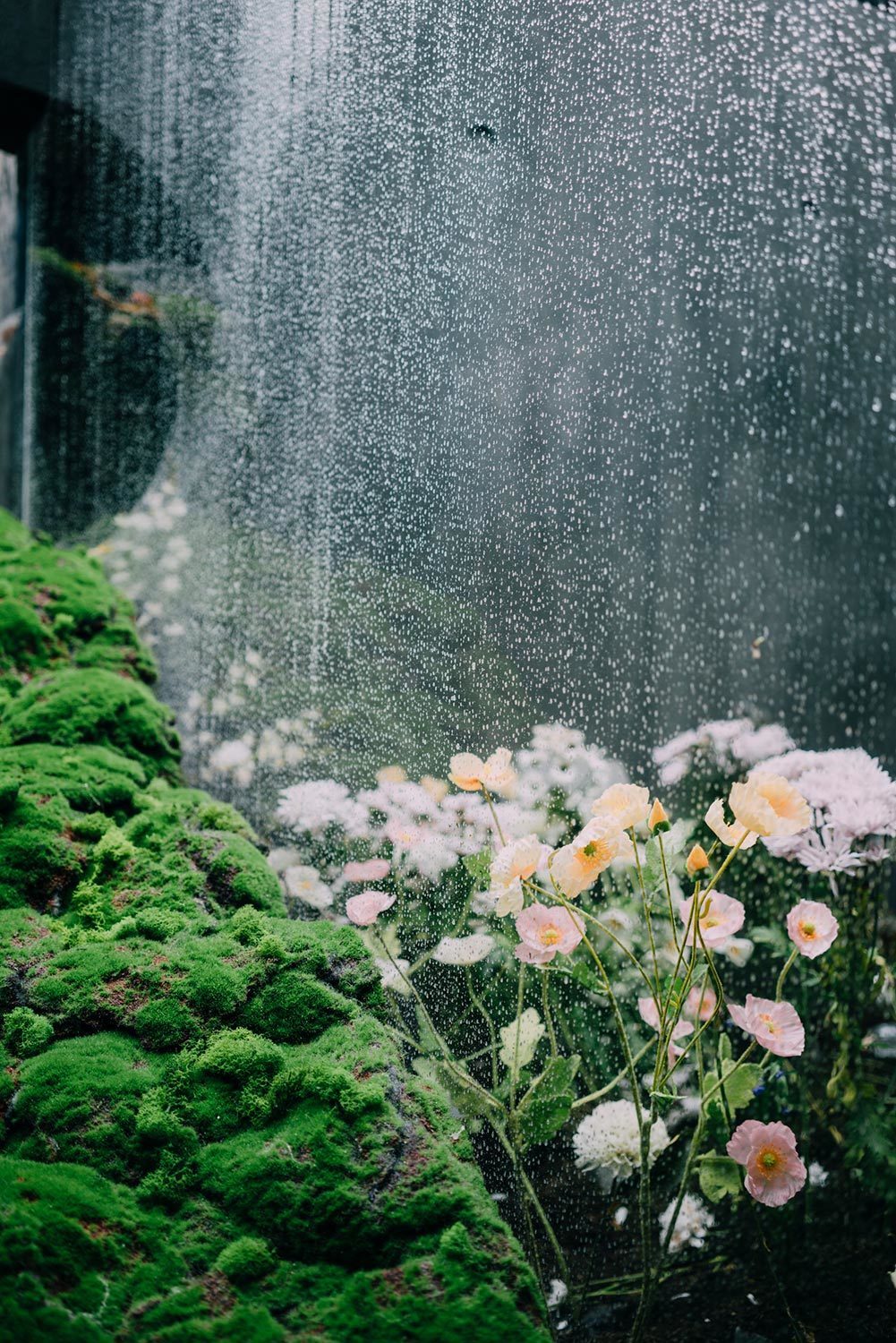
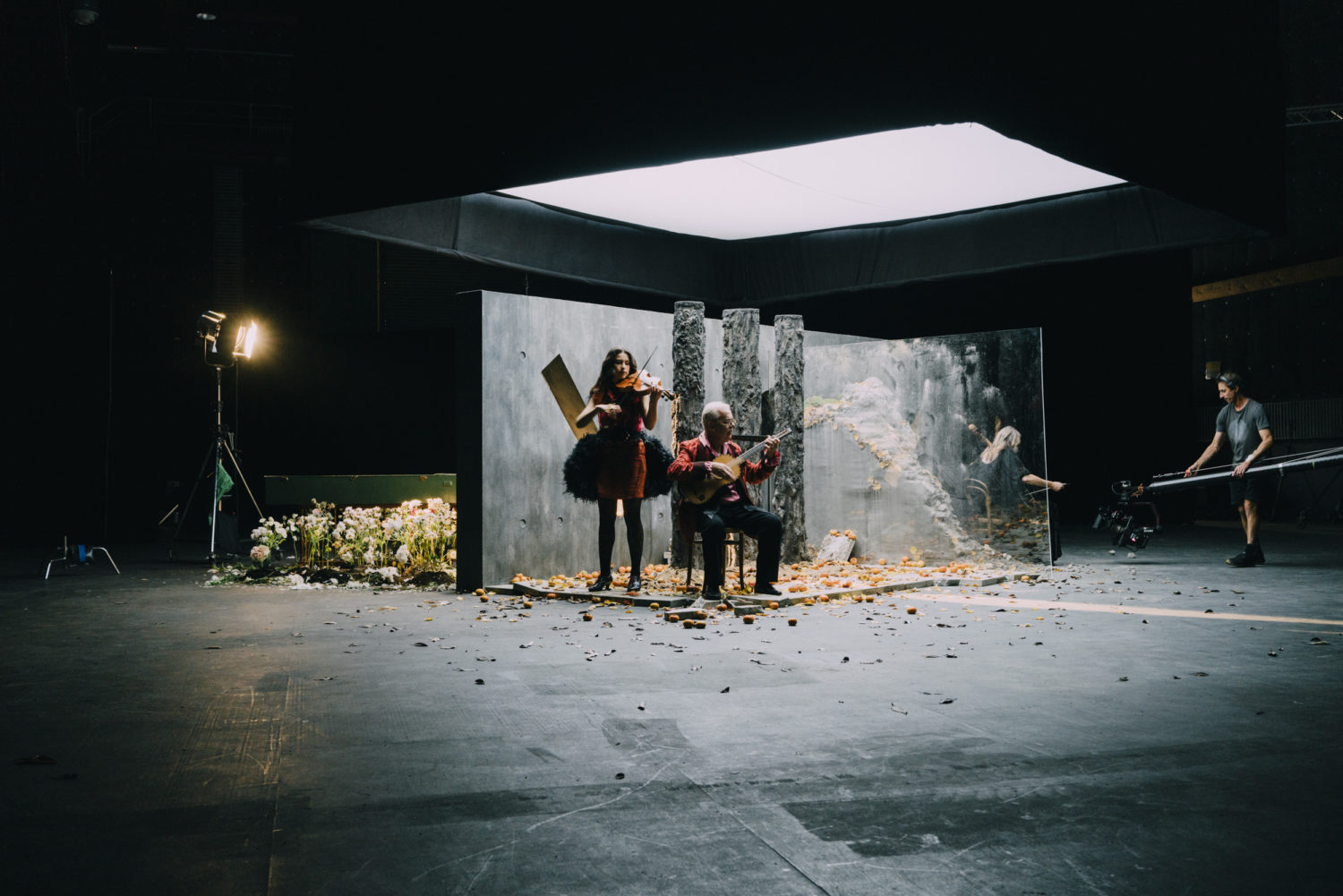
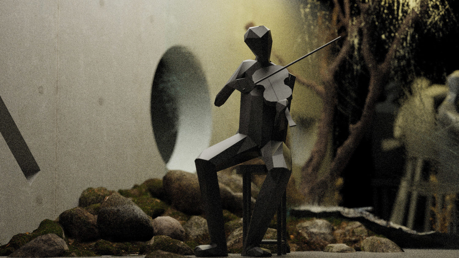
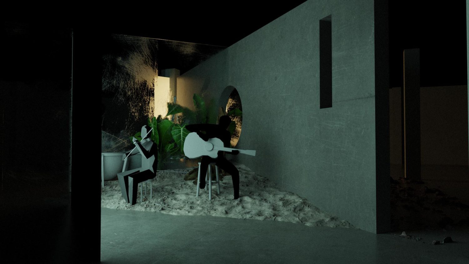
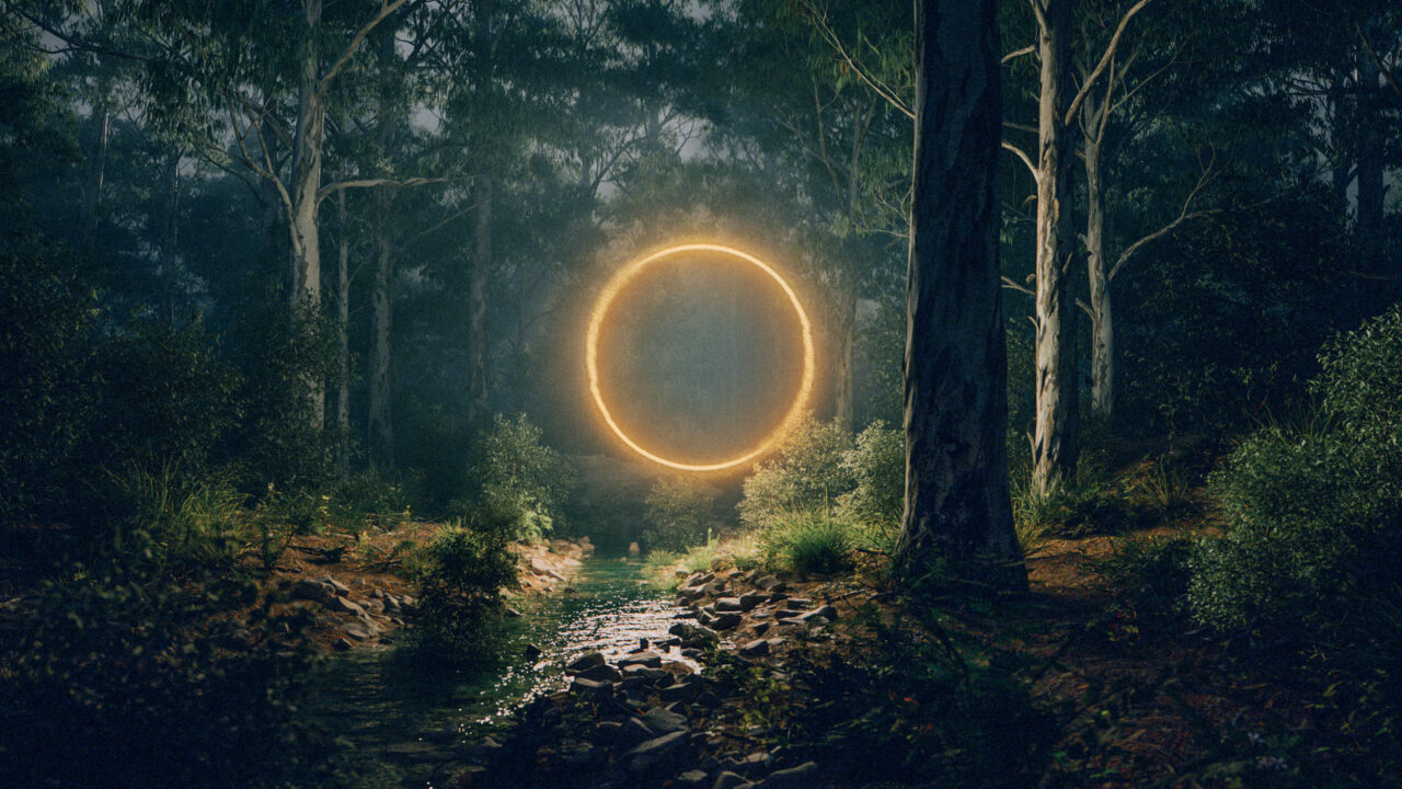
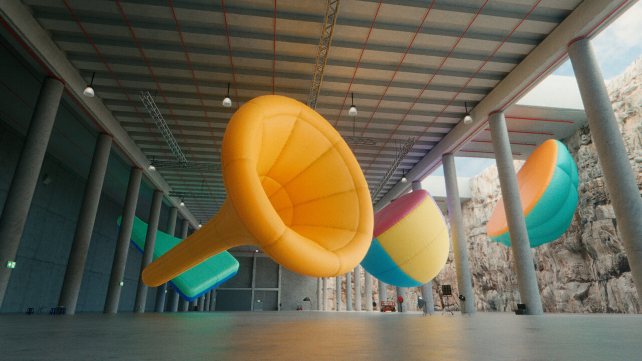
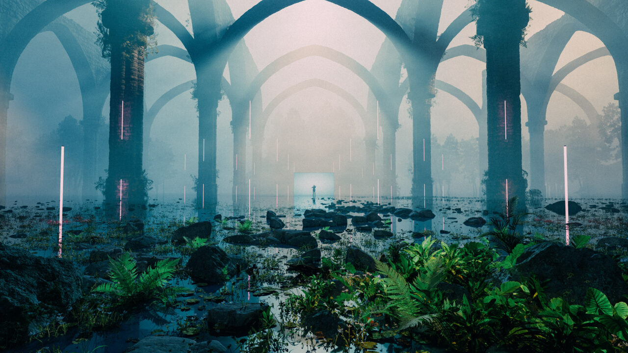
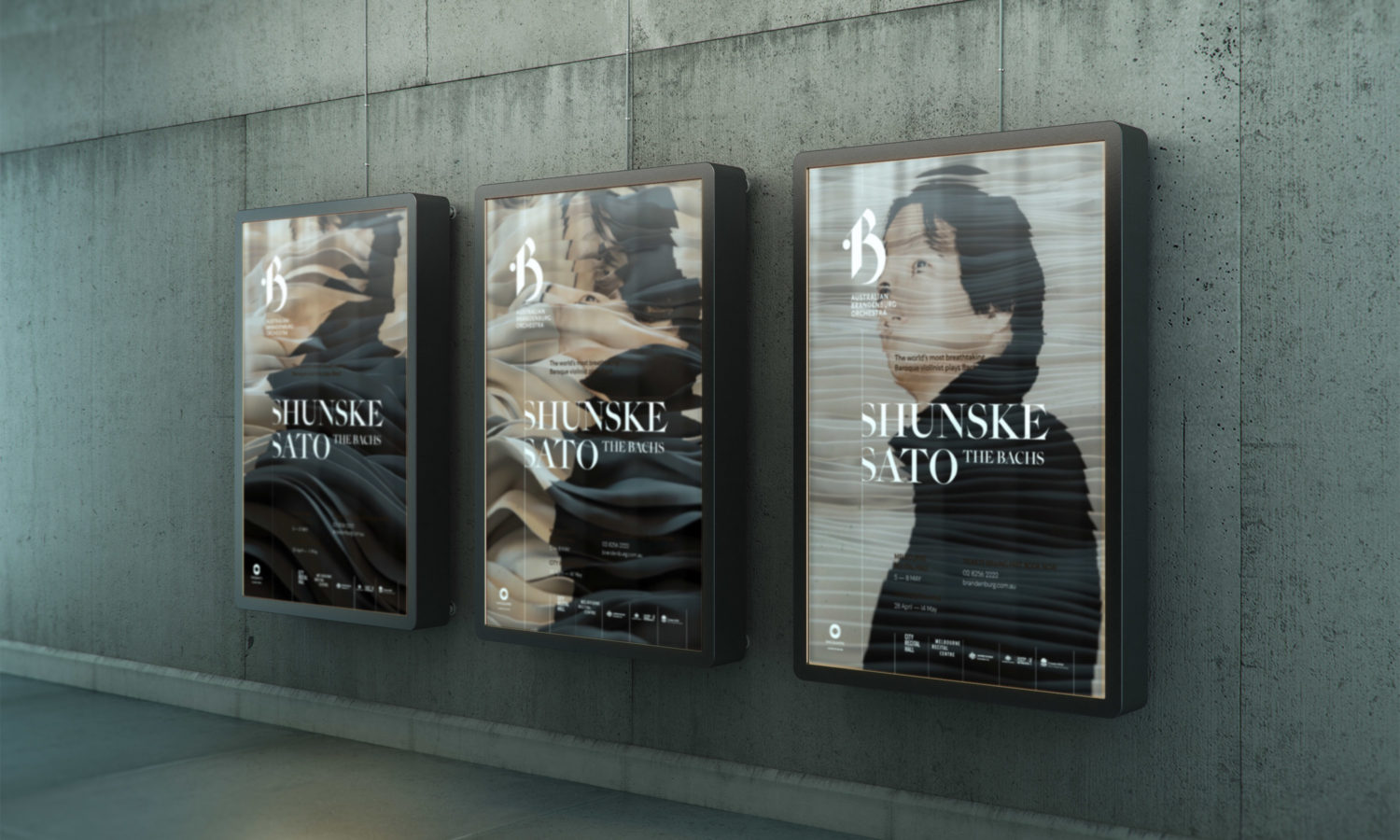
We wanted to bring motion to the brand, first and foremost, but also experimented with a number of new digital techniques in the process of making various key art solutions for their shows. The demand to bring movement and liveliness to brands in general is increasing, so we always think motion first when we come up with ideas around key art for performances. This allows us to create artwork that can find multiple expressions around the same theme, allowing us to not get stuck on one key visual for all the different outputs.

The new brand is centred around the letter B, as an expression of the Baroque, Bach and Brandenburg. The design of the B has a musical flavour to it, without being a literal reference to musical notes, as well as having a rather controlled modern aesthetic. It is expressive but also follows tight rules, much like baroque music itself. Rules around positioning of the B on the page are purposefully inflexible, as the intent is for the brand to claim its position as a strong and proud cultural brand with an increasingly high recognition factor.
To complement the form of the logo we were lucky enough to coincide this work with the release of the Epicene typeface, designed by Kris Sowersby at Klim Type Foundry. This typeface is inspired by Baroque typefaces, especially by the work of two 18th century maestros, J-F. Rosart and J.M. Fleischmann.
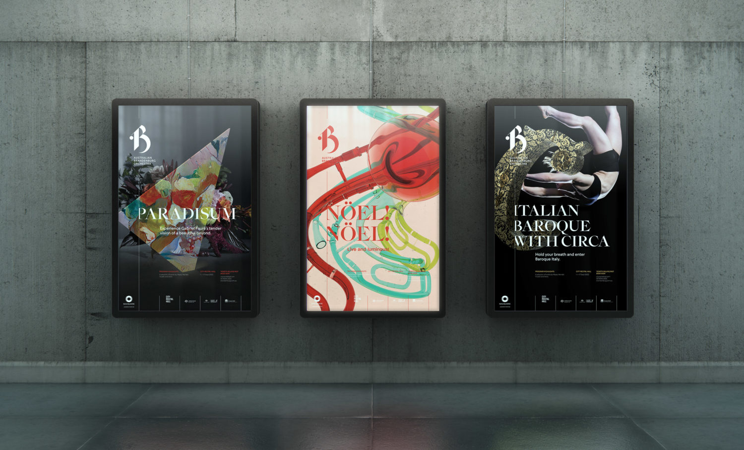
We wanted to bring motion to the brand, first and foremost, but have also explored GAN (Generative Adversarial Networks) technology and photogrammetry (3D digital recording) in the process of making various key art solutions for their shows. The demand to bring movement and liveliness to brands in general is increasing, so we always think motion first when we come up with ideas around key art for performances. This allows us to create artwork that can find multiple expressions around the same theme, allowing us to not get stuck on one key visual for all the different outputs.