Rob Mills Architecture & Interiors
Identity & Collateral
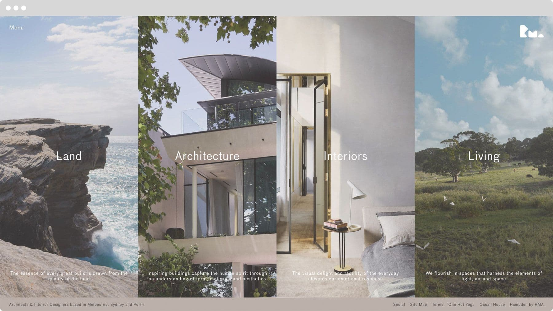
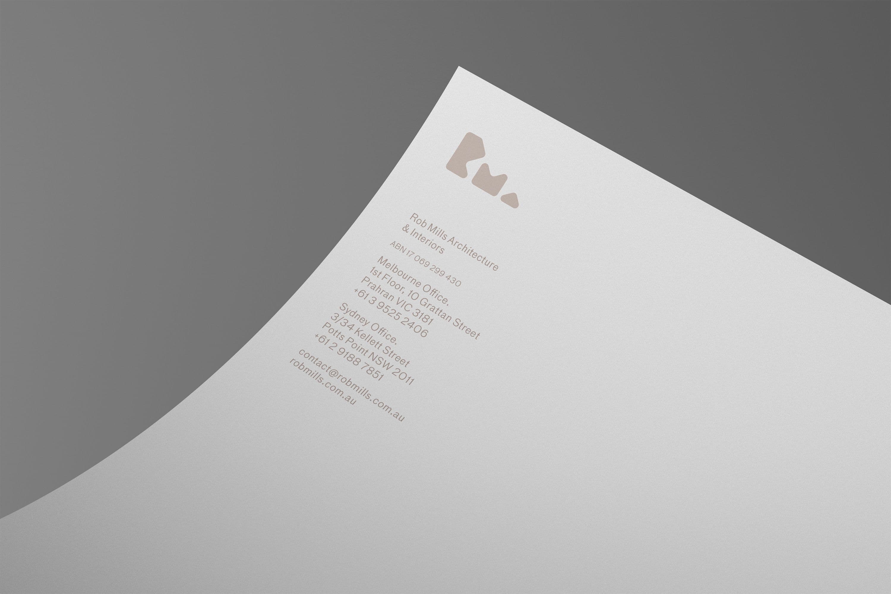
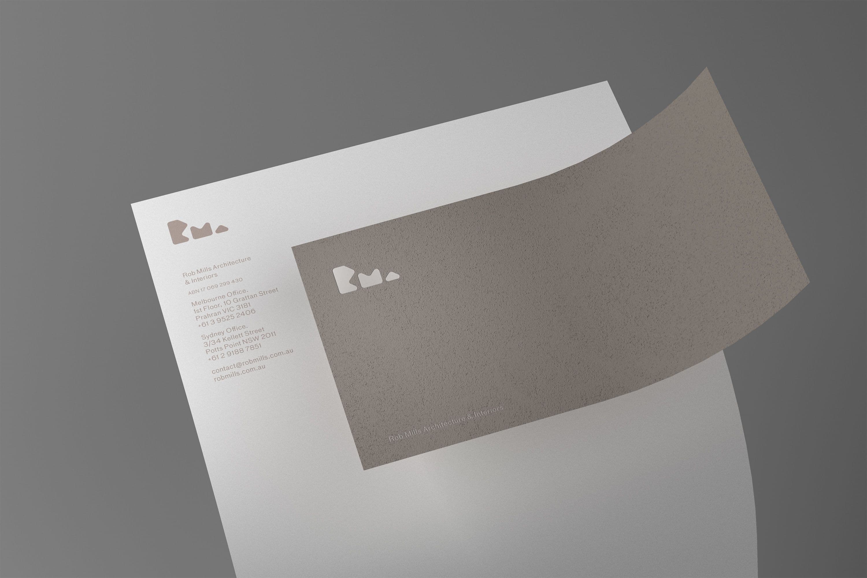
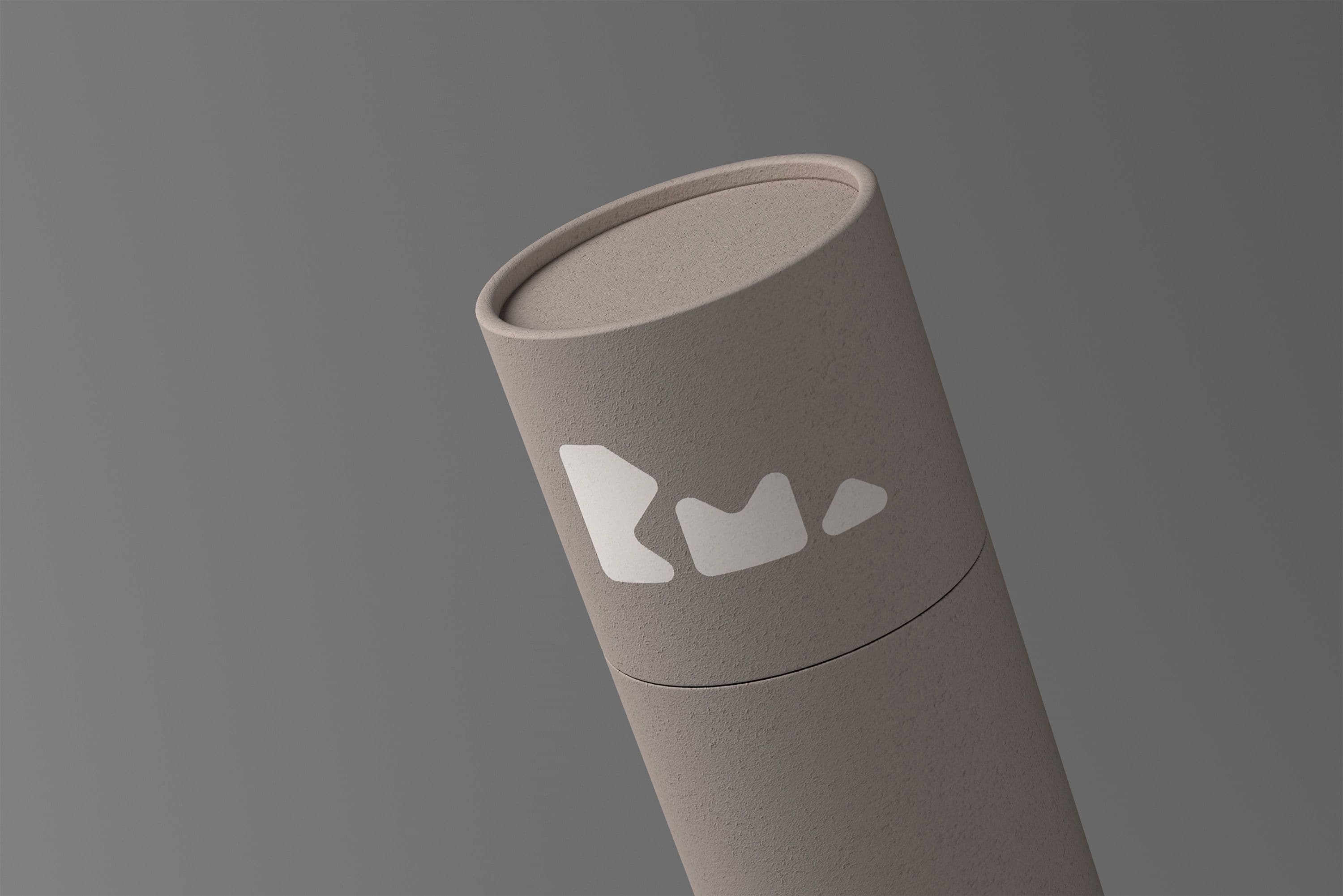
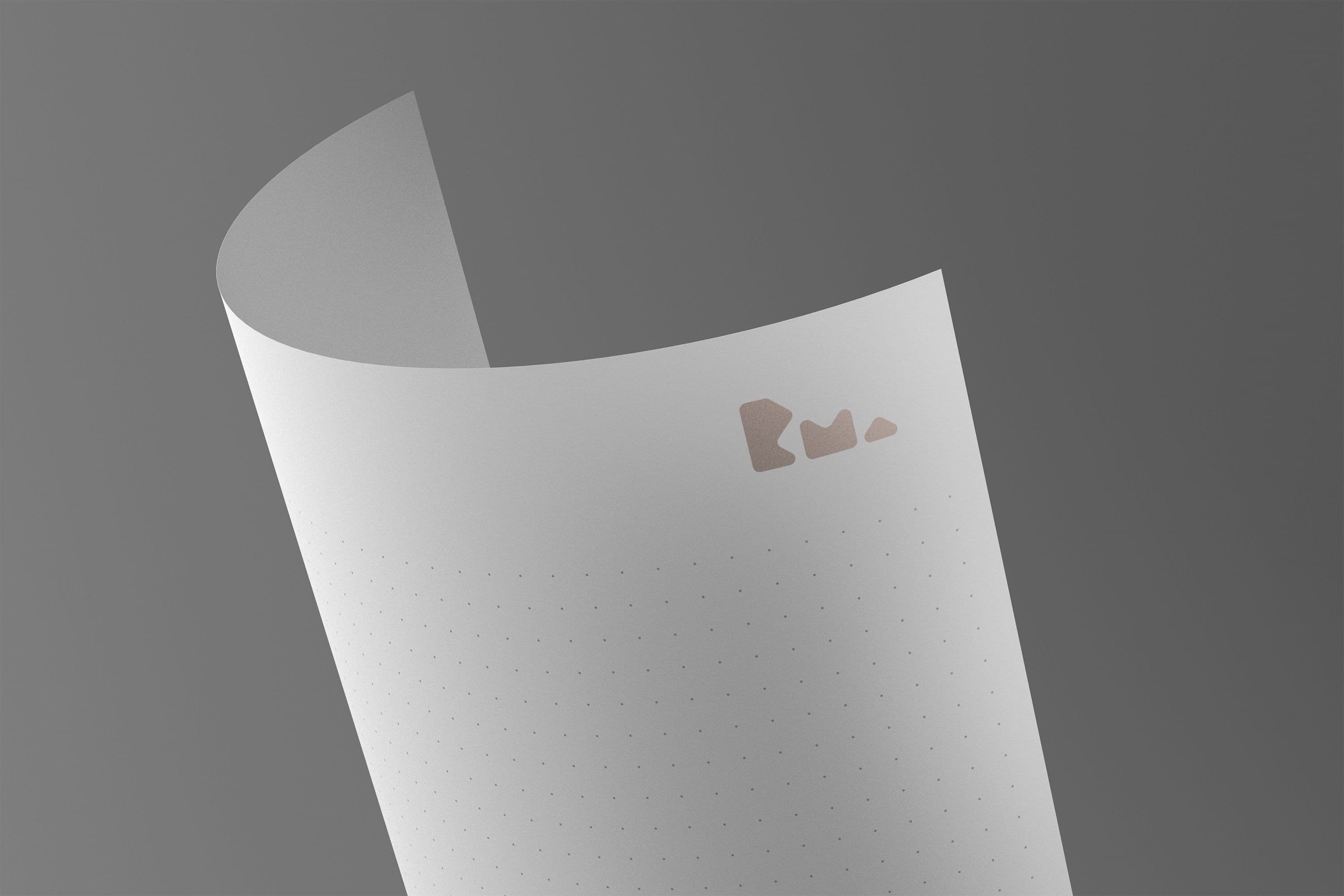
Collider worked with RMA to create a brand mark that had a more meaningful reference to their practice and influences. The solution aimed to find a counterpoint to the traditional typography of architecture identities by introducing forms that could be seen as much like sculpture as typography. The organic curves and natural forms of RMA's architecture also played a role in influencing the mark; the paper stocks chosen were specifically picked to speak to Rob's love of textures and thoughtful materiality in his work.
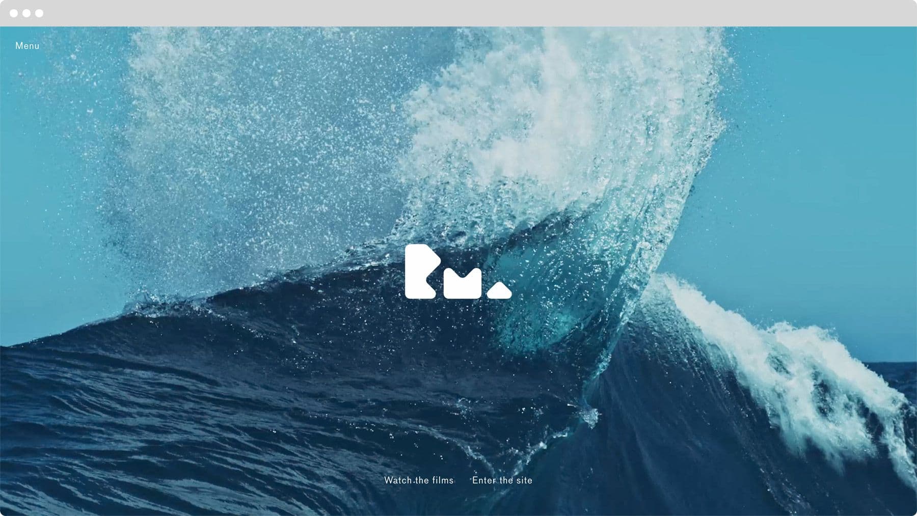
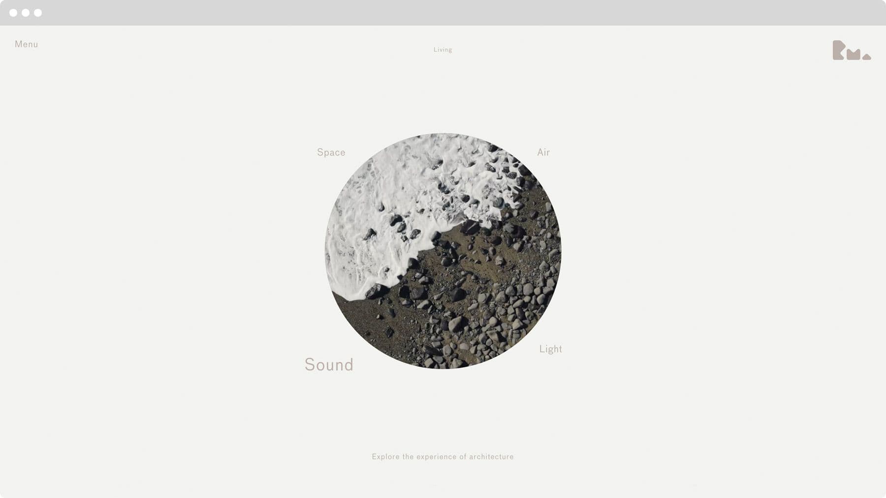
At the heart of the new brand for RMA, Collider also produced a film which aimed to capture the firm’s intersections between nature and architecture. It explores the emotion, beauty and power of our natural surroundings and how these elements – light, breezes, plants and trees, views and water – are folded into architecture and contribute to our sense of daily well-being.
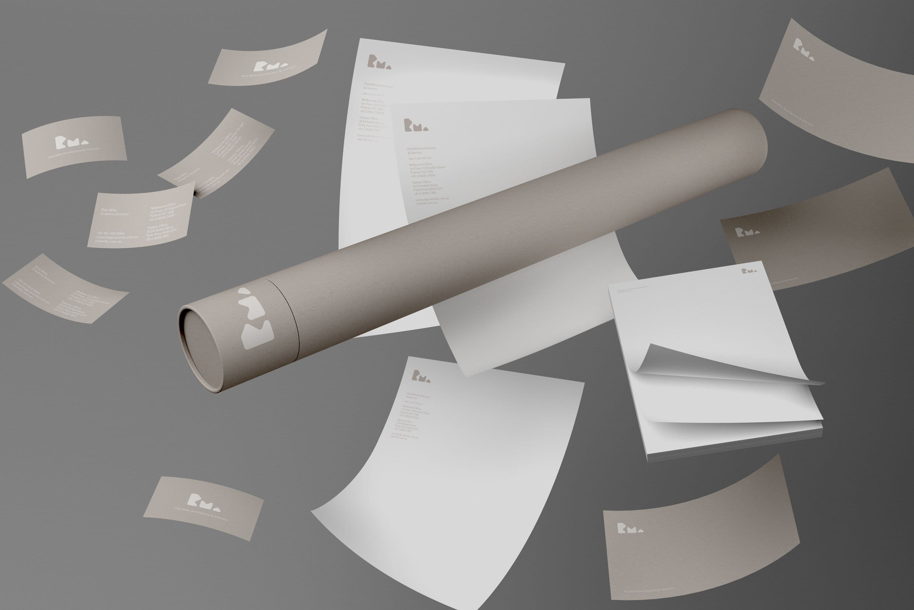
The organic curves and natural forms of RMA’s architecture played an important role in influencing the mark, and the paper stocks chosen were specifically picked to speak to RMA's thoughtful materiality in their work.
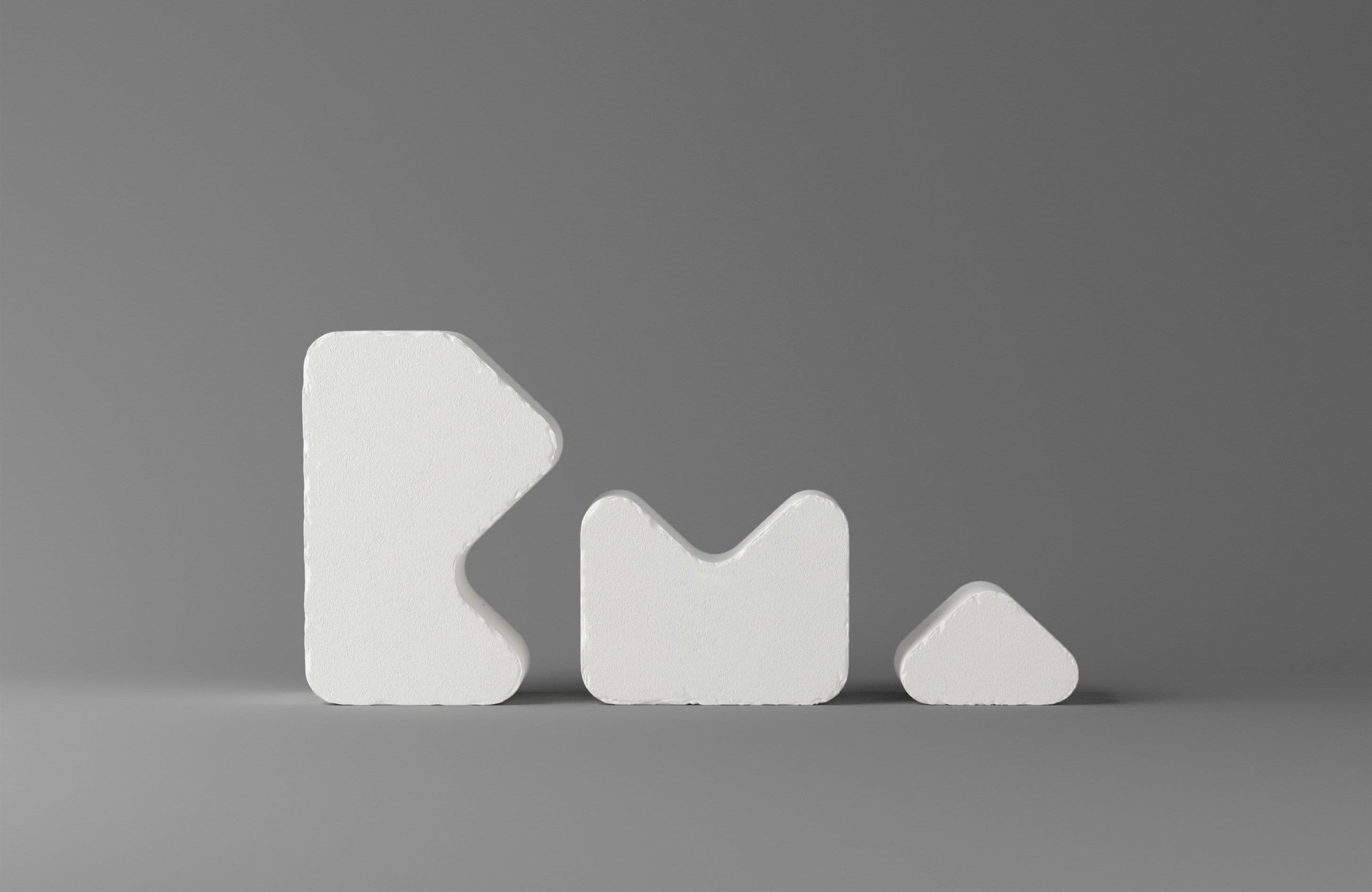
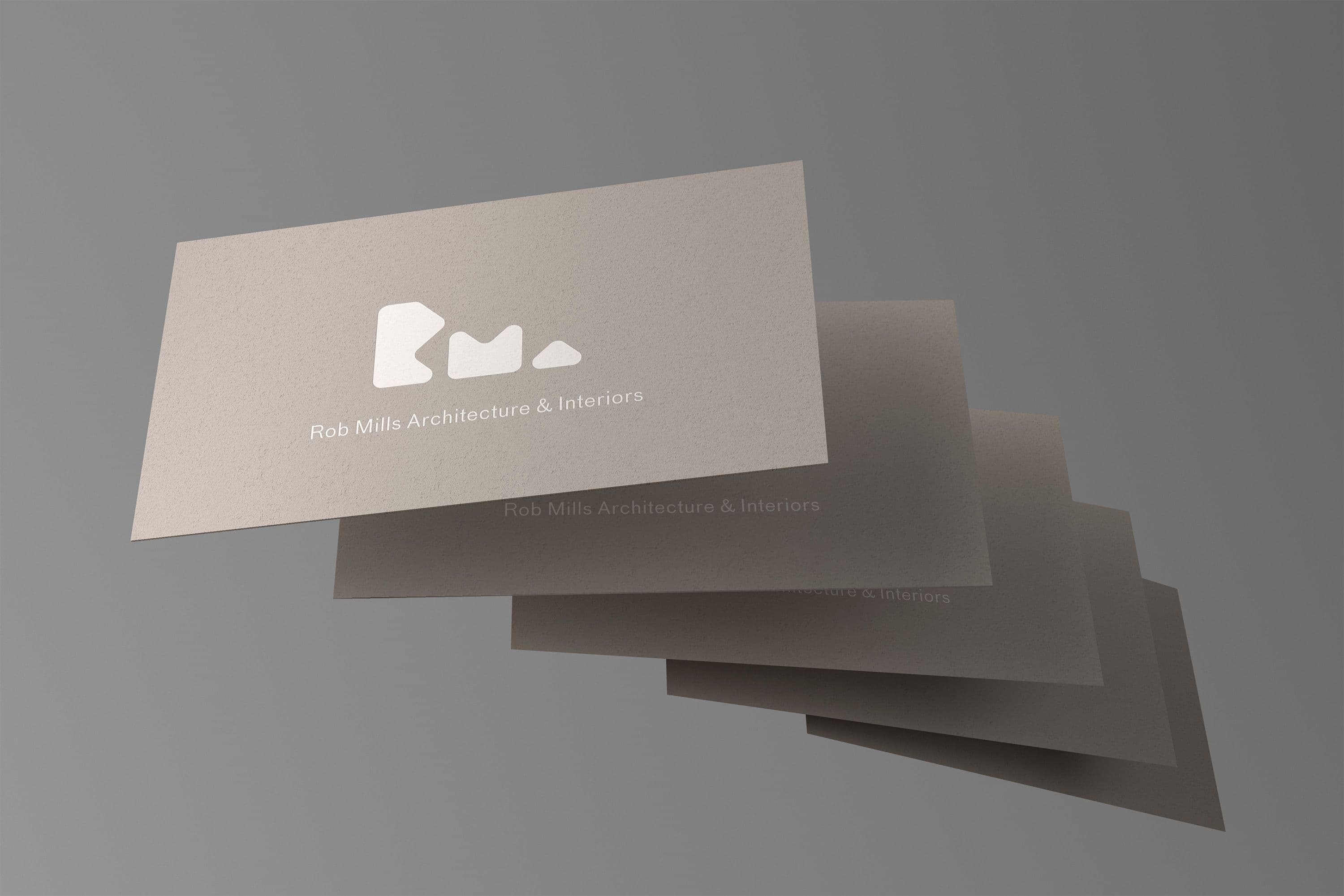
Collider also produced a film which aimed to capture the firm’s intersections between nature and architecture. Exploring the emotion, beauty and power of our natural surroundings, watch as the elements fold into architecture and contribute to our sense of daily well-being.