Sydney Opera House
Motion Identity
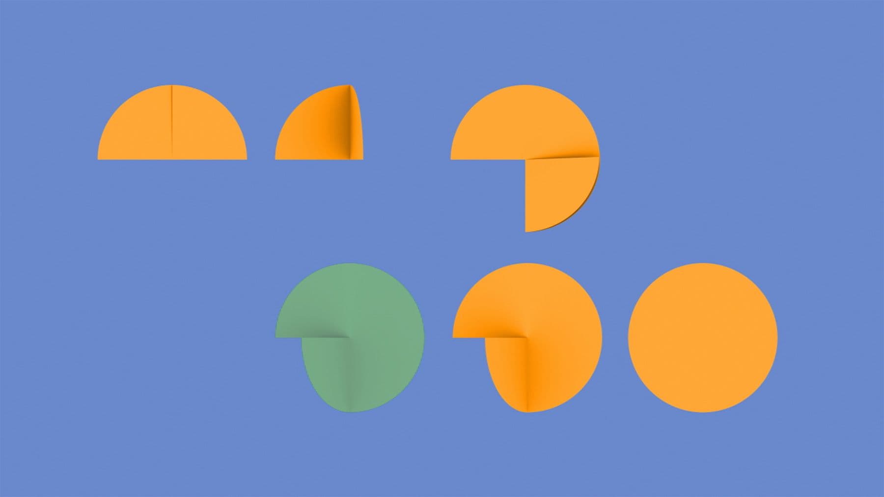
In collaboration with Interbrand Sydney and Sydney Opera House (SOH), Collider was engaged to extend a renewed visual language into a comprehensive motion system to be used across all of SOH’s digital platforms and channels. The motion elements drew on the sculptural direction of the hero brand system and many of Jørn Utzon’s forms and methods.
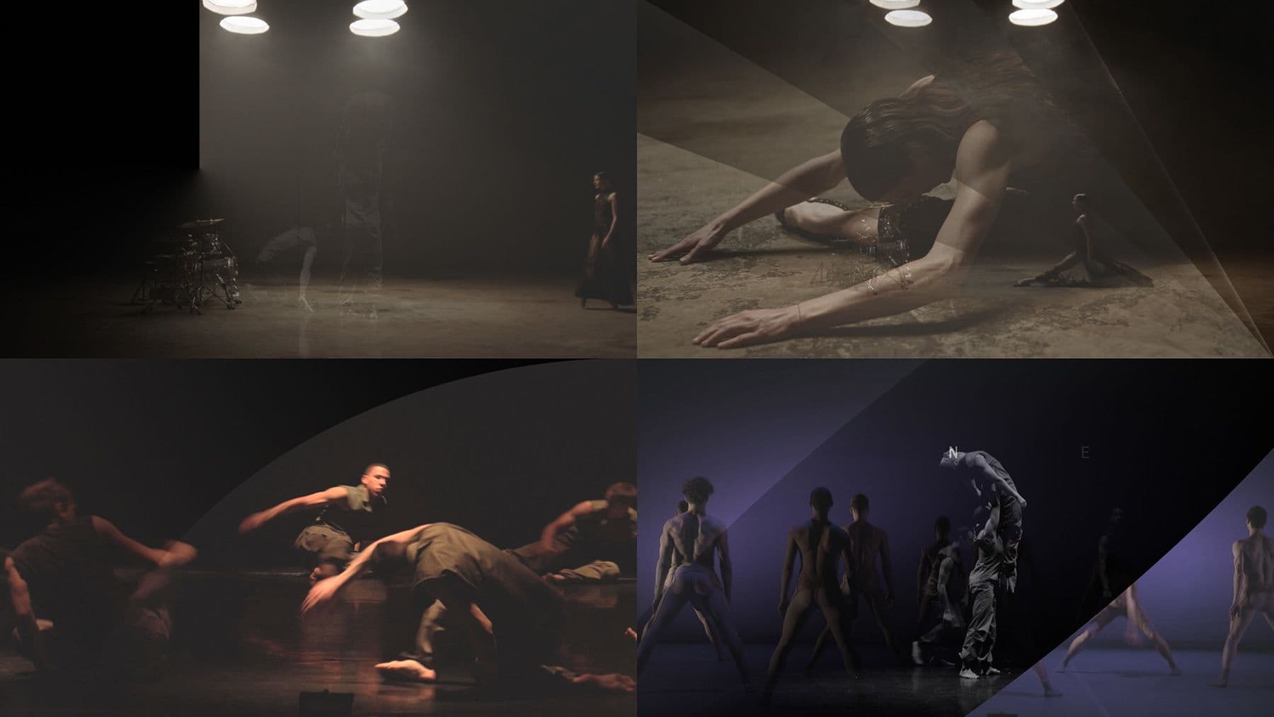
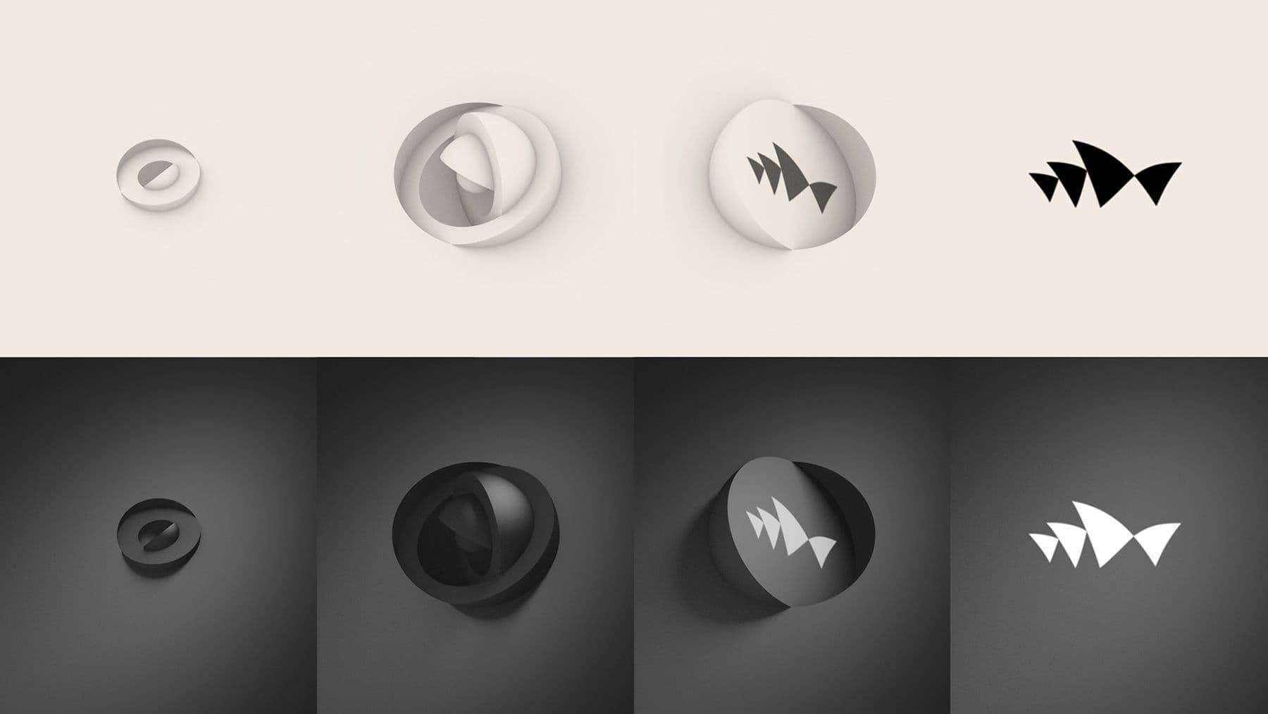
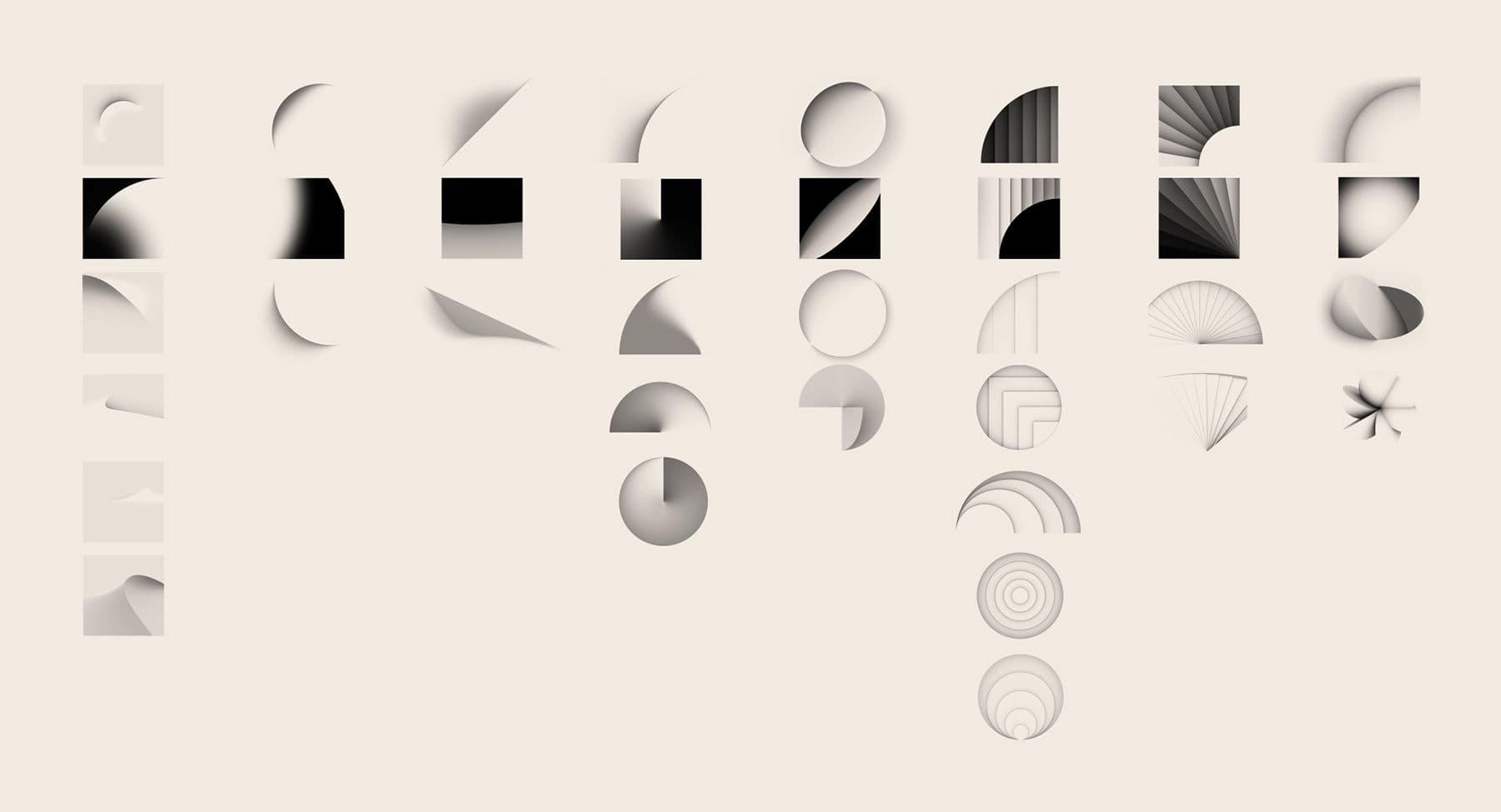
From eight primary ‘moving sculptures’, over 30 animated sequences were created for the in-house team at SOH to use across all future motion outcomes. A complete motion guideline was created including supers, transitions, straps and bugs. The main SOH ID sequence was also revisited in two colourways and three durations to replace the original shells reveal motion ident.
This project was awarded a Gold Lion at Cannes 2016.
The architectural forms of Utzon's world-famous building provided rich inspiration for the development of a complete motion system for the Sydney Opera House.
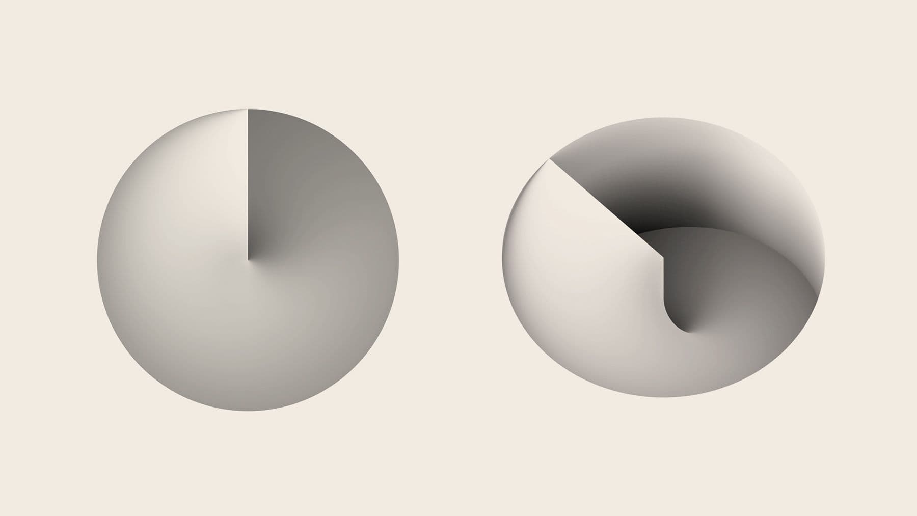
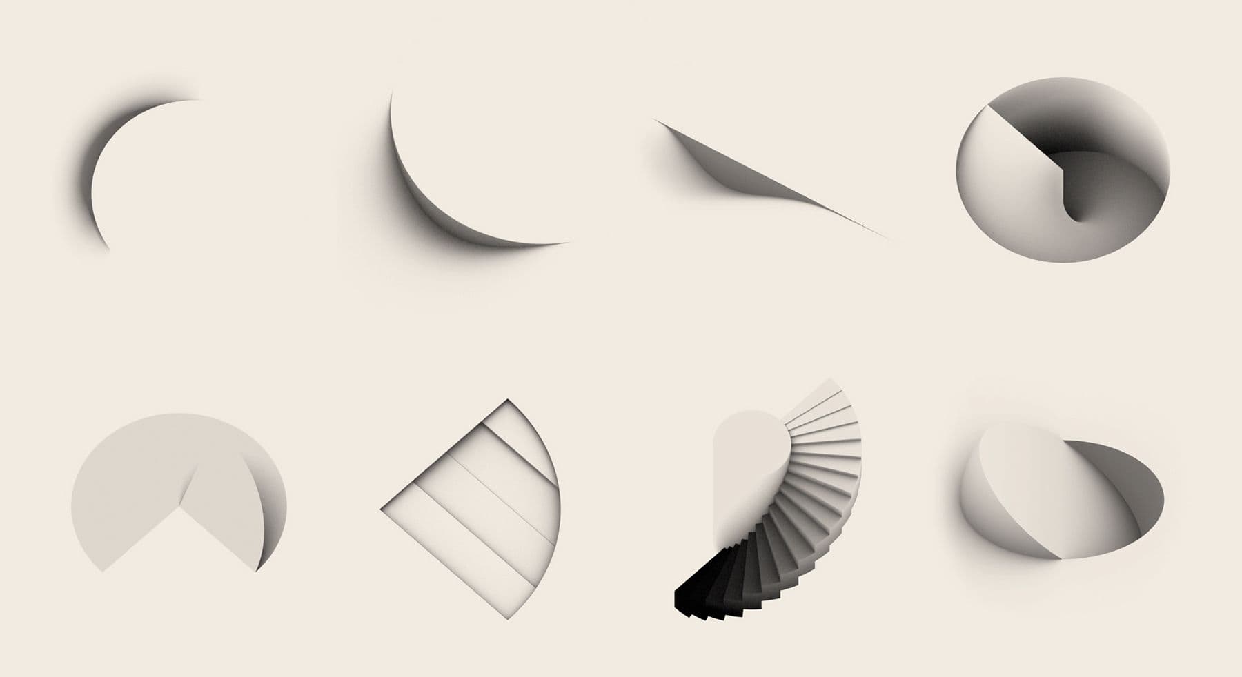
From eight primary ‘moving sculptures’, over 30 animated sequences were created for the in-house team at SOH to use across all future motion outcomes.
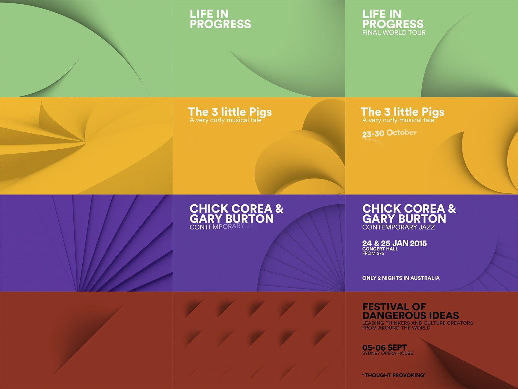
A complete motion guideline was created including supers, transitions, straps and bugs. The main SOH ID sequence was also revisited in two colourways and three durations to replace the original shells reveal motion ident.