Tenzing
Main-titles & Graphics
Studio worked with director Jen Peedom to create the main-titles and graphic sequences for her feature debut Tenzing. The Apple Original Films biopic, starring Tom Hiddleston, Willem Dafoe, and Genden Phuntsok debuted in October 2026 and portrays the life of Norgay Tenzing, and his incredible achievement in being one of the first people to summit Mt Everest with Sir Edmund Hillary in 1953.
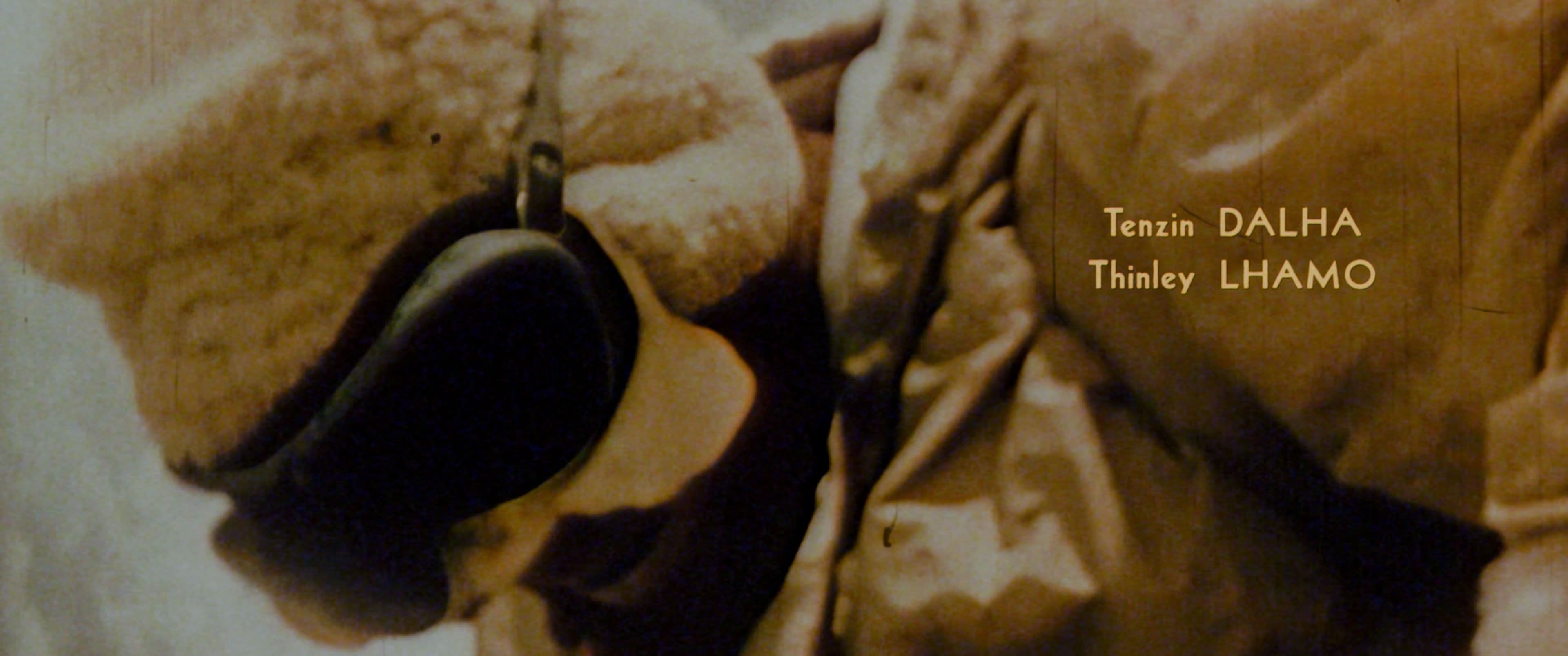
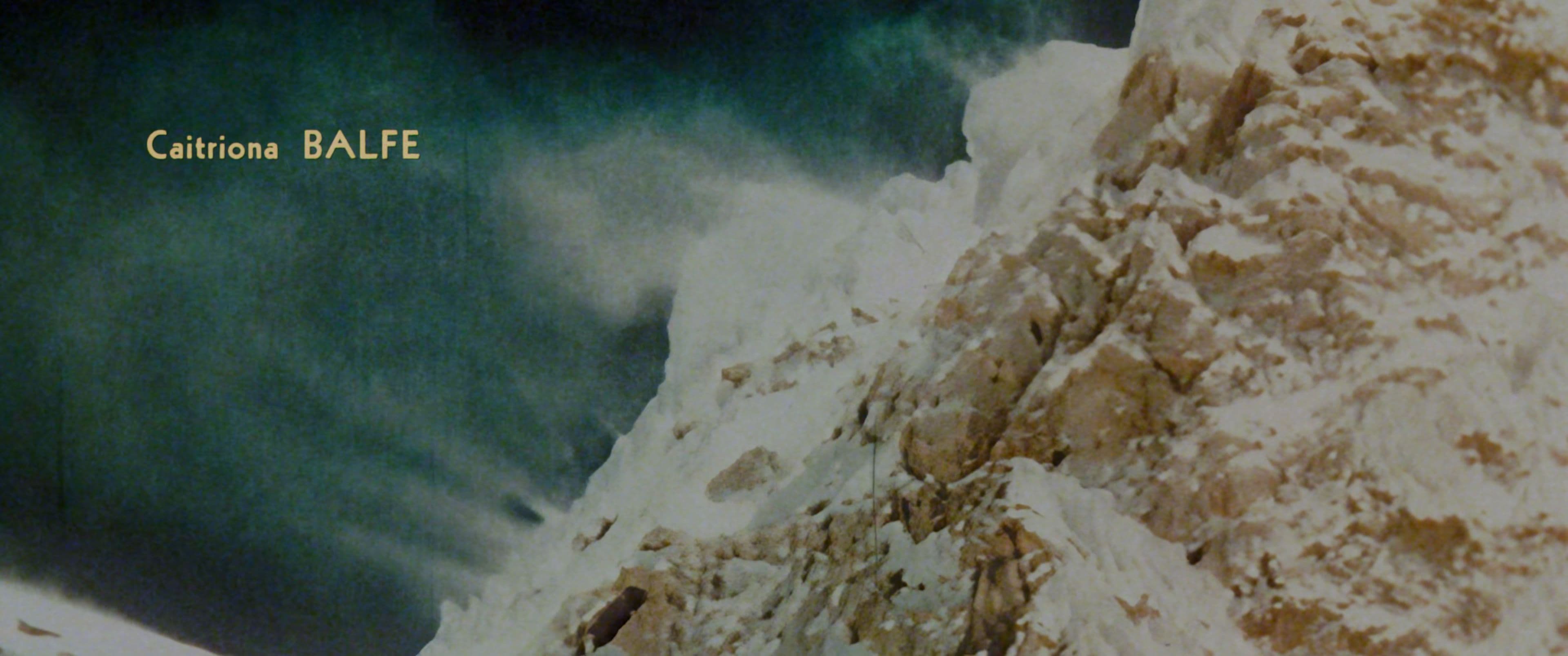
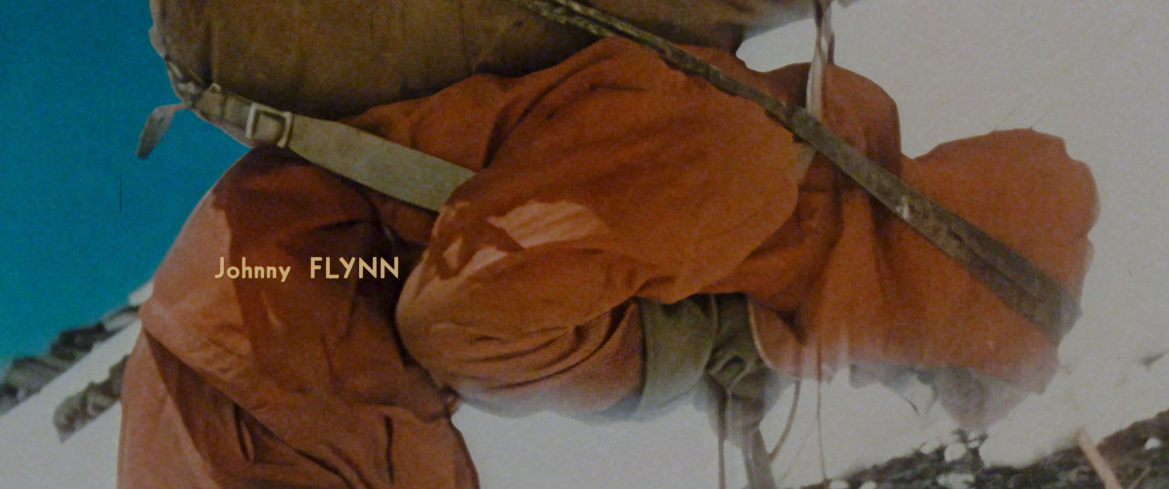
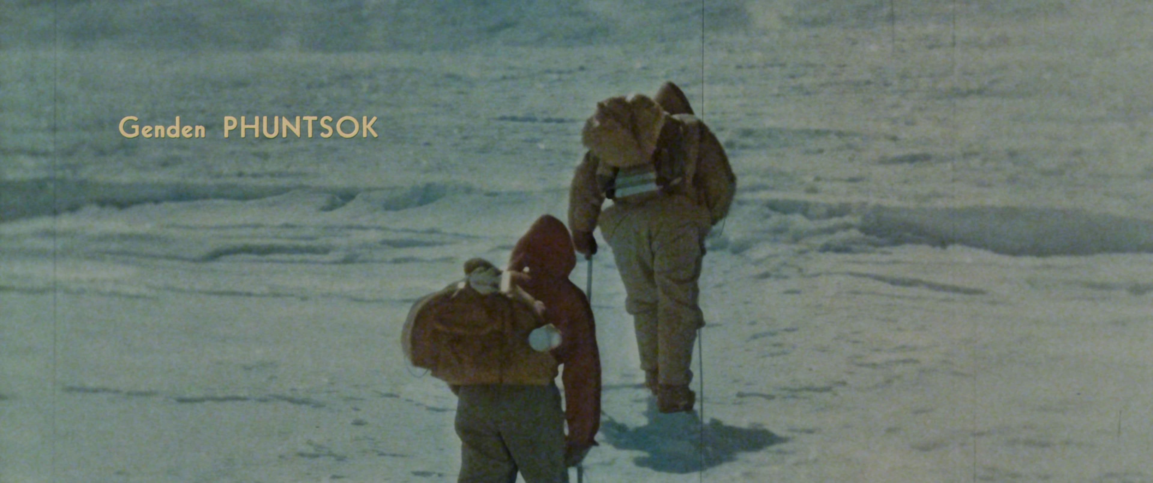
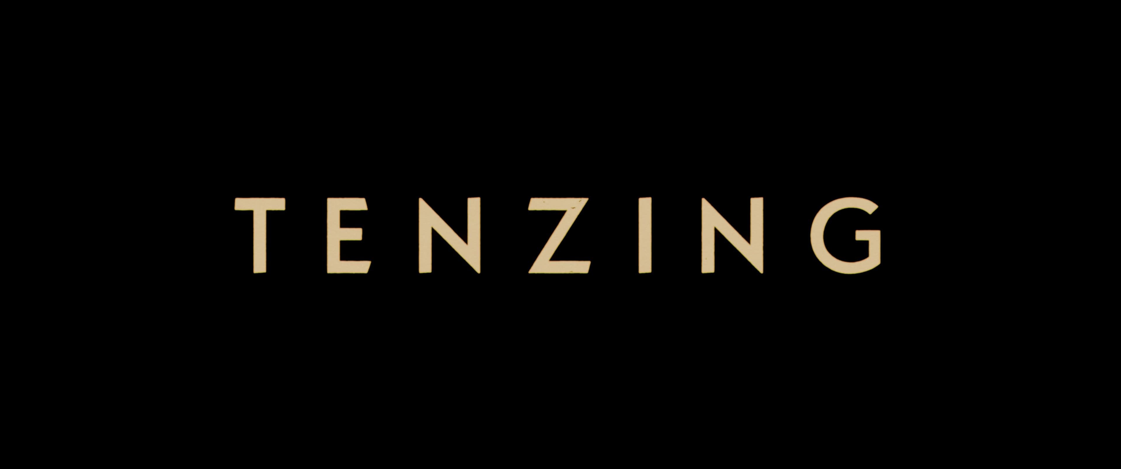
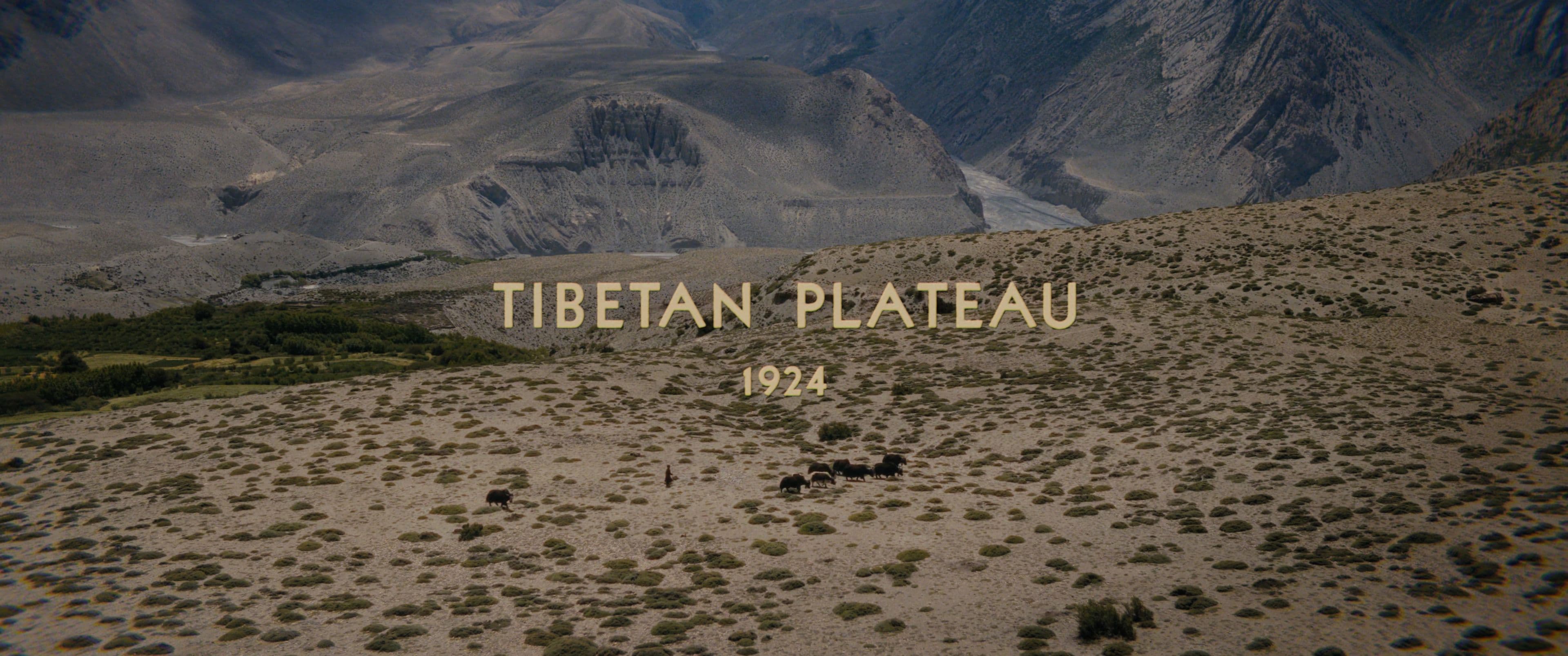
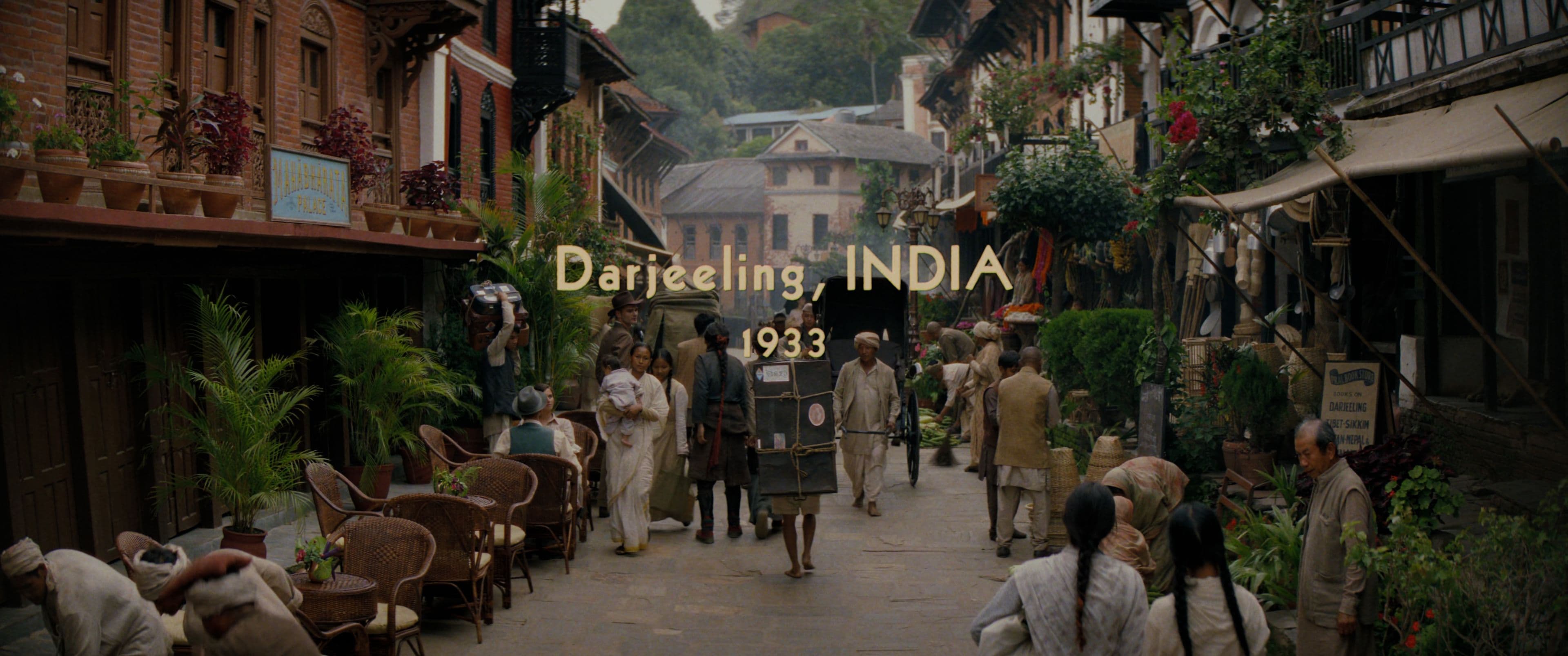
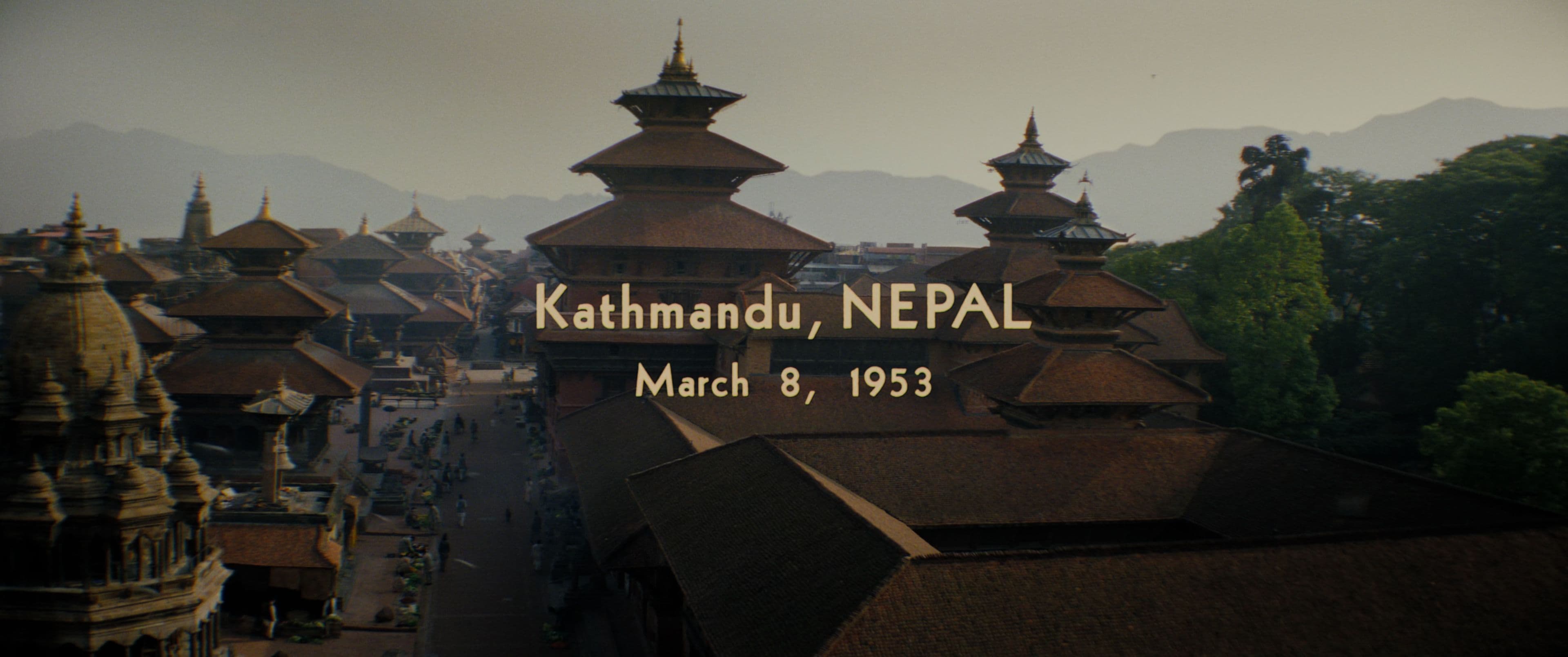
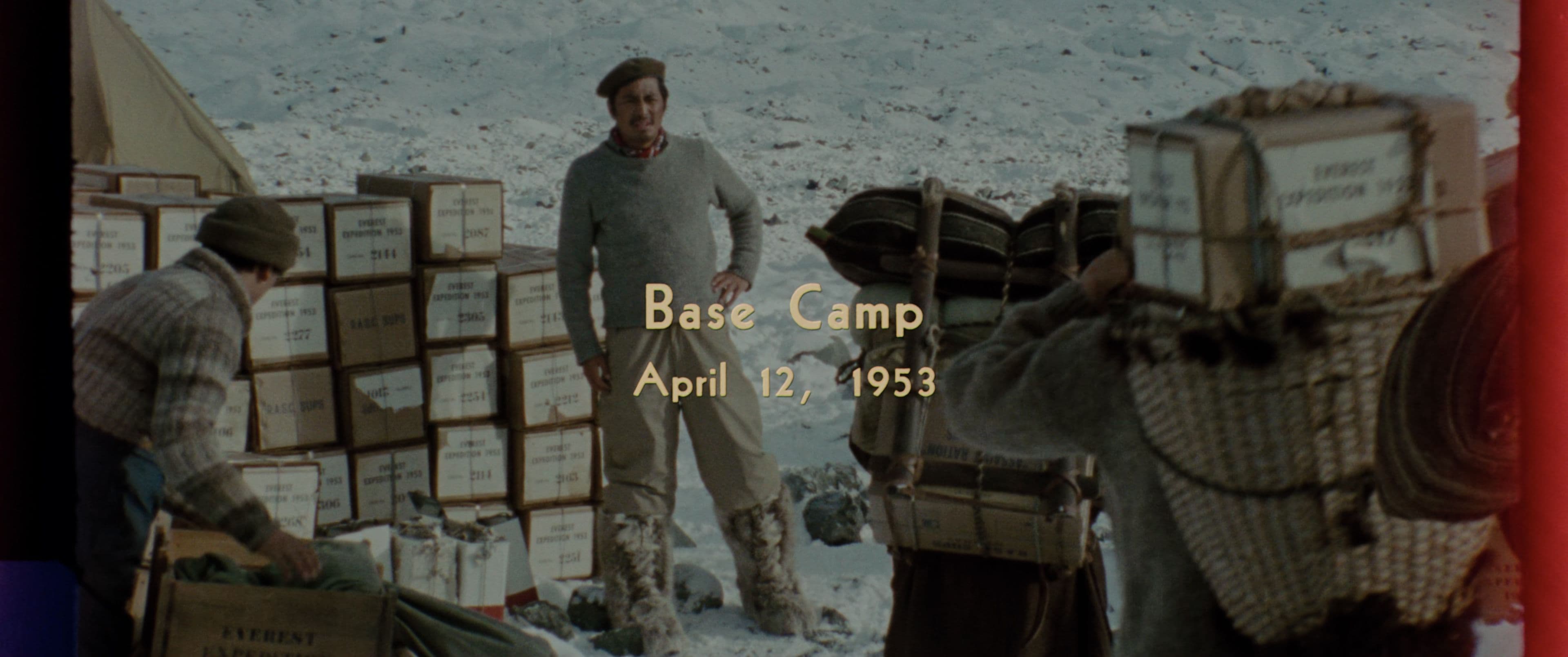
From the first watch of an early edit, the film’s honest and deeply human story inspired Collider Studio’s Creative Director Andrew van der Westhuyzen to approach the design elements with a strong sense of historical accuracy and reality. The design direction took strong cues from historical typography research from the time, and visual techniques and nuances from graphic sequences found in cinema of the day.
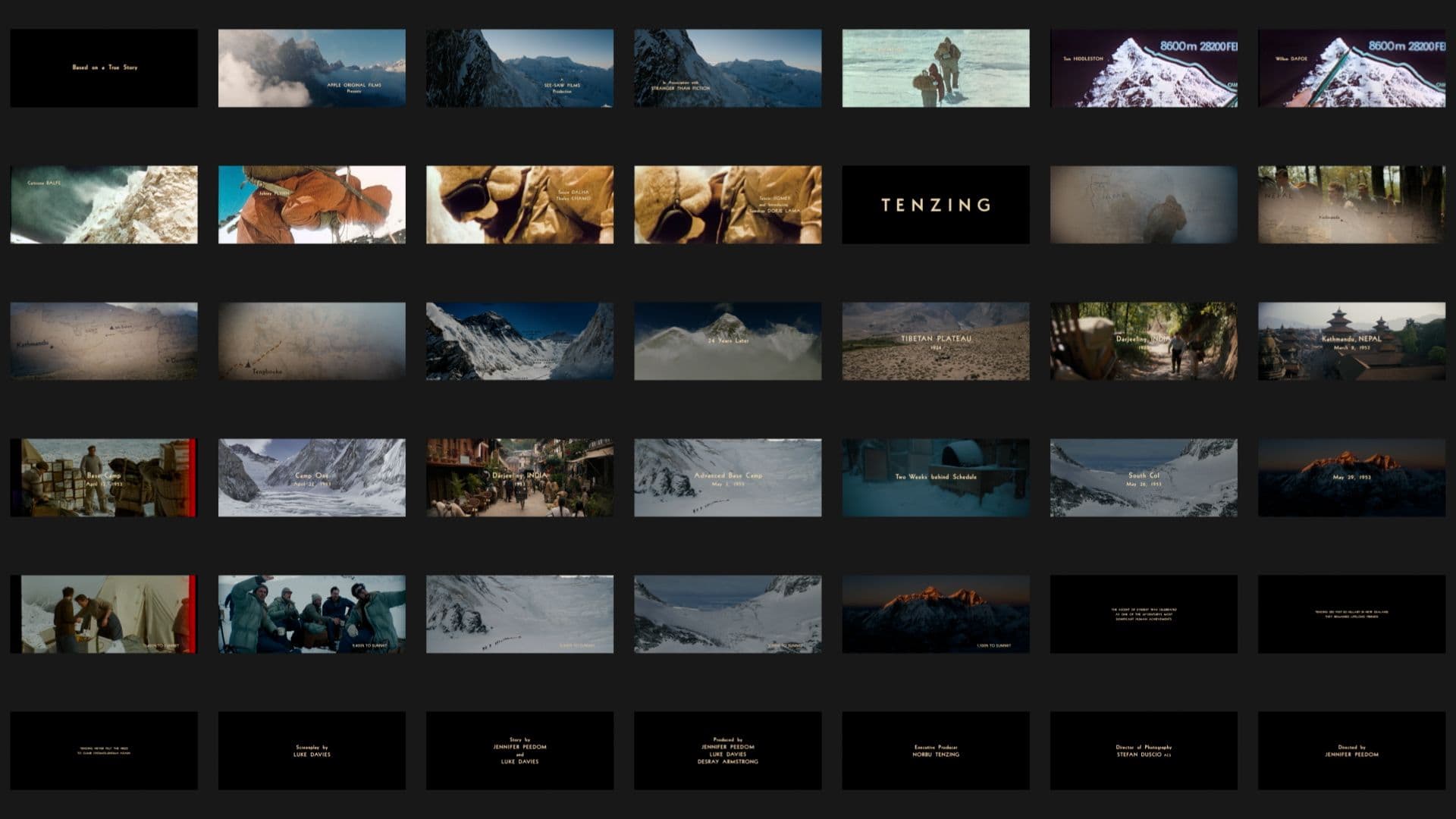
After exploring a range of modernist 1940s-1960s typefaces, looking at print and publishing references, we sourced an obscure cut of Bernhard Gothic Sans (designed by Lucian Bernhard in 1929) by a relatively unknown US type foundry called Wooden Type Fonts. There was a charming and imperfect nature about this interpretation that we liked and we used it through all the main-titles and mapping labels including the main film title (which for whatever reason was not adopted by Apple for their marketing posters or online campaigns for the film. They instead opted to use a modern version of Futura).
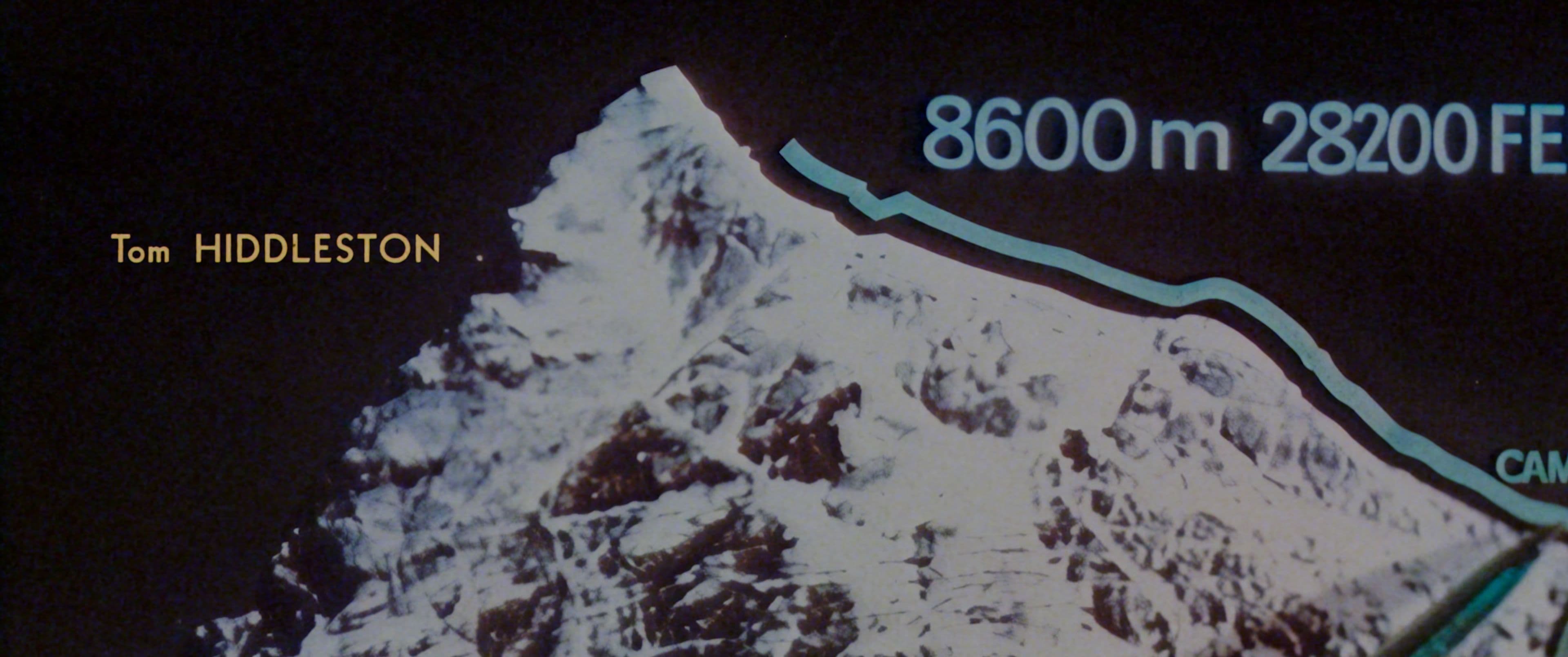
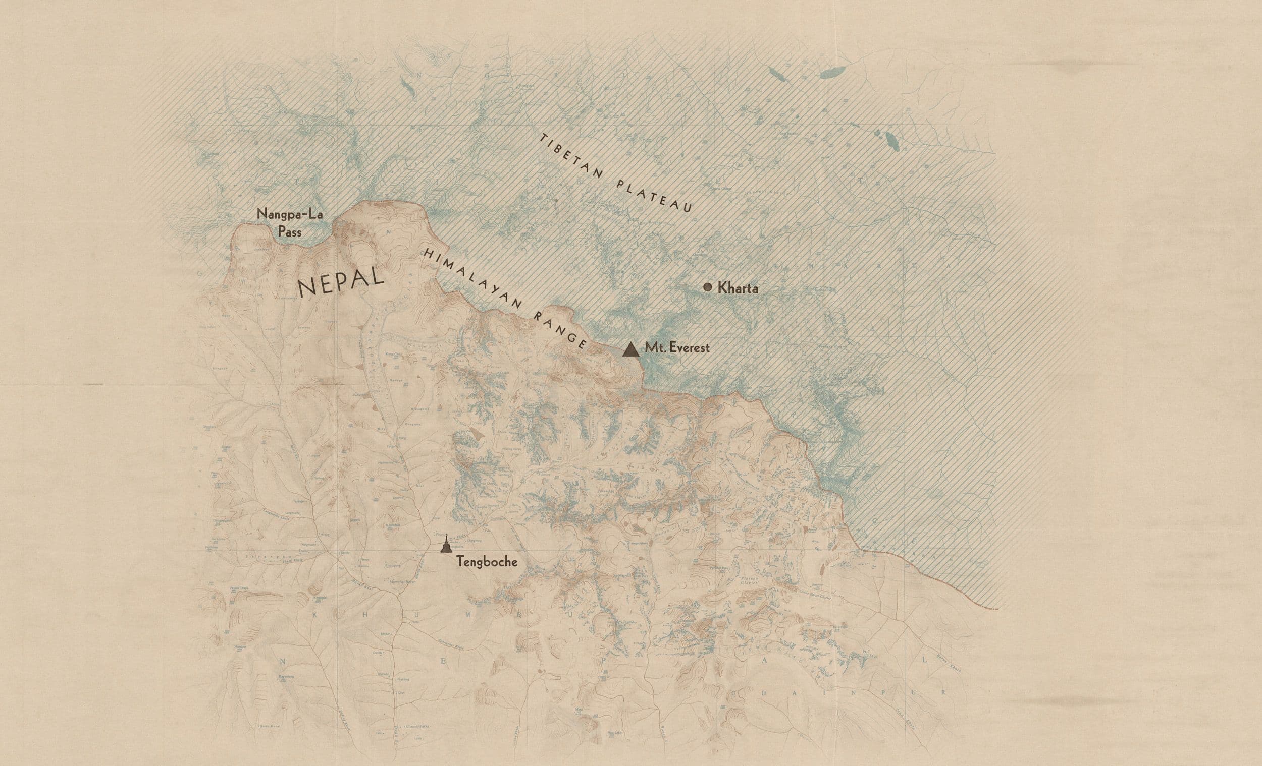
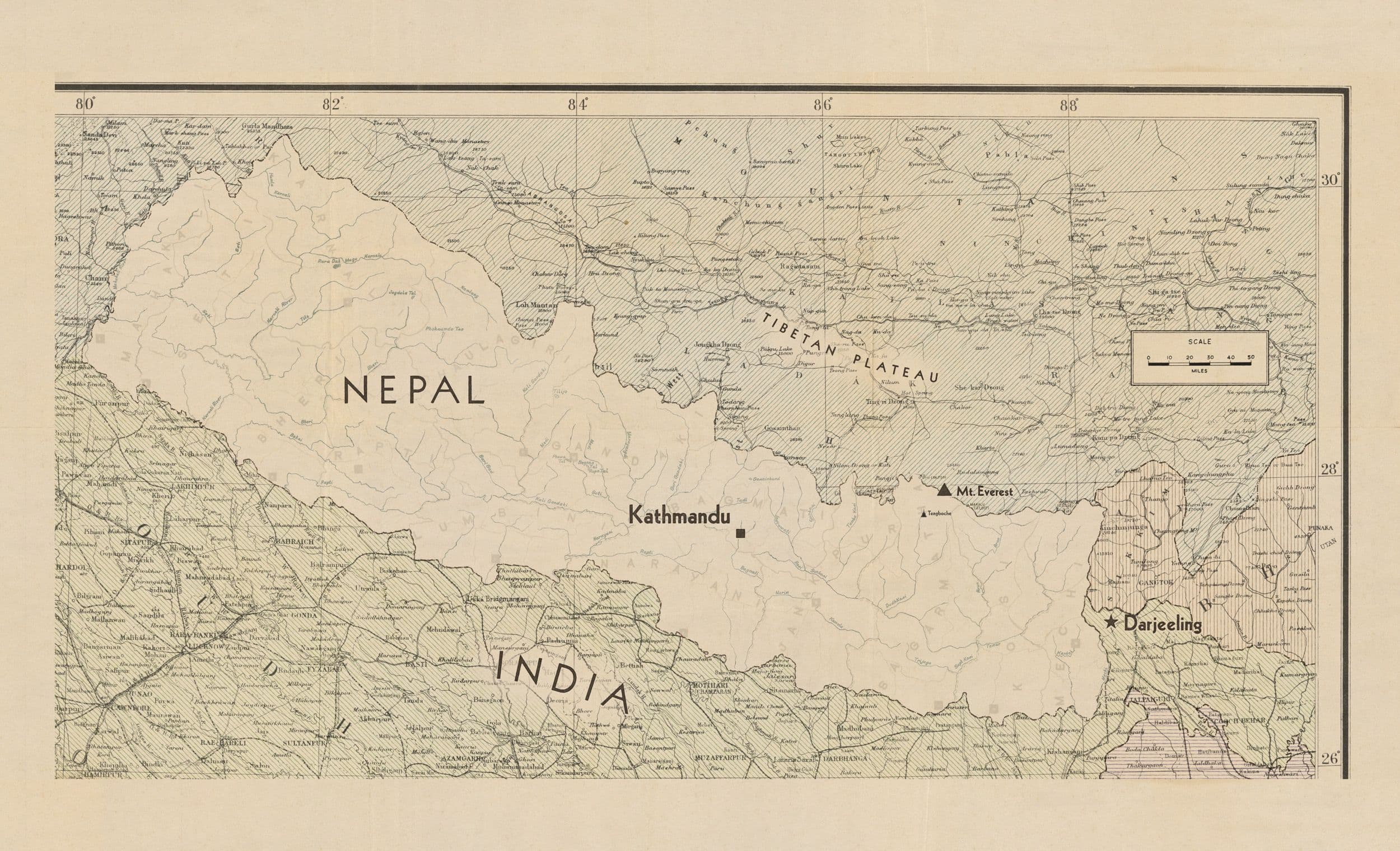
To ensure we created legitimate and honest versions of the maps we researched and sourced physical prints and archival documentation from the time and carefully repurposed them for the motion sequences. For the wide map of Nepal we sourced an original hardcopy 1960s map printed in Nepal by Sahayogi Press. For close map sequences near Mt Everest we used a digital archive asset from the Royal Geographic Society, lithographed and printed by Waterlow & Sons Ltd in 1961.
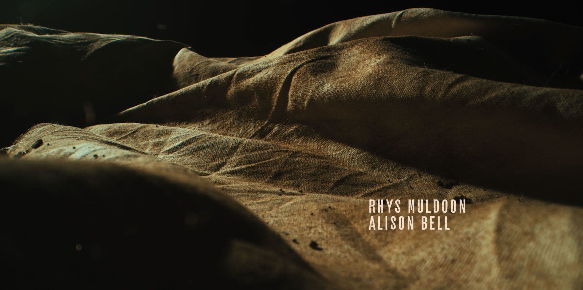
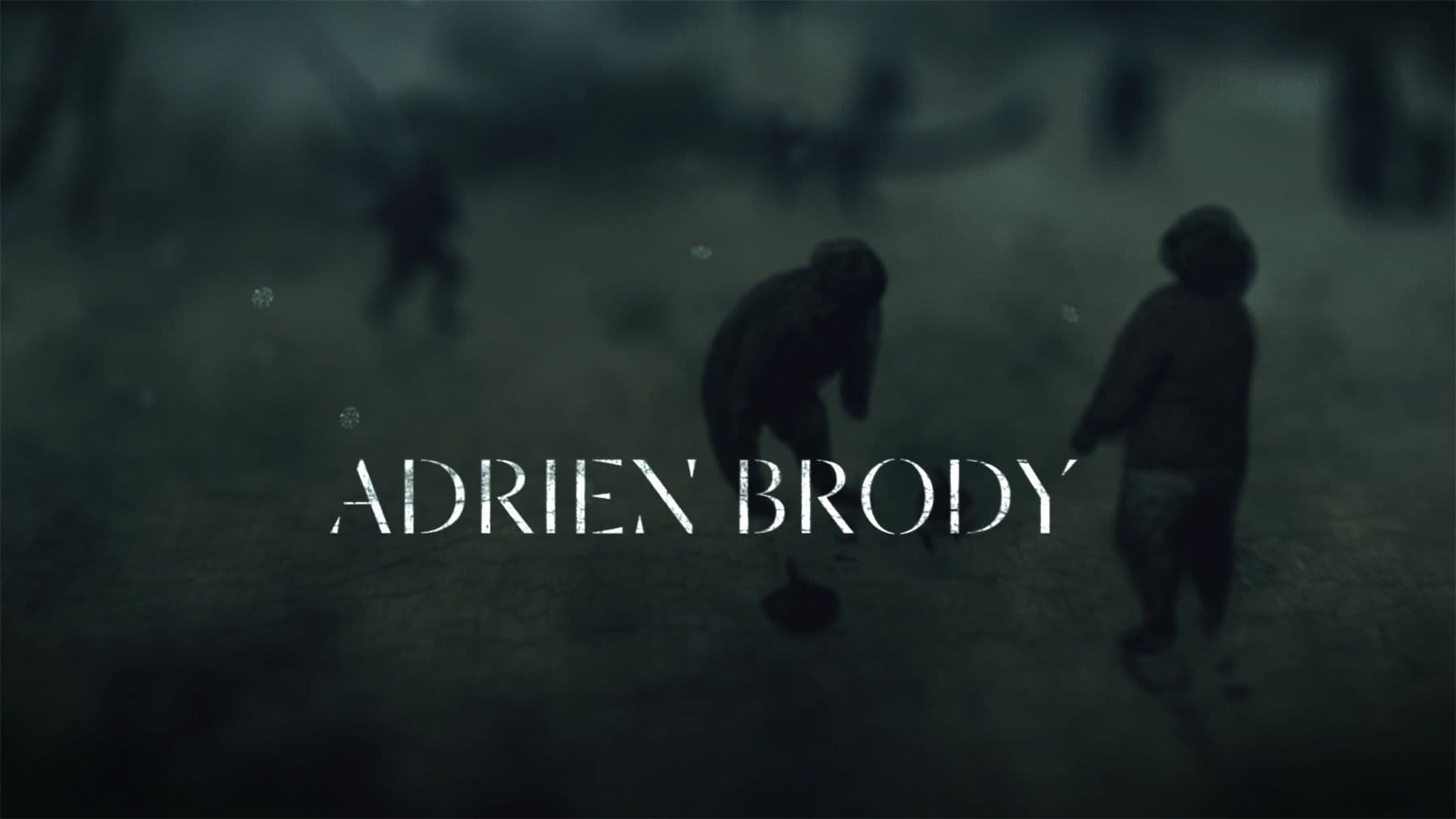
While the main titles were intentionally very simple and traditional, appropriate to cinema of the time, a lot of care was given to the details of the titles and how they felt connected to the Swiss archival footage that was used in the titles sequence. As such, we did a deep dive into optical titles compositing of the era, creating separate mattes to accurately recreate the multi step process, matching grain, gate weave, and halation. All the cast, location cards, chyron cards, attribution tags, main-on-end and epilogue cards were treated in the same way.
Telling the story of Tenzing’s incredible endeavours, both as an adult in the expedition to summit Everest and as a child when his family left Tibet to resettle in Nepal, the film required a number of map sequences to support the story-telling. We created three key map elements that would be used through the story at different time periods to visualise the days and weeks involved in such a difficult expedition and the final climb up Mt Everest with very specific route maps based on the original drawings inspired by the ones used by the English expedition team.
Credits:
Titles and Graphics Designers: Andrew van der Westhuyzen & Glenn Stewart
3D Artists: Gary Yeung and David Sujuno
Producer: Olivia Hantken
Commissioned by: See-Saw Pictures